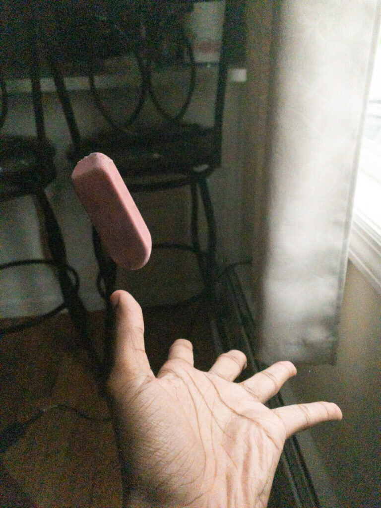
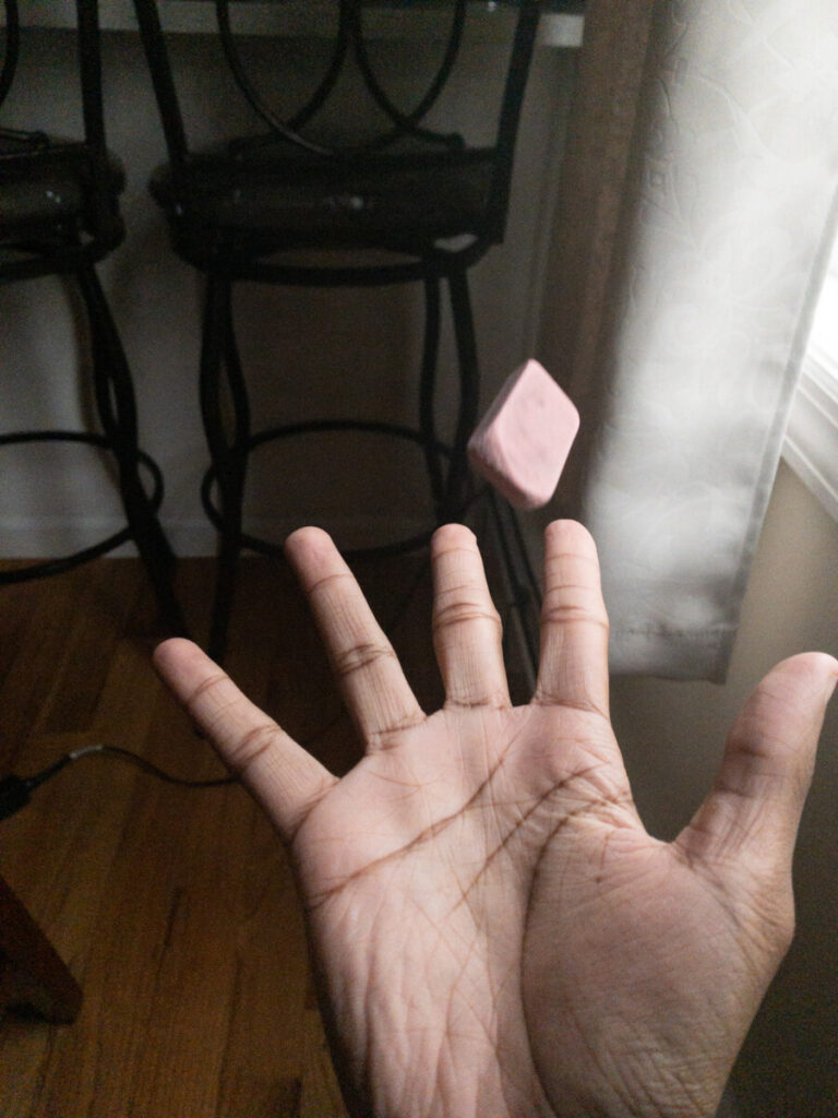
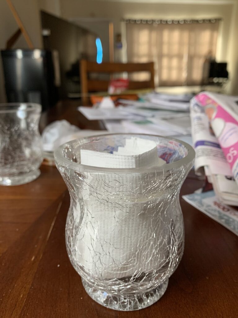
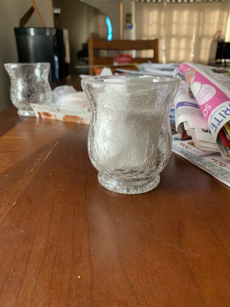
For this i used the portrait mode for both photos because felt like the focus was stronger this way. I also varied how much light was shining on the objects to see if it had some effect. For the 2nd photo it was a little challenging making the background blurry.
Author: UnphasedEli (Page 2 of 4)
The original photo is on the left and the edited one is on the right side. I wanted to make the colors pop or stand out a bit more because in the original photo the colors seemed a bit too bleached or in other words faded. So to fix that I changed the exposure to -1.00, for the color I changed the temp to +23, and for clarity i made it +31. I also slightly cropped the bottom of the photo.





Recent Comments