Robin Michals | COMD 1340 Photography 1 OL89 | FAll 2020

Author: Mercedes Alvarez (Page 5 of 6)

The Camera Meter

These two images don’t look too different because the light that reflects off the objects changes the way the color composition turns out.

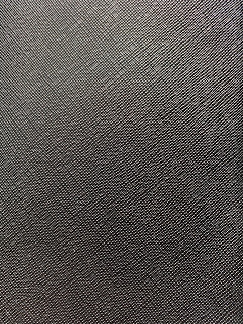
When I adjusted the exposure the color of the items are much more prominent. For the black image I used my purse and put the exposure almost all the way down. For the white shot I used Sketchbook paper and adjusted the exposure very high but to where you could still see the texture of the page if you look closely enough.

Hoola Hoop

Beverly’s Photo

I really like how the the rack looks like a frame and crops the image inside. The. background within the frame is very pleasing to the eye and symmetrical. I also like the shadows of the wall on the ground looks very interesting.

Patterns

I chose to use hangers for this assignment. I really like how all the colors stand out in the photo. I wish I could have used more hangers in the photo but since they are fairly large it was hard to fit too many in the frame.

Negative Space

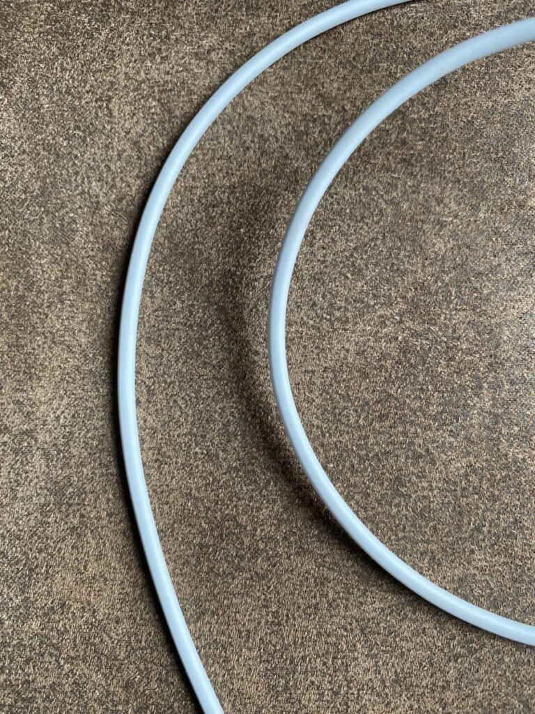
What I like most about the negative space on the left image is how it divides the background in 3. The way the charger is laid out makes the background look curved.

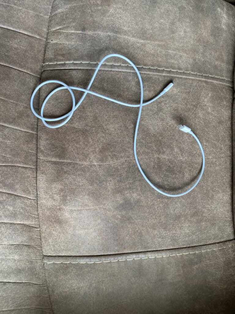
The photo on the right is further out so the negative space is more open but in-between the charger are more and very different shapes than on the left.

Framing HW

Lisa’s Photo

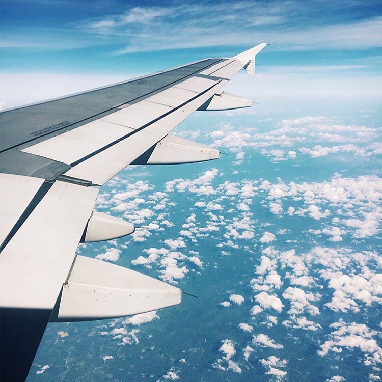
I like how we can see the two different type of clouds in the background. I can’t tell if the wing is eye level or high angle it seems like it was shot slightly above eye view. The wing is shot in the left side of the frame leaving much view of the background.

« Older posts Newer posts »

© 2024 Photography I

Theme by Anders NorenUp ↑