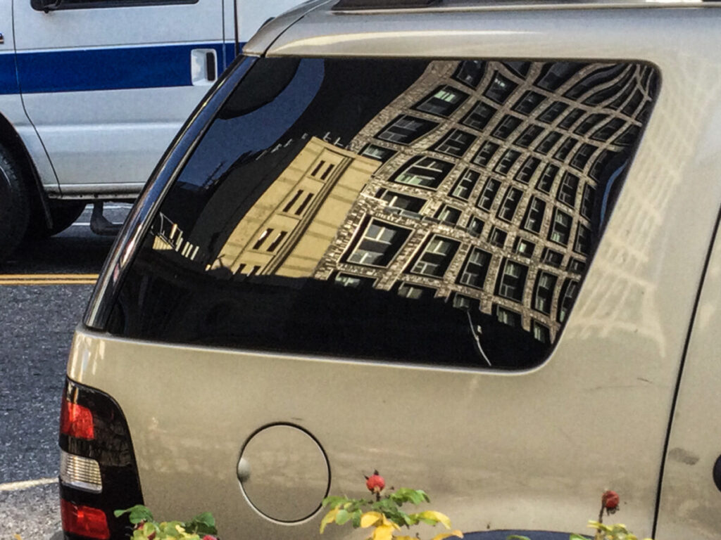
Edited 1 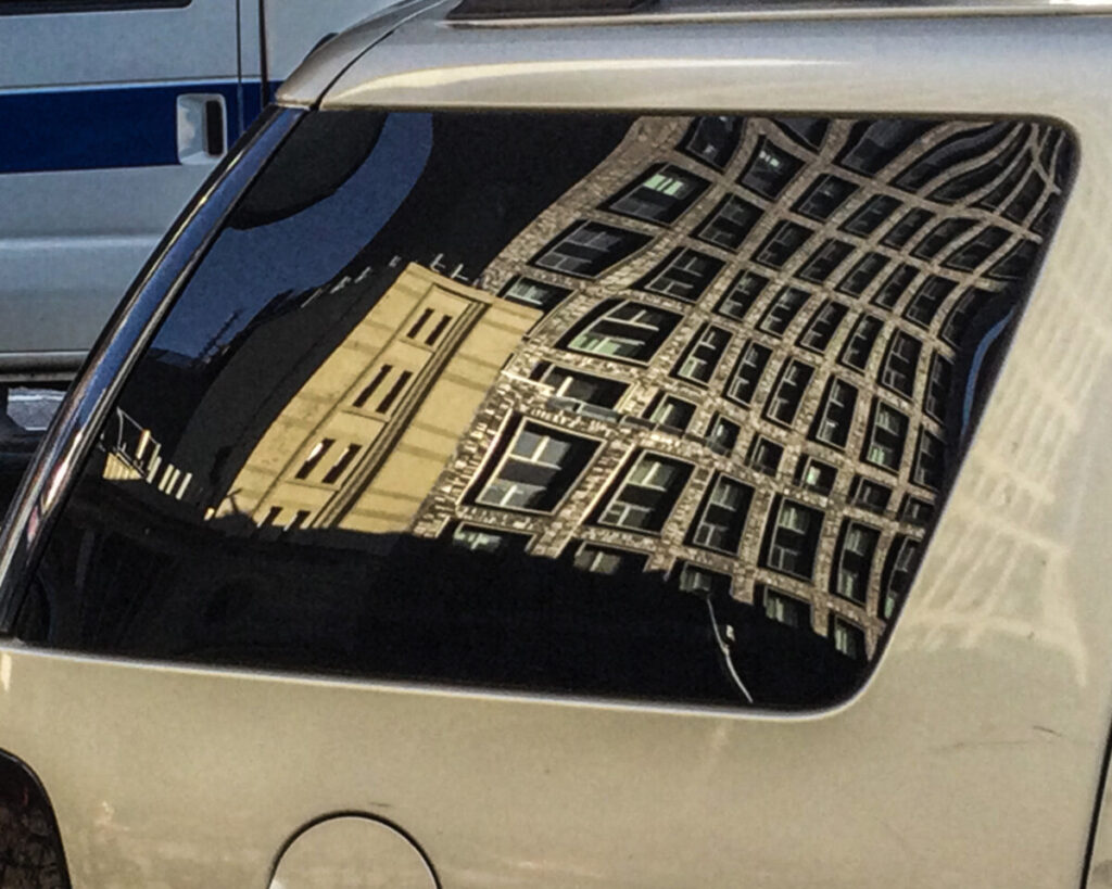
edited 2
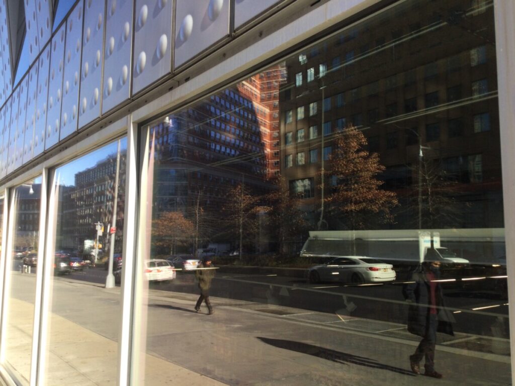
I adjusted the white of the truck so the attention can go to the main subject of the photo.
Robin Michals | COMD 1340 Photography 1 OL89 | FAll 2020
My name is Brianna Edwards. I'm in my first sophomore year in City Tech. I'm not sure on what I want to do yet but I'm thinking of being an illustrator. I've drawn on paper and digital media. I also want to tell my own story through drawings. I still feel like I have many things to learn so I'm looking forward to see how far I can go.
I'm also interested in animation. I have never properly animated before but I've grown up on them and I can't just let them go. So I still watch them now.


I adjusted the white of the truck so the attention can go to the main subject of the photo.
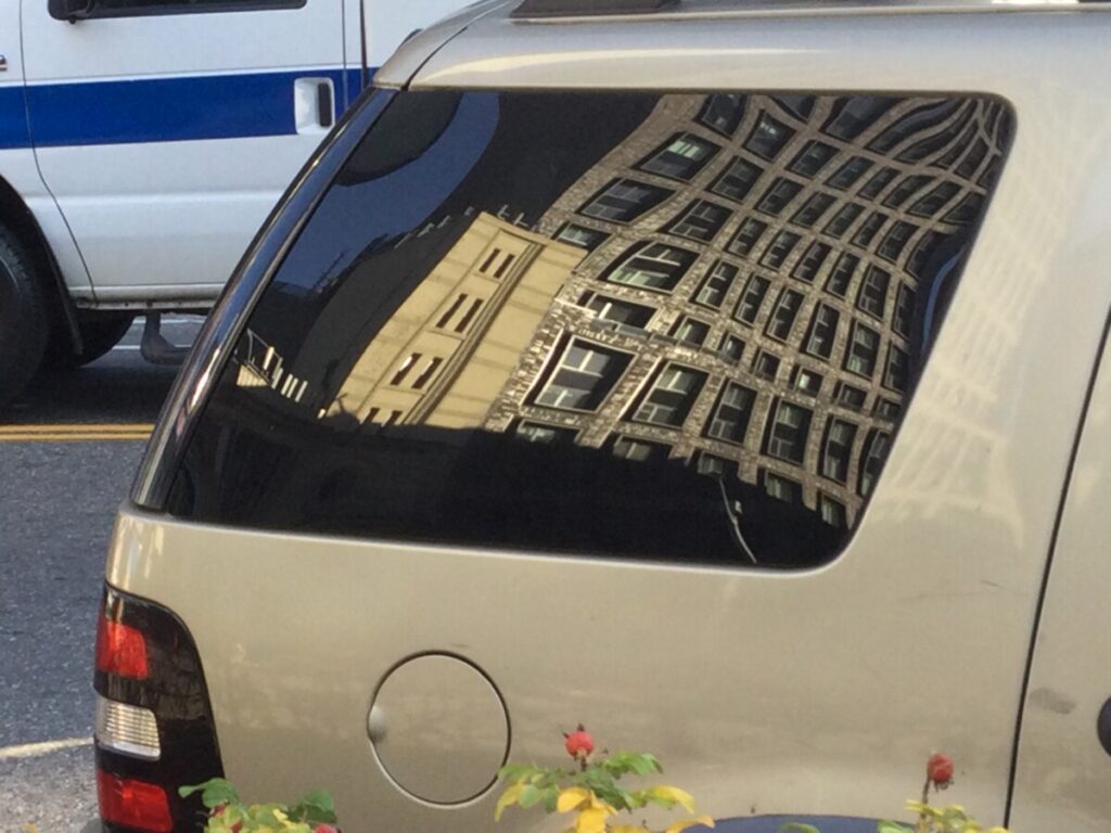

I found that the photo was a bit too flat so I upped the contrast and adjusted the clarity. Exposure: +.09, Contrast: +20, Highlights: -45, shadows: -25, Texture: +22 and Clarity +64

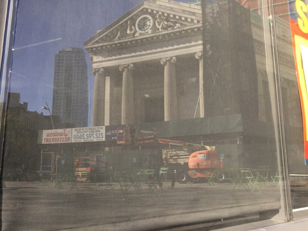
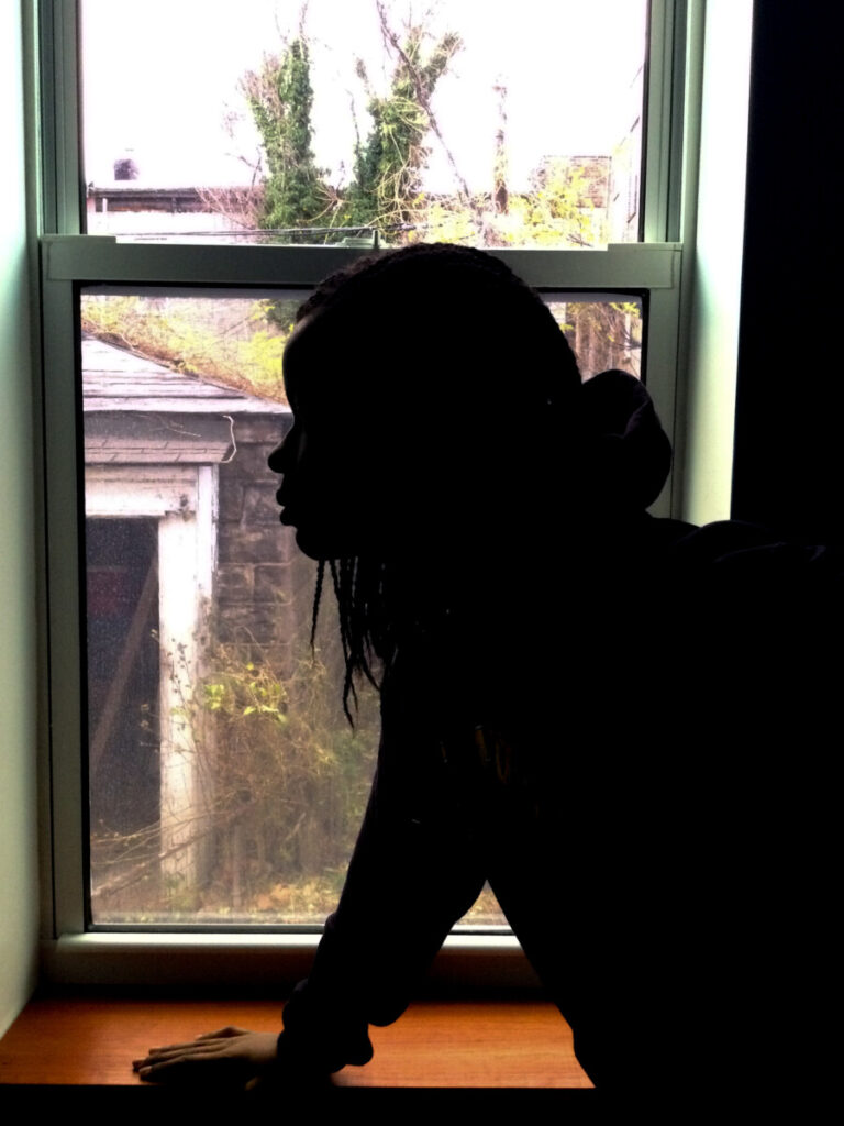
What did you have to do to get a clean silhouette?
I got a clean silhouette by putting the exposure to -0.63, the shadow to -96 and the black to -7.
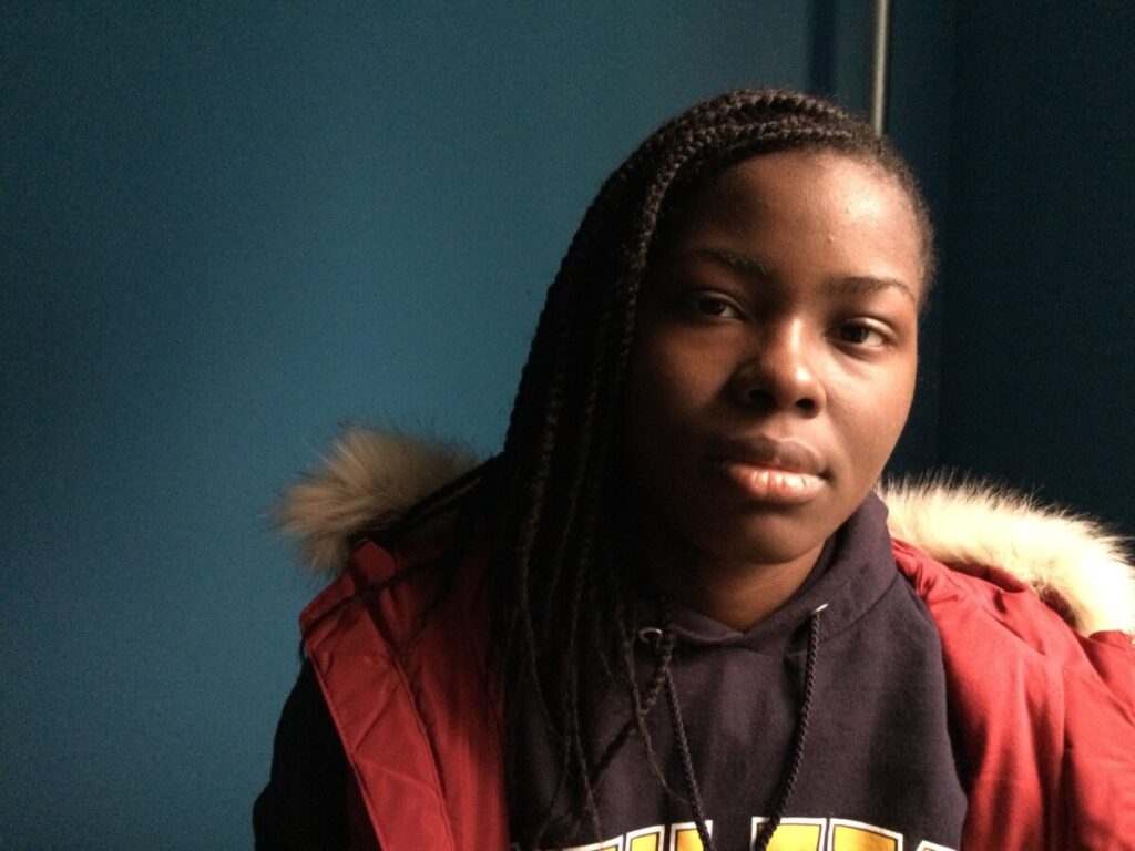
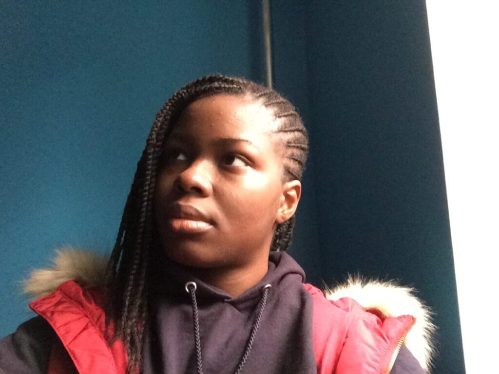
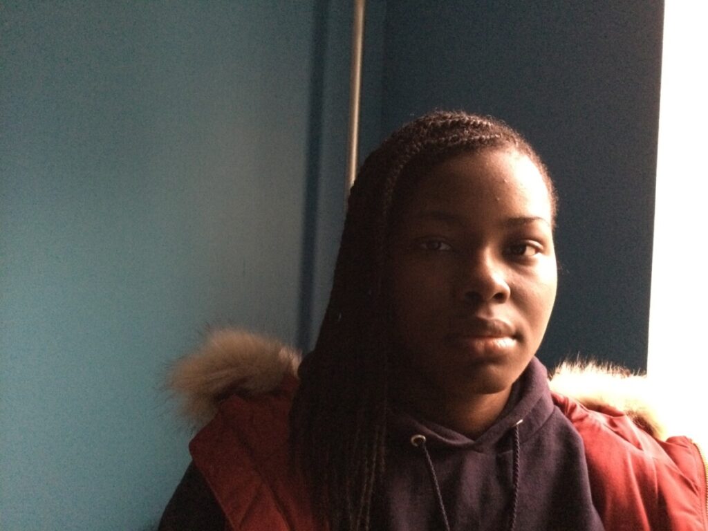
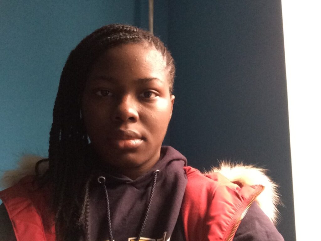
The most difficult style to create was short light. I couldn’t get the light to quite hit the very side of my face without moving too far from the window. I think Rembrandt gave me the best result. The camera kept picking up the hotspot from the light source. What I could’ve done better was adjust the exposure.
© 2025 Photography I
Theme by Anders Noren — Up ↑
Recent Comments