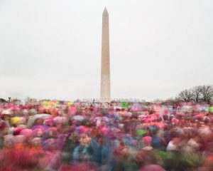
“The Women’s March”, 2017 – Matthew Pillsbury
This photograph taken by Matthew Pillsbury, named “The Women’s March” really caught my eye with how pleasing it was to look at. The vibrant color that fills only half the photo with the contrasting complete white of the clouds with the Washington monument right in the middle of the frame almost splitting the picture in two. The lower half of the photo also gives a very busy feel to the piece while the other half is the complete opposite giving off a very clean and calm feel. The use of symmetry also helps make the photo even more visually pleasing as its almost the same on the side split vertically. Along with the color and tone which makes for an excellent photo.


Good description. the almost complete emptiness of the top 2/3 of the photo really contrasts with the pulsing crowd in the bottom 1/3. Pillsbury uses a long exposure to get the motion blur. We will experiment wit this later in the semester.