
This provides a detailed of your homework.
Topic: Poster
Goal: Communicate an immediate message
Objective: Create a dynamic poster
homework:
-
-
- poster
- process book
-
1 poster
Revise your poster and image.
If your text is not correctly formatted, do not do this assignment. Instead, format your text as specified below Create 6 versions
If your text is correctly formatted, do this assignment.
-
- Group “similar” items –If you change size or style make it dramatic, (at least 10 points)
Create alignments that do not appear centered
Create a main access, you can include a secondary access but make sure that it does not take away from the hierarchy of the main access
- Group “similar” items –If you change size or style make it dramatic, (at least 10 points)
2. Eliminate extraneous items and punctuation, NO quote marks, dashes, ellipses, etc —Make your text easy to read, where are you breaking your lines?
3. Resolve the space within units of text ––text units should hold together, check for too much text between first and last name.
4. Do not fill the entire page with your text, leave a “mass” of white space
5. Position a graphic element to reinforce your structure and hierarchy –Do NOT position your element randomly in your white space –Do not fill the space with your image
6. Upload your 3 variations to Miro https://miro.com/app/board/uXjVPh2Fm1s=/
7. Check that you have completed the criteria. –If you do not fulfill the criteria, create 6 variations
8. Read this criteria
Make sure that you have followed each item
Paste the criteria below (1-10) in the chat with your name
Failure to post, results in no credit for homework
-
-
- align text on one main access
if you include a secondary access, make sure that it does not take away from the hierarchy of the main access - do not center any text
- group similar items
- no extraneous items and punctuation
- break your lines logically resolve spacing
- do not fill the entire page with your text,
leave a “mass” of white space - position a graphic element to reinforce your structure and hierarchy
- do NOT position your element randomly in your white space
- do not center your image
- do not fill the space with your image
- align text on one main access
-
examples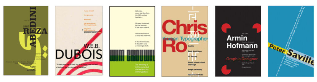
Miro: https://miro.com/app/board/uXjVPh2Fm1s=/


Revise your poster and image.
If your text is not correctly formatted, do not do this assignment. Instead, format your text as specified below Create 6 versions
If your text is correctly formatted, do this assignment.
2. Eliminate extraneous items and punctuation, NO quote marks, dashes, ellipses, etc —Make your text easy to read, where are you breaking your lines?
3. Resolve the space within units of text ––text units should hold together, check for too much text between first and last name.
4. Do not fill the entire page with your text, leave a “mass” of white space
5. Position a graphic element to reinforce your structure and hierarchy –Do NOT position your element randomly in your white space –Do not fill the space with your image
6. Upload your 3 variations to Miro https://miro.com/app/board/uXjVPh2Fm1s=/
7. Check that you have completed the criteria. –If you do not fulfill the criteria, create 6 variations
8. Read this criteria
Make sure that you have followed each item
Paste the criteria below (1-10) in the chat with your name
Failure to post, results in no credit for homework
XIANGYONG ZENG
1.align text on one main access
if you include a secondary access, make sure that it does not take away from the hierarchy of the main access2.
2.do not center any text
3.group similar items
4.no extraneous items and punctuation
5.break your lines logically resolve spacing
6.do not fill the entire page with your text,
leave a “mass” of white space
7.position a graphic element to reinforce your structure and hierarchy
8.do NOT position your element randomly in your white space
9.do not center your image
10.do not fill the space with your image
1) Have a dramatic difference between the heading and the rest of the text.
2)No quotation marks
3)Image should not be in center or in white space by itself
4)Text should not be in center and fill the whole page
5)White space is good
1.align text on one main access if you include a secondary access, make sure that it does not take away from the hierarchy of the main access
2.do not center any text
3.group similar items
4.no extraneous items and punctuation
5.break your lines logically resolve spacing
6.do not fill the entire page with your text, leave a “mass” of white space
7.position a graphic element to reinforce your structure and hierarchy
8.do NOT position your element randomly in your white space
9.do not center your image
10.do not fill the space with your image
1- Do not center image
2- No quotation marks or punctuation
3-do not center
4- leave white space
5- B/W
Cesar