This provides a detailed description of your homework assignment.
Topic: First impression
Goals: Communicate meaning using structure and hierarchy
Objectives: Clarify meaning with visual excitement
Dynamically represent your influence
HOMEWORK: Increase communication of your message.
Previous criteria
-
-
- every element must feel intentional
- do not fill the entire page with your text or image,
BUT–make sure that all the space in the poster is relevant
— “mass” of white space - align text on one main access—if you include a secondary access, make sure that it does not take away from the hierarchy of the main access
- do not center any text or image
- group similar items
- no extraneous items and punctuation, take out quote marks and dashes
break your lines logically resolve spacing - position your graphic element to reinforce your structure and hierarchy
- do NOT position your graphic element randomly in your white space
- do NOT use your image to create a shape around your entire text block
It isolates your text from the other areas of the page
-
You must have resolved the above criteria to continue
Goal
-
- Convey a message
If you have a “book report,” a list of facts, update to convey a message
Use scale, emphasis, and position, to communicate the meaning - Refine hierarchy, is it in the best position?
- Increase scale to make your composition more active
- Convey a message
Process
-
- Check that you have fulfilled all the previous criteria
- Create 3 compositions with new criteria
- Emphasize 2 different meanings on at lease 2 posters
Your third can repeat your meaning in a different composition - Upload to Miro
- Add 1 sentence under each composition that describes your meaning
Rubric for grading:
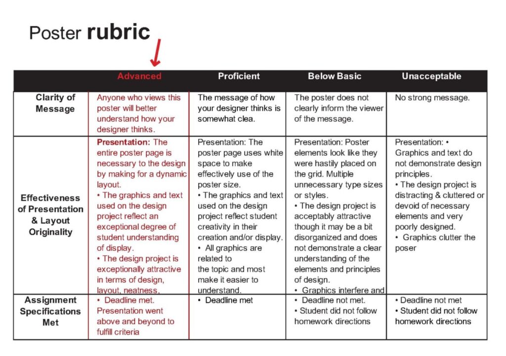
poster rubric


I’m don’t quite understand what we’re specifically suppose to do in this homework and what message?
1)every element should be intentional
2)the image or text should not be centered and fill the whole page
3)All the secondary text should be cohesive and the main hierarchy should emphasize an alignment.
4)3 posters and I need to empathize different meaning for at least 2 of my works
5)Add 1 sentence under each poster
– All elements must be intentional
– don’t fill entire page with text or image, make sure all poster space is relevant
– align text on one main access, if using a secondary access, make sure it keeps the same hierarchy
– no centering
– take out quote marks, dashes, logically break lines
– graphic elements must reinforce structure and hierarchy
– no positioning graphic element on a random white space
– don’t wrap text around or inside a shape or image
1- Every element should feel intentional
2- Image should not fill whole page or around text
3-group similar items
4-Position your graphic element to reinforce your structure and hierarchy
4-