First of all, let’s define the term Information Architecture or IA:
An IA is the structure of a system. It is the model produced when a website’s content and functionality are organized so users can easily access everything in the final site. Its main purpose is to optimize the user experience, meaning anyone visiting your site will be able to intuitively navigate to the information for which she is looking.
Your website, however small and simple, is actually a system for delivering information and facilitating task completion to an inquisitive public. The more carefully you structure your site’s navigation, the better and more quickly it will deliver content. There’s nothing more frustrating to a web user that a confusing or misleading navigation.
If you take the time to create an IA for your site, you will know what content you need, how the user will be guided, and how the site will be structured. This is hugely helpful information to have before you start designing.
A Word About User Experience
The web development process should be user-centered from start to finish, no matter which step you are on. In the early days of the internet, design tended to be about the designer, and what he could imagine was cool or new. Now we know that unless the user finds the experience useful, compelling, and satisfying, she will simply leave the site probably never to return. This means that even if the interface is beautiful, a site is a failure if its information architecture is garbled, or its coding is subpar.
Also, if you are working for a client, never forget to keep his objectives in mind.
“As user experience designers we have to find the sweet spot between the user’s needs and the business goals, and furthermore ensure that the design is on brand.” Whitney Hess
Creating an Effective Information Architecture
You need to take the following into account:
- Your end objectives
- The constraints you have to deal with
- The content you have or will generate
- The requirements for the people who will visit your site (this depends on who your target audience is).
Card Sorting
One great way to organize your content is to write out your main topics and subtopics on cards, one item per card. Then sort the cards into the groups that make the most sense. It is great if you can have a couple of representative users sort the cards into groups that make sense to them, just to see if your logic holds true.
Sitemaps
Once you have taken note of the way things and tending to be grouped, create asitemap. A sitemap is a high-level chart where each topic (or page) is represented by a box, and the basic relationships between pages is drawn in a simple manner. Take the time to draw a couple of sitemaps and get it right.
Wireframes
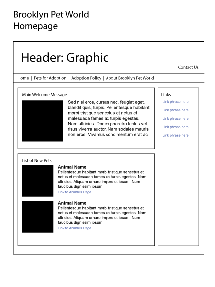
Once you have established the overarching relationships between content areas, it’s time to go in and create detailed wireframes of each individual page type. Wireframes are simple, unembellished diagrams of the page structure. They help you figure out how each element on the page relates to the others, and provide invaluable insight on how the page should look and function.
Articles used to write this lesson
What is information architecture? Iain Barker | May 2nd, 2005
Information Architecture: Enhancing the User Experience Rick Sloboda | June 14th, 2010
Starting Out Organized: Website Content Planning The Right Way Kristin Wemmer | March 17th, 2010
10 Most Common Misconceptions About User Experience Design Whitney Hess


“Thank you, for this useful content it is a very surprising content, the whole paragraph and the word are clearly explained
This is a great and informative article! I find that utilizing sitemaps and wireframes can really bring a lot of better interaction and a good look for the user interface on the website. Don’t you agree?