Jan Tschichold, “The Principles of the New Typography” pg35-38, Karl Gerstner, Designing Programmes pg55-61, Joseph Muller-Brockman, “Grid and Design Philosophy” pg62-63 from Graphic Design Theory: Readings From the Field by Helen Armstrong.
Reading Response 5
Many designers have their own way of approaching design. Whether it is using text as a design piece, having only images in their design, or having a single illustration in the design. Design is something that can be different with each work depending on who is doing it. That’s what makes design interesting.
We can also see the idea of different approaches to design in the reading. Where each designer has their own view of how design should be used. Jan Tschichold wanted to approach design with the idea of not just using text as decoration in a design. Wanting it to be used as something that is simple, easy to understand, and can communicate the message of the design with a minor issue. Jan wanted text too, not to have different fonts, be different sizes, or have a design going around it. He did not want this because, as I understand, it would make it hard for the viewer to understand the text or focus on it. Karl Gerstner believed design should be approached more systematically. He wanted design too to follow a sort of formula so that designers would have trouble with what they were designing. The system would help them with many parts, or they design processes so they could focus on how they would put it together. This system would help them decide what fonts to use, the flow of the text, or how close their words should be. Finally, Joseph Muller’s approach was to use grids to help organize the design. Joseph believed that using a grid helps to bring an understanding of what the designer is doing. That grids help them design to organize the work and give them control over the space they are using for the design.
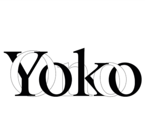
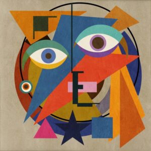
The piece I chose below represents the approach of all three designers, and I will explain how. For one, this design has simple use of typography. The type is both the same font, size and is very easy to understand. This represents the typography Jan wanted, as I stated before. The text carries some choices used in the chart created by Karl. Such as the use of san-serif font, the text going from left to right and the text being combined. I saw all these design ideas in the chart that Karl created for design. Finally, their design shows the use of a grid because of both texts being on the same line with neither falling below the other. This is a representation of what Joseph wanted in designing an organization and clarity in the design. As shown and stated, design can come in many different shapes and sizes, but its goal is always the same. That goal is to help the design express their message in their own way.
Annotation Links
Rephasing: The criteria are rough.
Question: The importance of “combined” is shown in example b 14:
Definition of morphological box




Recent Comments