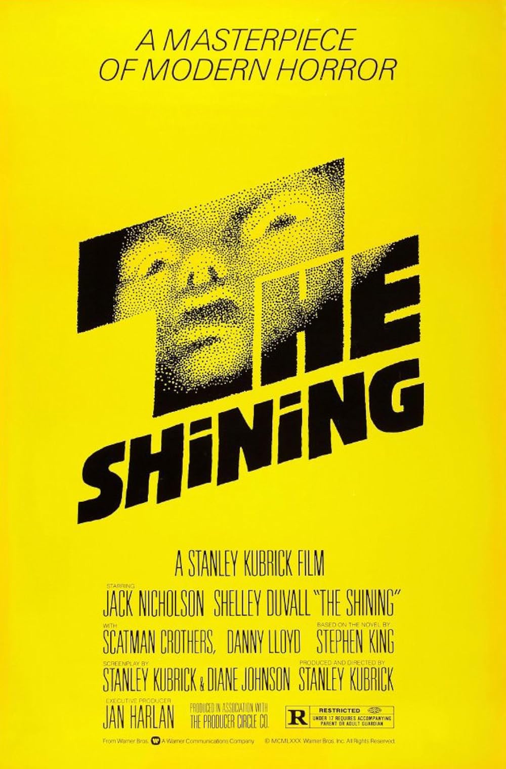
Beatrice Warde describes the function of printing and how it is similar yet different from fine arts. She believes that printing’s function is to convey thoughts, ideas and images from one mind to another. Printing is meant to convey specific and coherent ideas. This concept to her is what she believes to be the basis for all typography. One design after 1971 that I would like to take a look at that would help consider this theory is the typography for The Shining which was done by Saul Bass. It was made for a movie about a homicidal maniac that begins to terrorize his family.
The typography in this is not cleanly drawn. The typography scatters along the edges almost as if to simulate pencil strokes, also the spacing between the letters are not evenly distributed which gives off tension and an unsettling vibe. In addition, there is a giant face in the word “The”. This face also adds to the unsettling vibe of the letters because of the stippling effect used to create. If we are using Beatrice’s definition then this would be a good use of typography because it is conveying the idea and images of the movie to the consumer.


Leave a Reply
You must be logged in to post a comment.