Typography, merging art/ science and Grid all somehow work together to create the new evolution of the international style of the typography movement in the Bauhuas during the 1920-s to 1940s to the new Swiss Typography embraced by European Modernism in the early 1950s. Designers such as Jan Tschichold and the reading “The Principles of the New Typography “, Karl Gerstner in “Designing Programmes’’, and designer Joseph Muller-Brockman “Grid and design Philosophy all objectively have in common structure and development. The New typography was a part of the Avant-Garde movement since it was rejecting traditional arrangements and functional structure. Muller’s emphasis on grid usage may create art more organized and legible.
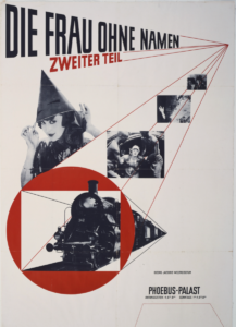
During the New Typography era, Jan Tschichold’s poster on the right shows a great example of all three design systems. Clarity and freedom of art, Design, and Grid. The 1927 “Die Frau Ohne Namen” posters consist of all three philosophies, the layout of the images all align with the concept of the two focal points, one on the upper right of the poster and the other on the bottom right. The type, as well as most of the images lean towards an upright position while the train and bottom type lead towards the second focal point. The abstract shape (circle) ties into both focal points as a center of attention. This is where the grid system comes in and how the overall subject is placed, giving it Hierarchy and a clean design.


good description with the use of imagery.
late