At the end of this session, students should have an understanding of the following:
- Evolution and adoption of the International Style and influence on the current design field.
- Guidelines and due date for the Week 7 Discussion
- Expectations and due date for Research Project Outline
- Prompt and due date for Reading Response 6
Activities
Below find the information covered in this session.
Consider
-
- In 1930, Beatrice Warde, a publicist for the leading typeface corporation, Monotype, gave a lecture called The Crystal Goblet, or Why Printing Should Be Invisible.
- In it, she uses a metaphor of optimal typography as a crystal goblet, beautifully built yet transparent, allowing for the clarity of words and ideas to be shared without distractions.After reading the writings from Jan Tschichold, “The Principles of the New Typography” pg35-38, Karl Gerstner, Designing Programmes pg55-61, Joseph Muller-Brockman, “Grid and Design Philosophy” pg62-63 in our main text Graphic Design Theory: Readings From the Field by Helen Armstrong. And watching the documentary “Helvetica” consider the following…Is Helvetica invisible?When answering this question, reference the theories presented by Tschichold, Gerstner, and Muller-Brockman and any of the opinions presented in the documentary that resonated with you.
1. Typography and International Style Evolution (1.5 hours)
The early European avant-garde designers like the Futurists, Dadaists, and Constructivists changed the way we use typography. Today we may use typography, not just to communicate information or data, but as a compositional element to communicate a tone, feeling, or idea.
In the readings this week we were introduced to the ideas of three designers who shared a passion for typography and layout that was clean, efficient, and structured. Influenced by the Dutch De Stijl and Bauhaus movements their work aimed to achieve a universal method for visual communication.
This evolution of influences from the Constructivists, De Stijl, New Typography, and the Bauhaus led to the mainstream adoption of the modernist International Typographic Style or Swiss Style in the mid 20th Century and beyond.
New Typography
Swiss designer, Jan Tschichold was influenced by the Dutch De Stijl movement and the Bauhaus. In his book “The Principles of the New Typography” in 1928 Tschichold promoted dynamic asymmetry, san serif fonts, and many of the tenets of the Bauhaus. He believed that typography should never distract from the goal of relaying information as efficiently as possible. Layout was based on mathematical calculations to promote visual hierarchy, but he also valued beauty and spirituality.
With the volume of information and data shared today, clarity in typography and layout is as important, if not more important as it was when Tschichold formulated his ideas.
Rewatch the Graphic Design History section on New Typography on LinkedIn Learning or in the YouTube video below to refresh your knowledge of this movement. NOTE: In the following video, watch from 44:02 to 48:09
Swiss Style / International Typographic Style
The next generation Swiss designers and pioneers of the Swiss Style, Karl Gerstner, and Joseph Muller-Brockman created and spread their systematic approach to design across Europe and America. The typographic tools for layout and typography that we use today in Photoshop, Illustrator, InDesign, etc. grow out of the structured grid and typographic methods of the Swiss Style. Web design also relies on the grid for clear communication.
Watch the Graphic Design History section on Swiss Typography on LinkedIn Learning or in the YouTube video below to refresh your knowledge of this movement. NOTE: In the following video, watch from 1:21:57 to 1:25:45
Confoederatio Helvetica = Switzerland (in Latin)
Originating from the early Avant-Garde, the Swiss Style / International Typographic Style (and the modernist aesthetic in general) reaches its height in the 1950s and 1960s. In America, it transforms corporate advertising.
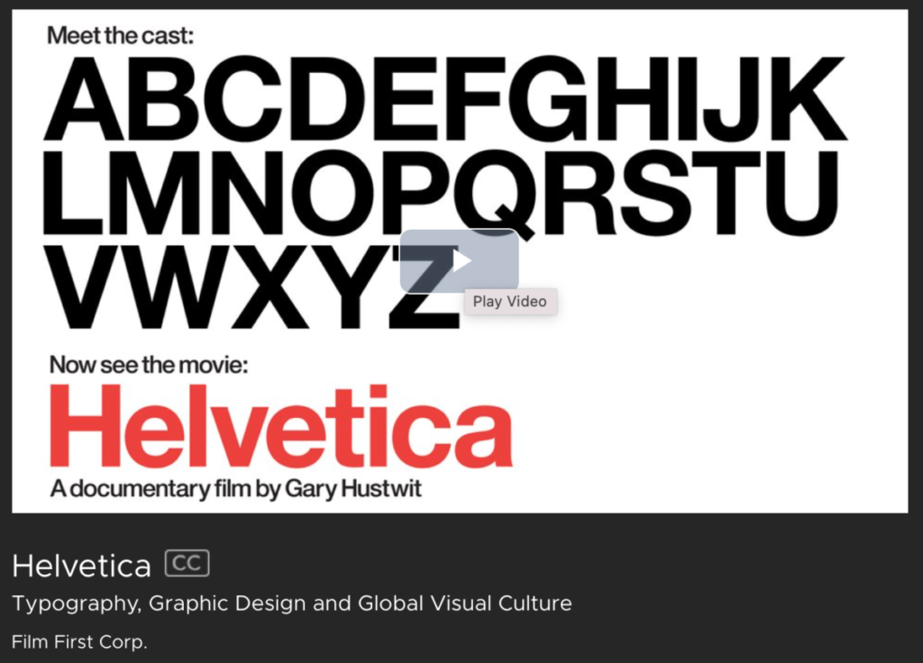
In preparation for our look at corporate identity design and advertising next week, let’s look at the ultimate Swiss Style typeface “Helvetica.” Designed in 1957 it became a hallmark of the International Typographic Style and one of the most popular typefaces of the mid-20th century.
Watch this documentary “Helvetica” from 2007. Note the mention of MySpace and other dated references. Also note that the documentary, which focuses on a typeface that was intended to be a universal typeface, is lacking a diversity of voices.
You will need to Log into the Citytech Library
2. Research Project Outline (30 min)
Review the Research Project & Presentation guidelines again and create a formal outline of your research project due Sunday, October 17th, at 6pm
Create your Research Project Outline in Google Docs with the following content:
1. Introduction
Explain in detail the topic you are examining and why it is significant.
2. Background/Review of the Literature
Include a summary of the basic background information on the topic gleaned from your literature and sources review (you can include information from the readings and class, but the bulk should be outside sources).
3. Rationale
A description of the questions you are examining and why you are exploring this topic.
4. Method and Design
A description of how you will go about collecting resources/data and how you plan to present the information in your presentation.
5. References
List the resources and references you have found so far. Include all references in MLA style.
Create a new post following the guidelines below.
-
- TITLE: Research Project Outline – Your Initials
- CATEGORY: Research Project
- TAG: Research Project Outline
- TAG: Your Name
3. Assignment: Reading Response 6 (2+ Hours)
Follow the assignment guidelines and prompts: Reading Response 6 – DUE Sunday, October 17th, at 6pm
You will be reading and annotating three essays written by Madeleine Morley, Silas Munro, and Alice Rawsthorn looking at the lack of diversity in the design field and design history. Refer to Assignment: Reading Response 6 for prompts.
Read and annotate
Celebrating the African-American Practitioners Absent From Way Too Many Classroom Lectures by Madeleine Morley, Eye on Design, 2018,
Typography as a Radical Act in an Industry Ever-dominated by White Men by Silas Munro, Eye on Design, 2019
Design Gets More Diverse by Alice Rawsthorn, NYTimes, 2011
As before, after annotating the text, create a rough draft of your response in your Research Journal.
Your response should be about 200 words and checked for spelling and grammar errors.
Publish your finished response on the class site, using the guidelines provided.


Leave a Reply
You must be logged in to post a comment.