Can someone please take pictures of the handouts that were given to us on Monday to complete for next Monday? I seem to have lost them. Even if you can text them to me that would be great. just message for my number. Please and Thank you!
Category: Uncategorized
Good and bad letter spacing

The equal letters have some bad spacing as well, the opportunity part. The bad spacing for opportunity its between the second O and the R.

There is no bad spacing here the 330 and the 2 words are perfect and has equal space.
Good and Bad Letter spacing
This is an example of bad letter spacing. Where it says “Clean” for example the letters appear to be looser than the average text that may be slightly kerned.
This is an example of good letter spacing. The letters appear to be tighter (kerned) in this image. For example where it says “student government…” the letters seem to be a lot closer together.
good & bad letterspacing/kerning
The photo below is an example of “good” letterspacing/kerning: “Priority Mail.” The type below provides an appropriate amount of spacing within each letter. The letters are not touching or overlapping eachother. The adjustment of space between the letters are thoroughly balance and share proper amount of spacing below/above the two words.

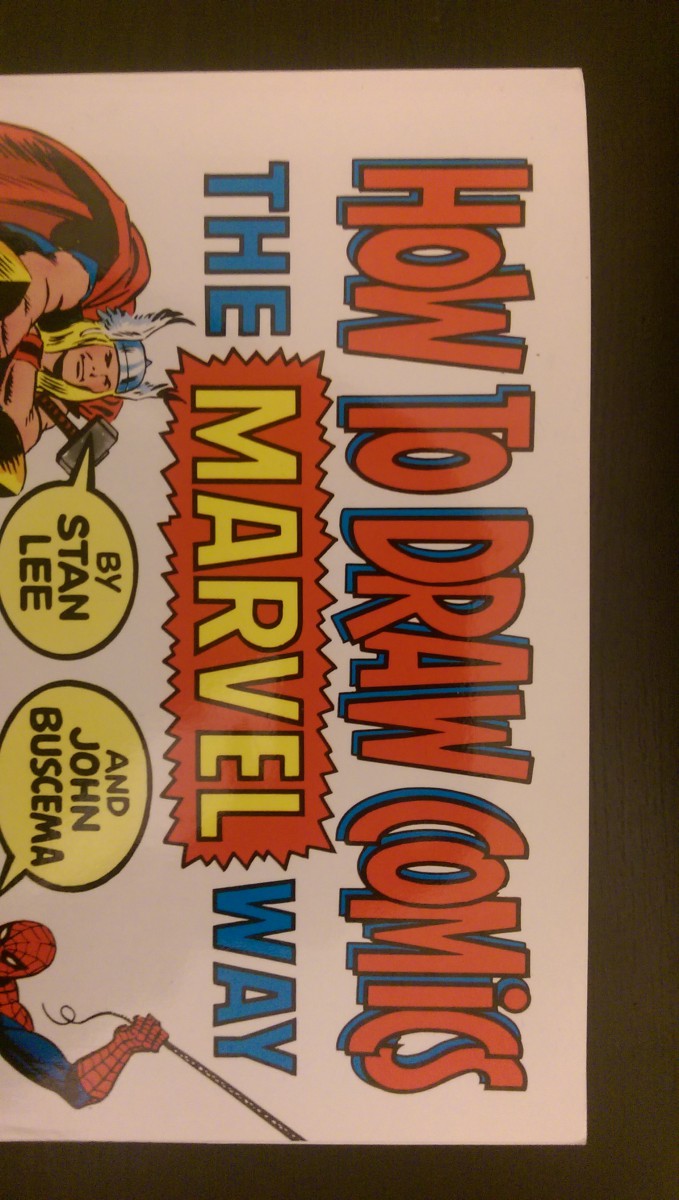
The photo below is an example of “bad” letterspacing/kerning: “How to Draw Comics.” The type below provides an inappropriate amount of spacing within each letter. The letters are touching and overlapping each other. Although the style of the typography seems appropriate for the material in this book, the letters are extremely tight and compressed and could use letterspacing. The words would be completely illegible and lost without the dark black stroke and blue shadows.
Good/Bad LetterSpacing_hw_Dhruvp
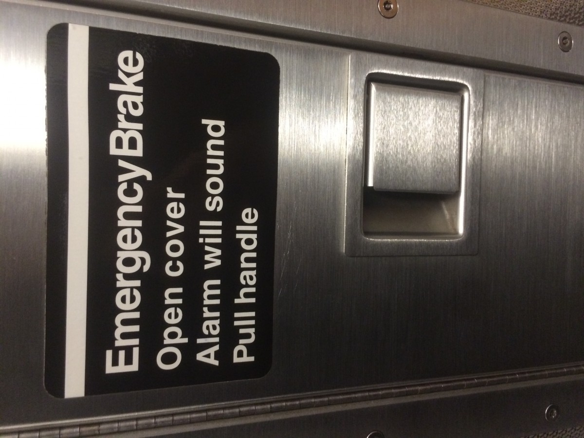
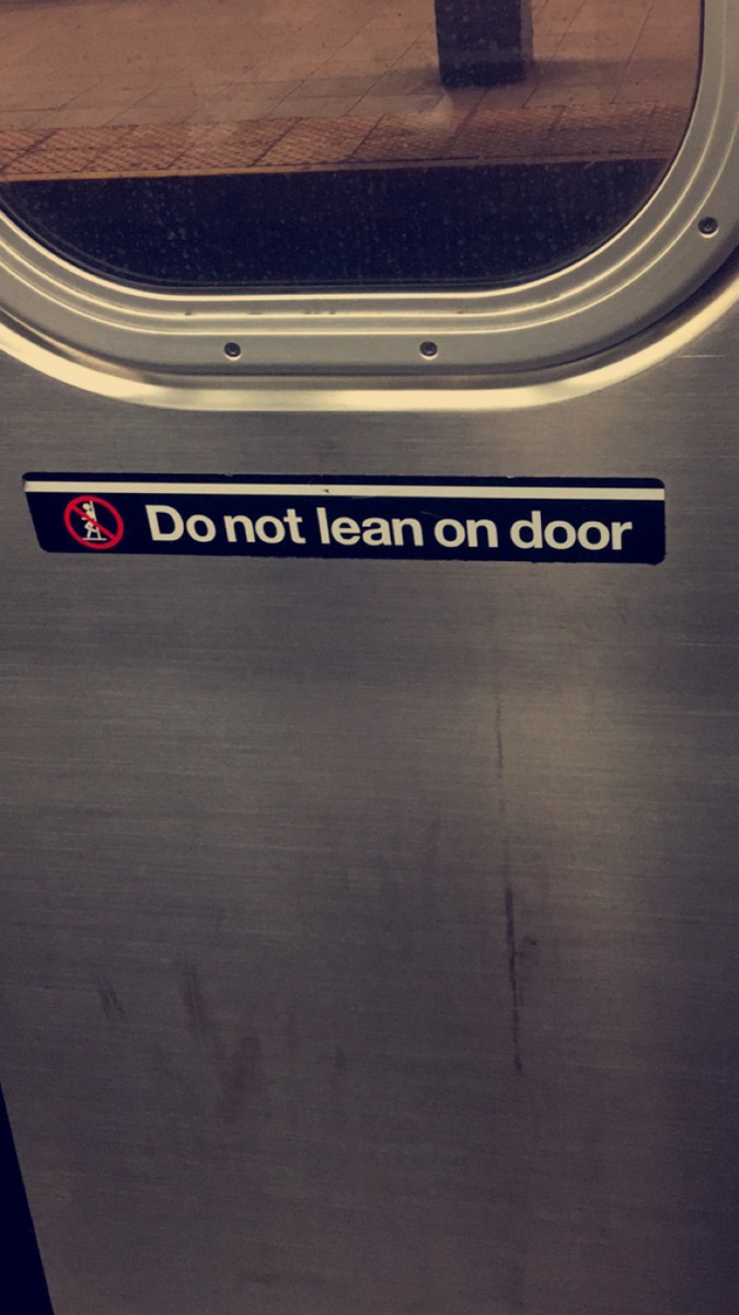
I seen this sign while in the train. It does not show good letter spacing. In the word Brake, the letter “e” is very close to the letter “k”. Also there is very little space betweeen the words Emergency and Break compared to the spacing between the words bellow it.
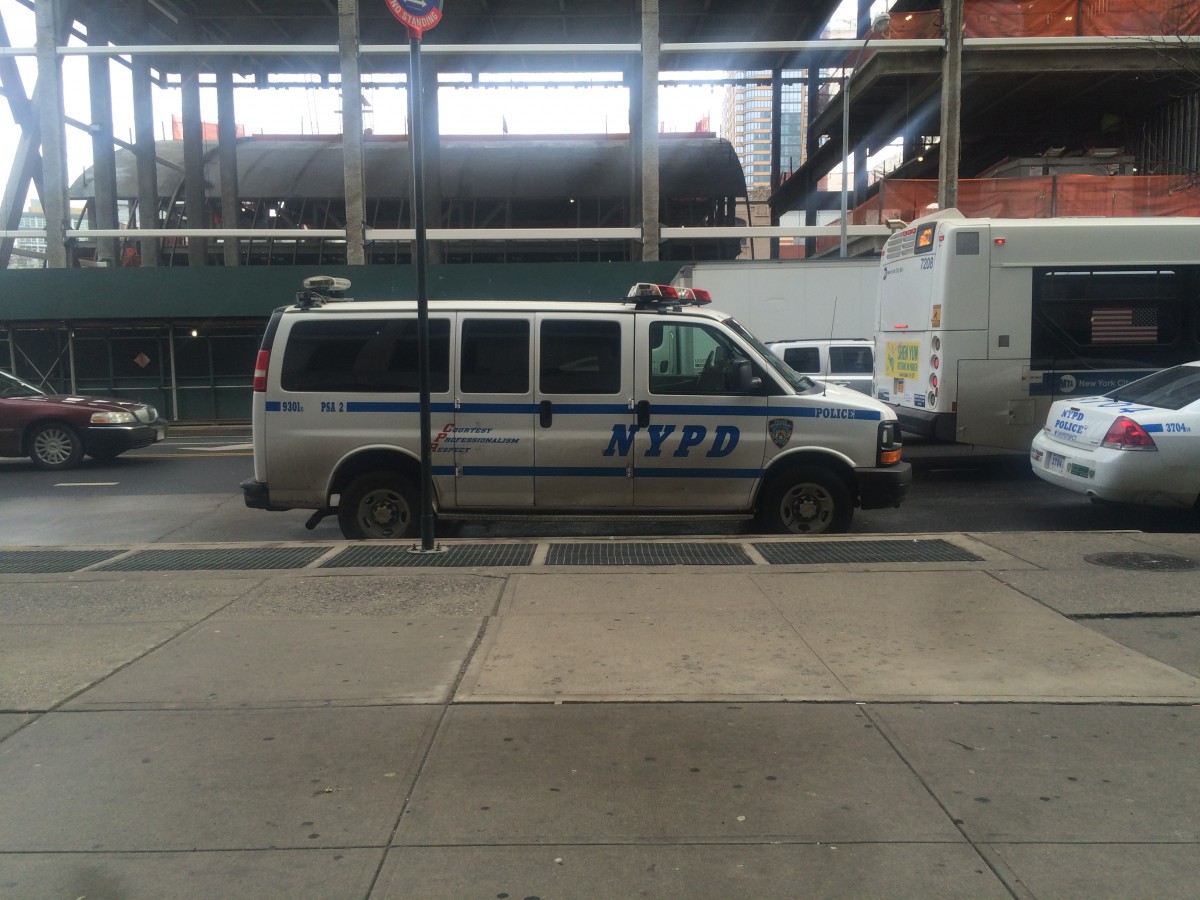
The NYPD car is an example of good letter spacing. If u look at where it says NYPD, the spacing between the letters is perfect. The letters are all evenly apart from each other.
Good vs Bad Kerning/letterspacing
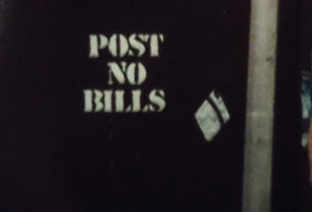
As I crossed the street I came upon a message on a piece of wood with bad kerning. The reason it is considered bad kerning is because the P and O in the word ‘POST’ seem to be right on top of each other, as well as the S and T are fusing together. Yet the O and S are not connecting in any way. Also the I and L in ‘BILLS’ have space to spare but the B is right on top of the I.
In the city there is a Dunkin Donuts shop with a sign outside listing the flavors of coolattas. The kerning in this picture is sharp as well as the letter spacing between the individual flavors. Therefore making this a good example of kerning/letters pacing

Good/Bad Letter spacing Homework_AlcantaraG

- This is considered bad letter spacing because there is too much space after each phrase.

2. The text shows good letter spacing because all the letters are aligned and there’s a good amount of space between each letter.
Kerning Errors
Good /Bad Letter spacing !- Homework
The following image below is an example of bad letter spacing because if you look closely the first two letter the O,P are much closer together than the P and T. And also at the end the Y is a tad bit further than the R.

The following image below is a great example of good letter spacing because the all of the letter are evenly spaced even though the letters are tightly together. And the spacing between the actual word are evenly spaced as well.