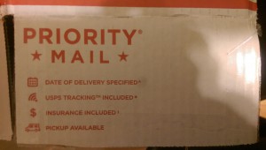
The photo below is an example of “good” letterspacing/kerning: “Priority Mail.” The type below provides an appropriate amount of spacing within each letter. The letters are not touching or overlapping eachother. The adjustment of space between the letters are thoroughly balance and share proper amount of spacing below/above the two words.
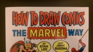
The photo below is an example of “bad” letterspacing/kerning: “How to Draw Comics.” The type below provides an inappropriate amount of spacing within each letter. The letters are touching and overlapping each other. Although the style of the typography seems appropriate for the material in this book, the letters are extremely tight and compressed and could use letterspacing. The words would be completely illegible and lost without the dark black stroke and blue shadows.


