Can someone please take pictures of the handouts that were given to us on Monday to complete for next Monday? I seem to have lost them. Even if you can text them to me that would be great. just message for my number. Please and Thank you!
Author: Alexis Vega Velez
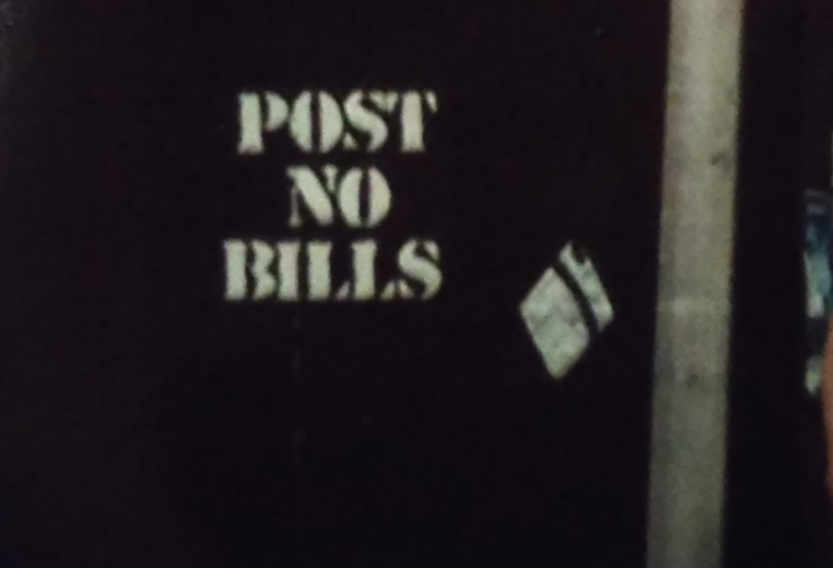
Good vs Bad Kerning/letterspacing
As I crossed the street I came upon a message on a piece of wood with bad kerning. The reason it is considered bad kerning is because the P and O in the word ‘POST’ seem to be right on top of each other, as well as the S and T are fusing together. Yet the O and S are not connecting in any way. Also the I and L in ‘BILLS’ have space to spare but the B is right on top of the I.
In the city there is a Dunkin Donuts shop with a sign outside listing the flavors of coolattas. The kerning in this picture is sharp as well as the letter spacing between the individual flavors. Therefore making this a good example of kerning/letters pacing


