
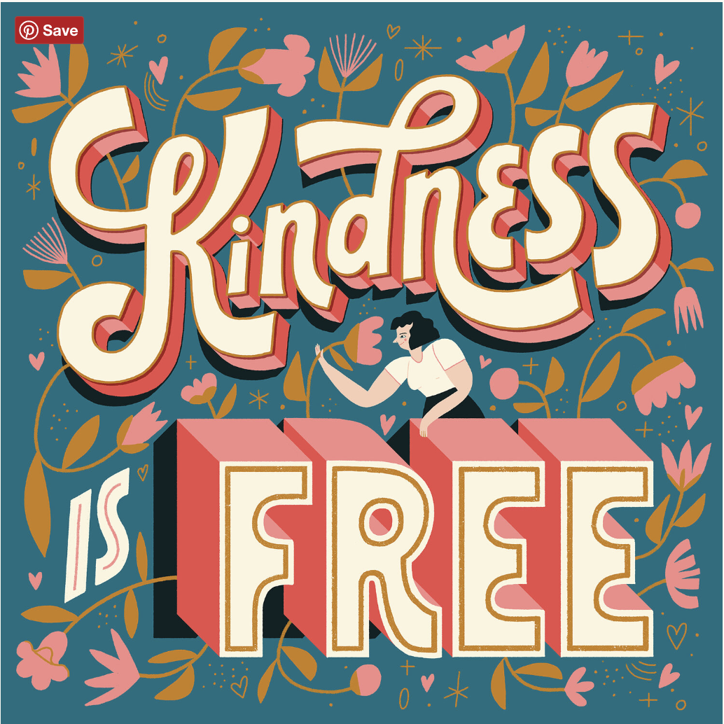
I chose this piece because it is very artistic, smooth and transitions well. The design by Tim Kilgore, is what I feel is a simple yet elegant design. What I like about it is the type and how is blemishes … Read More
Prof. M. Brown | COMD1127 - E038 | Fall 2022
I chose this piece because it is very artistic, smooth and transitions well. The design by Tim Kilgore, is what I feel is a simple yet elegant design. What I like about it is the type and how is blemishes … Read More

I selected a work by Danny Pelavin. It shows a surprised Mario Bros reclining in a very comfortable and fancy chair. What i liked about this work is the use of very bright colors, it draws a lot of attention … Read More
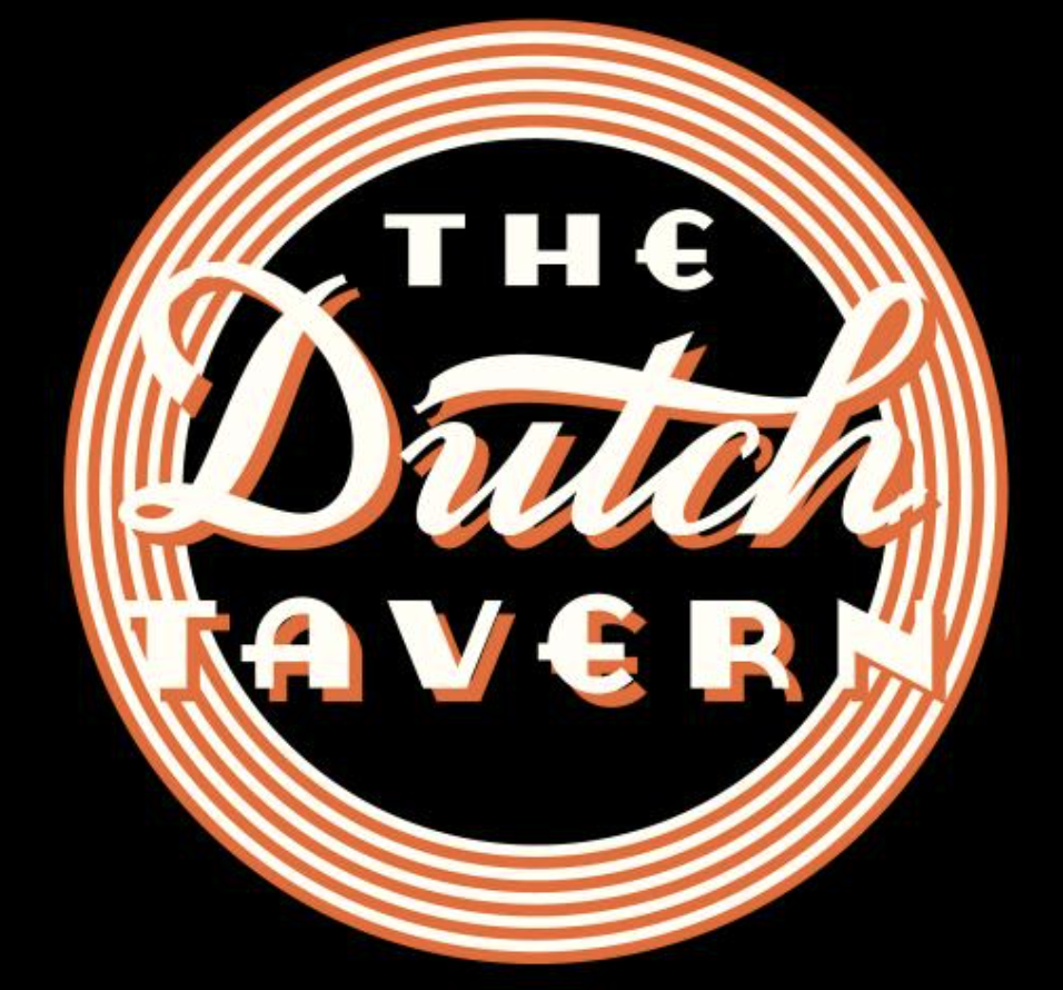
I chose this piece and artist because it reminds me of the industrial era. Early advertisements big bold letters and simple colors not so complex designs. There a bit minimal but also have a cartoonish look to them. They look … Read More

© 2024 COMD1127-E038 Type & Media, Fa2022
Theme by Anders Noren — Up ↑
The OpenLab is an open-source, digital platform designed to support teaching and learning at City Tech (New York City College of Technology), and to promote student and faculty engagement in the intellectual and social life of the college community.

