How do you promote a brand? How do you target an audience? Every brand, every logo has a story, an attachment to identity. The product that they sell and the attraction that it brings, so having an ideal logo or banner is important to attract your audience. Branding is a way to reach consumers and we are exposed to this everyday. However, what makes us drawn to such logos or brand names? Their advertising goes unnoticed most of the time, yet for the trained eye notices font types, spacing, line all the meticulous details.
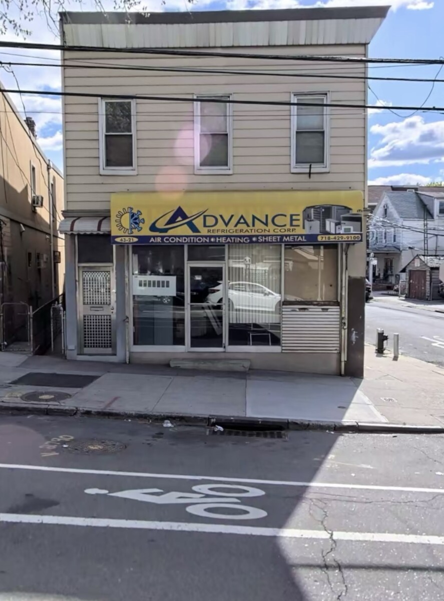
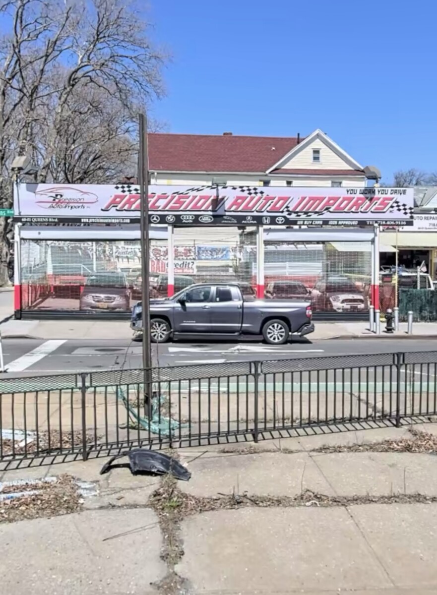
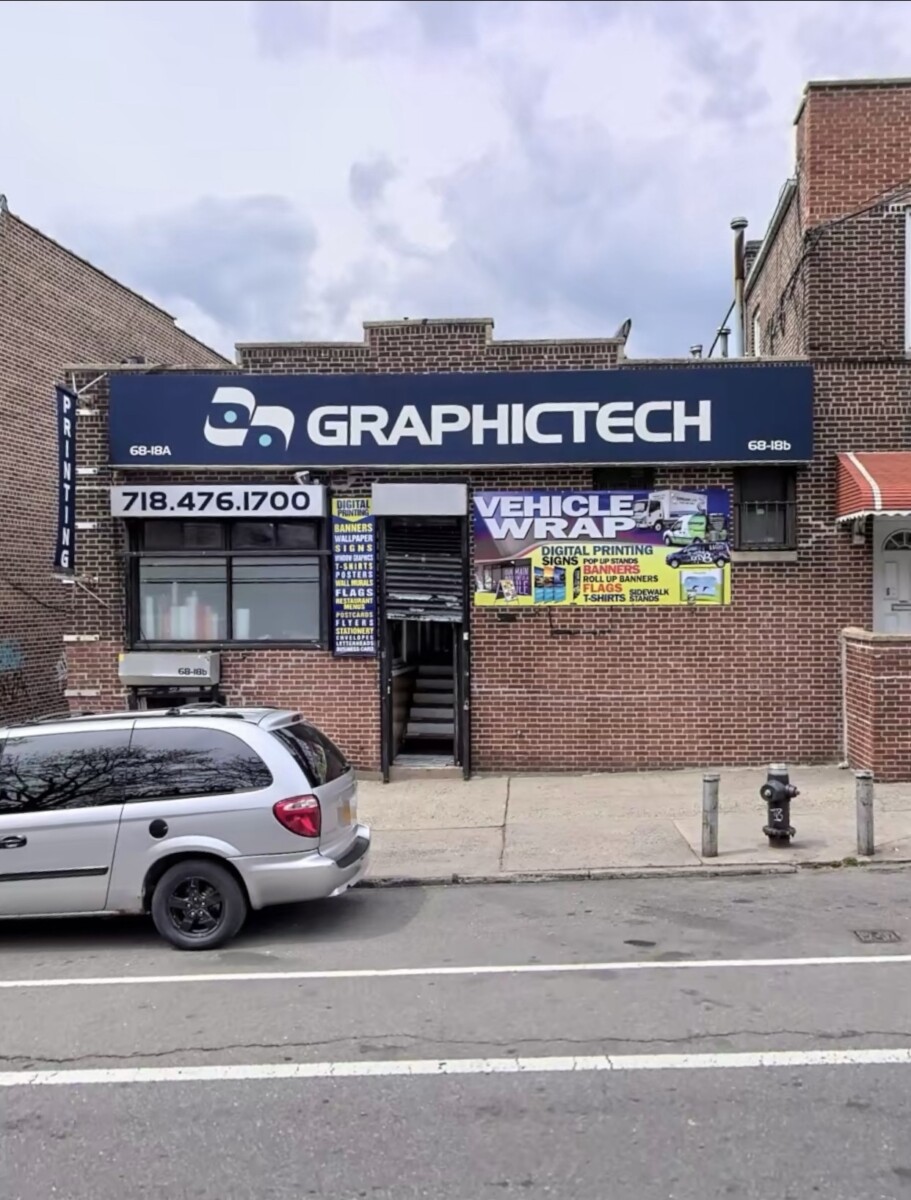
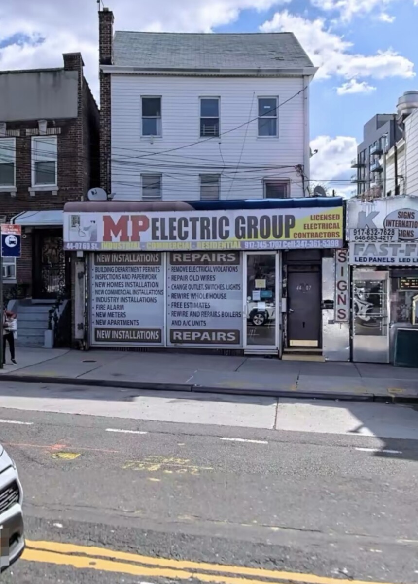
A walk around my neighborhood in Woodside, Queens. I’ve encountered various designs for small enterprises. All with different fonts, different executions. Precision Auto Imports font correlates to what they are advertising, I can’t imagine or believe I can use any other type of serif fonts. I believe this typeface works perfectly for what their product is. Although they do have a logo of a car with the name which is more elegant, legible and appealing to the eye, they also took the liberty to post the company’s name right beside it using a different font face. Which together doesn’t sit right but singling one out, they are both great designs. MP Electric Group went about their branding as is with just the font. Which now is crucial if there is no other design or element to look at, font face and color highlight has to be more appealing to send out their message to their audience. In which i believe the bold letters and the red “MP” make that statement. Advance Refrigeration Corp, included a logo in their branding half sun, half ice flake. Representing what it is they do, specializing in air conditioning, heating and sheet metal. The “A” in advance captures the viewer’s eye, drawing them in and taking note of the whole banner. There is a correspondence of typeface and brand that works perfectly here. Graphic tech all bold and capitalized letters, alongside a bold logo that really doesn’t relate to anything, however it represents this enterprise.


Leave a Reply