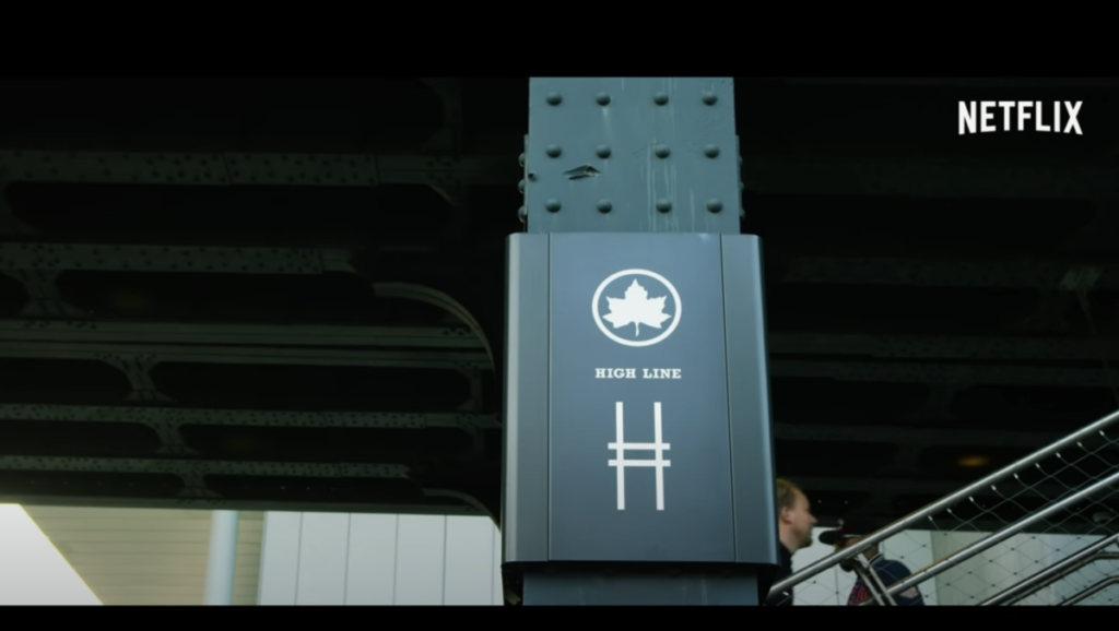
One project of Scher that caught my attention was the High Line logo because of how well thought out it was made. She had made logo a combination of an “H” and railroad track. She used weight in the lines to help show it is a railroad track. A lot of her art is really amazing and has a lot of thought in them.
About This Course
A foundation course in typography with emphasis on using type in industry related applications from print to interactive. Students will be introduced to principles of type design and terminology
Search this Course
Find Library Materials
Library Information
Ursula C. Schwerin Library
New York City College of Technology, C.U.N.Y
300 Jay Street, Library Building - 4th Floor
Open FAQ, questions, ANY topic dialogue
OpenLab Help
Sharing
Logged-in faculty members can clone this course. Learn More!
Acknowledgments
This course is based on the following course(s):
That was one of my favorites also.