Class Info
- Date: Thursday, November 10, 2022
- Meeting Info: 6:00pm – 8:30pm, Room P114
- QUIZ #2 – Tuesday, November 22, 2022
Topic
- Color and typography
- Refer to this Quick Reference PDF with basic color/type info
- Explore color contrast and legibility
- Explore type-image relationship and typeface choices
- Grid Basics
Objectives
- Learn and understand the importance of color as it relates to typography and legibility. Students explore contrast and legibility through the use of color (other than black), imagery (photographs), and type.
- Contrast and the relationship of foreground and background.
- Typographical color vs. actual color
Activities
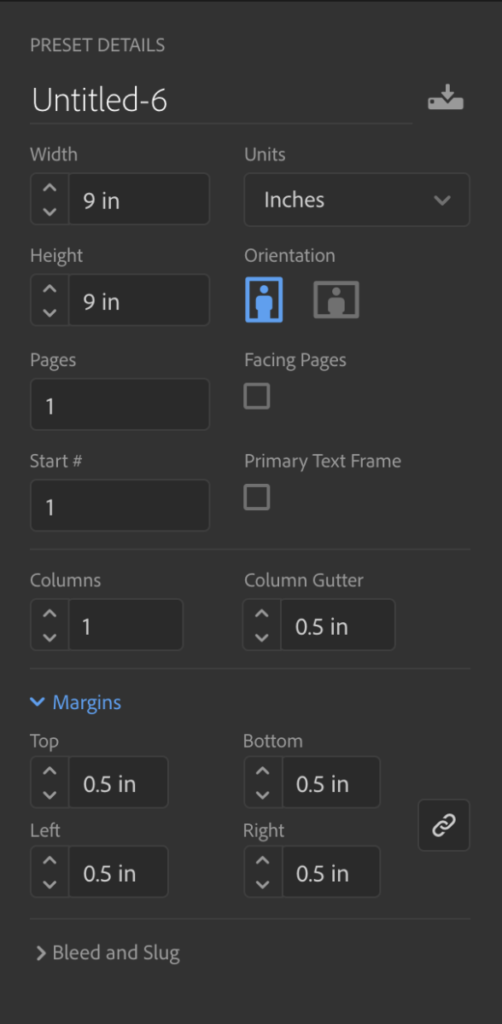
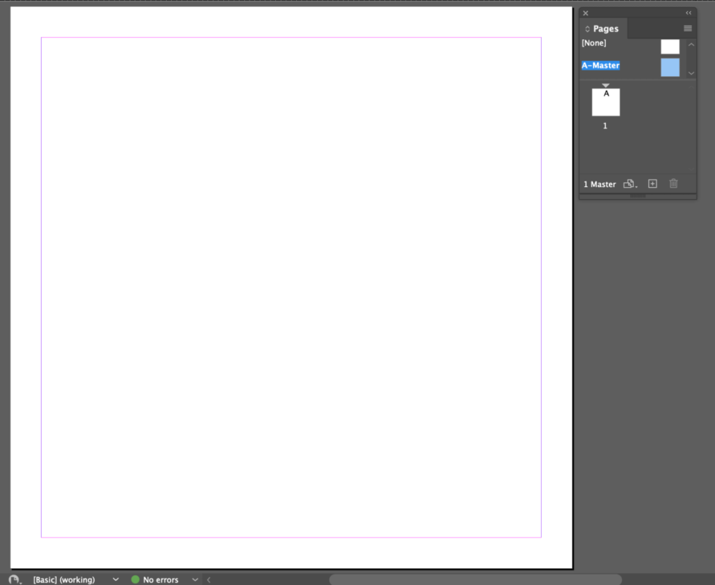
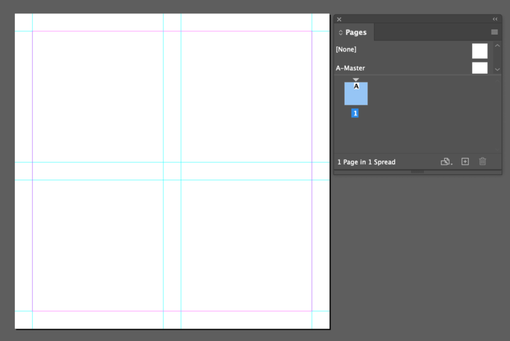
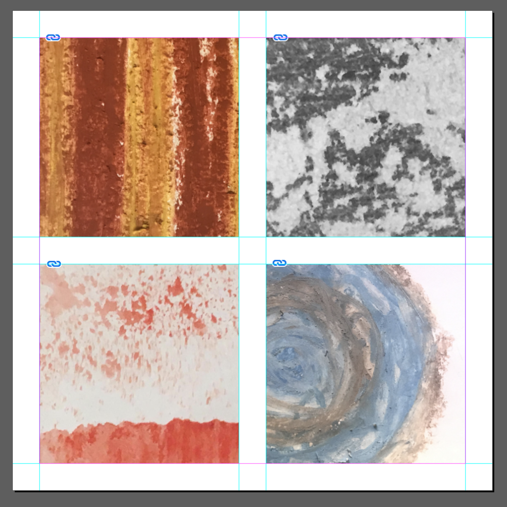
- We will create a new InDesign document.
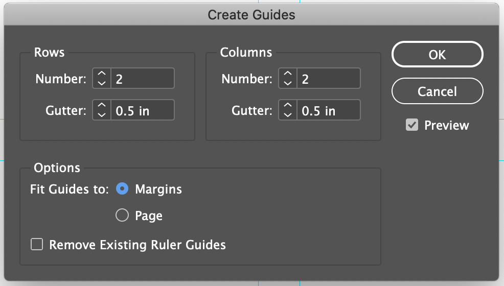
Enter 2 rows, 2 columns with .5 inch gutter. OPTION fit GUIDE to MARGIN
2. Create various abstract textures with whatever materials that you might have at home.
- You can use paints (acrylic, watercolors, gouache, markers, etc)
- Do not find them on the computer, create you own.
- Take a picture of your textures, and PLACE them in your InDesign document.
3. SAVE your InDesign document
- Export as a PDF
- Name file: Lastname_Firstname_colorandwords_1.pdf
- Post to OpenLab
- Upload to Google Drive
To-Do After Class
Expressive Textures
- Choose 4 words that each of your images make you think about. For example: fall, moon, lava, hurricane
- Think: about the image itself, and how the word could be designed to represent it
- Design: Use typeface, size, case, tracking, placement, meaning, color, and contrast to design your word into each of your textures.
- Upload to Google Drive: 16 – Expressive Textures
- Name file: Lastname_Firstname_ExpressiveTextures.pdf


Leave a Reply