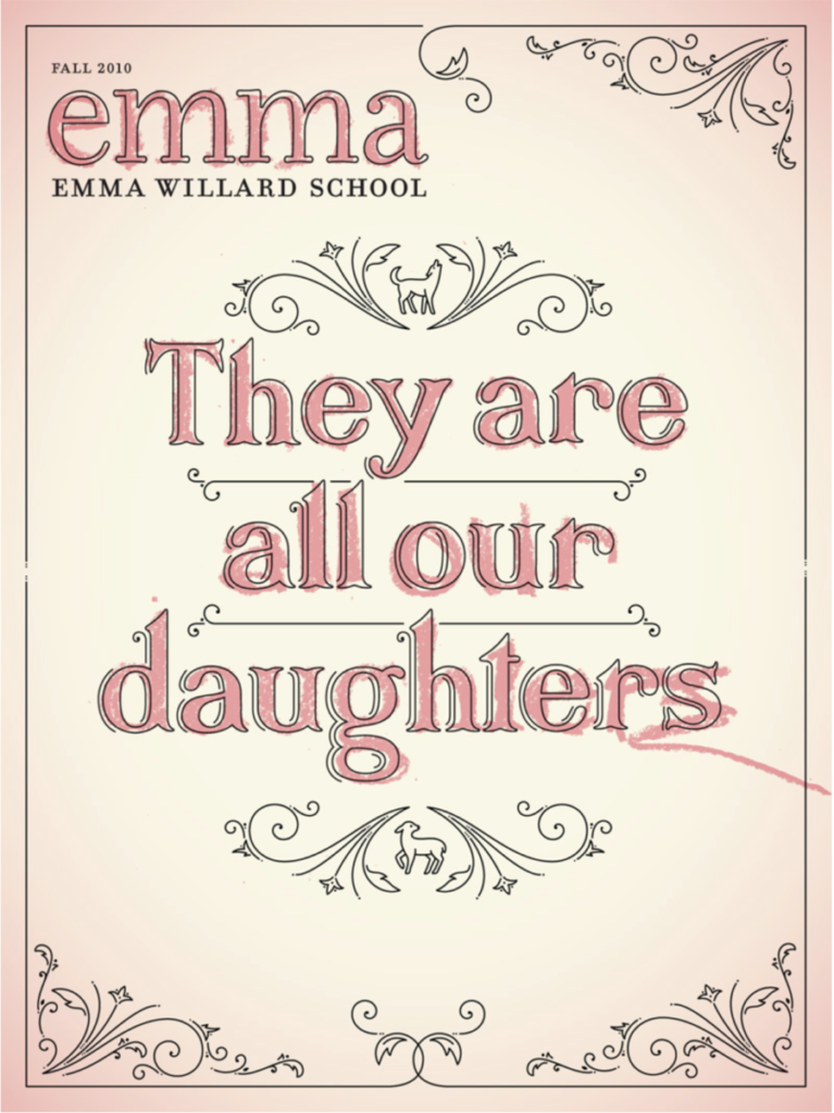
I choose the art from Jessica Hische. What I really like from this art is the font and the contrast in the letters. I really like the simplicity of the art and how she added the color to seem like crayon. I like that the artist style is really simple with not a lot of colors all in one design.
About This Course
A foundation course in typography with emphasis on using type in industry related applications from print to interactive. Students will be introduced to principles of type design and terminology
Search this Course
Find Library Materials
Library Information
Ursula C. Schwerin Library
New York City College of Technology, C.U.N.Y
300 Jay Street, Library Building - 4th Floor
Open FAQ, questions, ANY topic dialogue
OpenLab Help
Sharing
Logged-in faculty members can clone this course. Learn More!
Acknowledgments
This course is based on the following course(s):
Leave a Reply