Three Dimensional Shapes

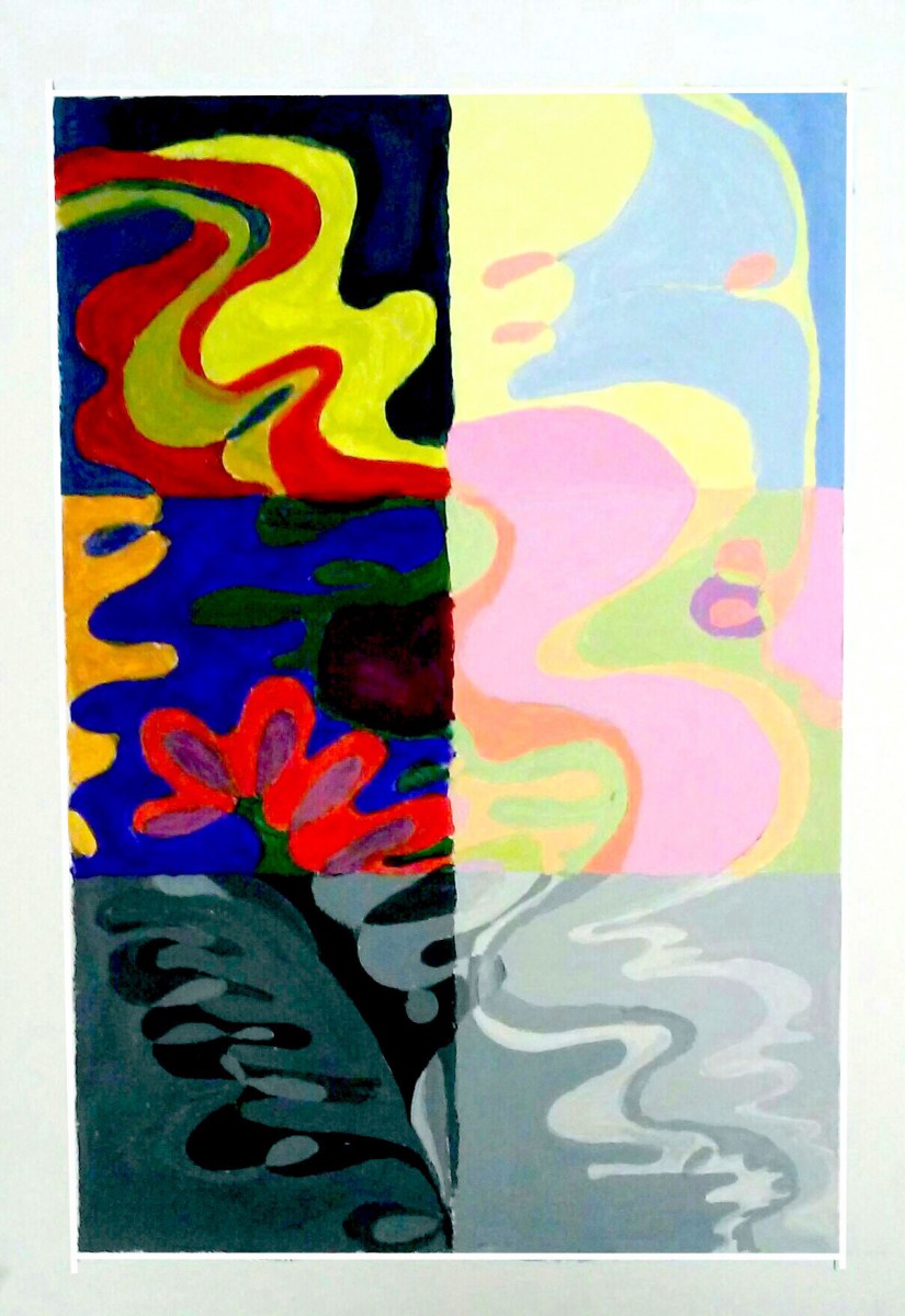
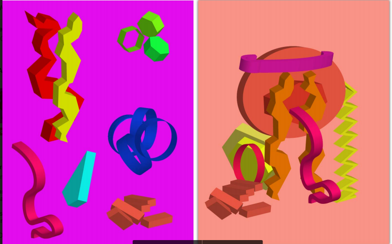
This project was the first project where it was required to be digital, we used illustrator to create three dimensional shapes and we took the time to experiment on how it works after we had to make an image where the color use is cohesive. Since this class focuses on maintaining our work abstract I focused on making the shapes unified rather than focusing on give it a theme. While we were experimenting with shapes we were encouraged to sketch the shapes so we could get a better idea on how shading and perspective may work.

This project helped me learn how to create three dimensional shapes on illustrator and gave me a tool on how to draw outlines of shapes. Using a function that only shows the contour of the shapes and having to sketch them out by hand helped my get a better idea on how to draw the form in different perspectives as well as learning how to shade better and seeing of changing how the shape faces the light source may change the color value.


Color Contrast

For this project we used acrylic paint(using only the colors cyan,yellow,magenta,black, and white) then we drew a pattern so we could paint primary, secondary and a monochromatic color scheme of grey. The left side has a dark value where we occasionally mixed the colors with grey and the right side is the lighter tint of the colors. With this project we had to be careful with colors and how they would show on the white paper, what color they would be after it dried, and how it would look like next to the other colors.

During the process of doing this project I was became more aware of how the surrounding colors may affect how dark or light something else may appear, for example, when making the square for light primary colors I had to keep adding white to the pink because it looked darker and more orange compared to the surrounding colors. It also surprised me how much a color would change after adding grey to the point that I thought that I didn’t wash off my brush correctly before painting again. I enjoyed the project,  it helped me learn more about value and tint along with getting me more accustomed to painting.

Texture Collage

For this project we were asked to collect images that displayed texture, items that had texture, and texture we made ourselves after that we were asked to arranged them in a manner that made it cohesive or connected in some form. I collected magazine clippings that were parts of clothing photographs, made rubbings using tracing paper and household items that had texture, along with scraps of cloth and aluminum foil. The structure I had with this work was to break up the collage into small sections that connected to each other, for example the aluminium and magazine clipping to the right were both cut in order to give the illusion of cloth or lace the section on the bottom half of the right side were cut into squares and are overlapped to make it look like they were puzzle pieces

Throughout the project I’ve learned how to attempt to have unity throughout the project in order to not have the viewers eye focus on only one section of the work. I’ve also learned how to combine  and overlap organic and geometric shapes without having the contrast be overwhelming. Also how certain combinations of shapes or strokes can create a texture and how the spacing between shapes and strokes can change the appearance of the texture.