Project: Design a Ligature Banner for Our ePortfolio Website of My Initials that Incorporates at Least One Type of Ligature Style
Sketches:

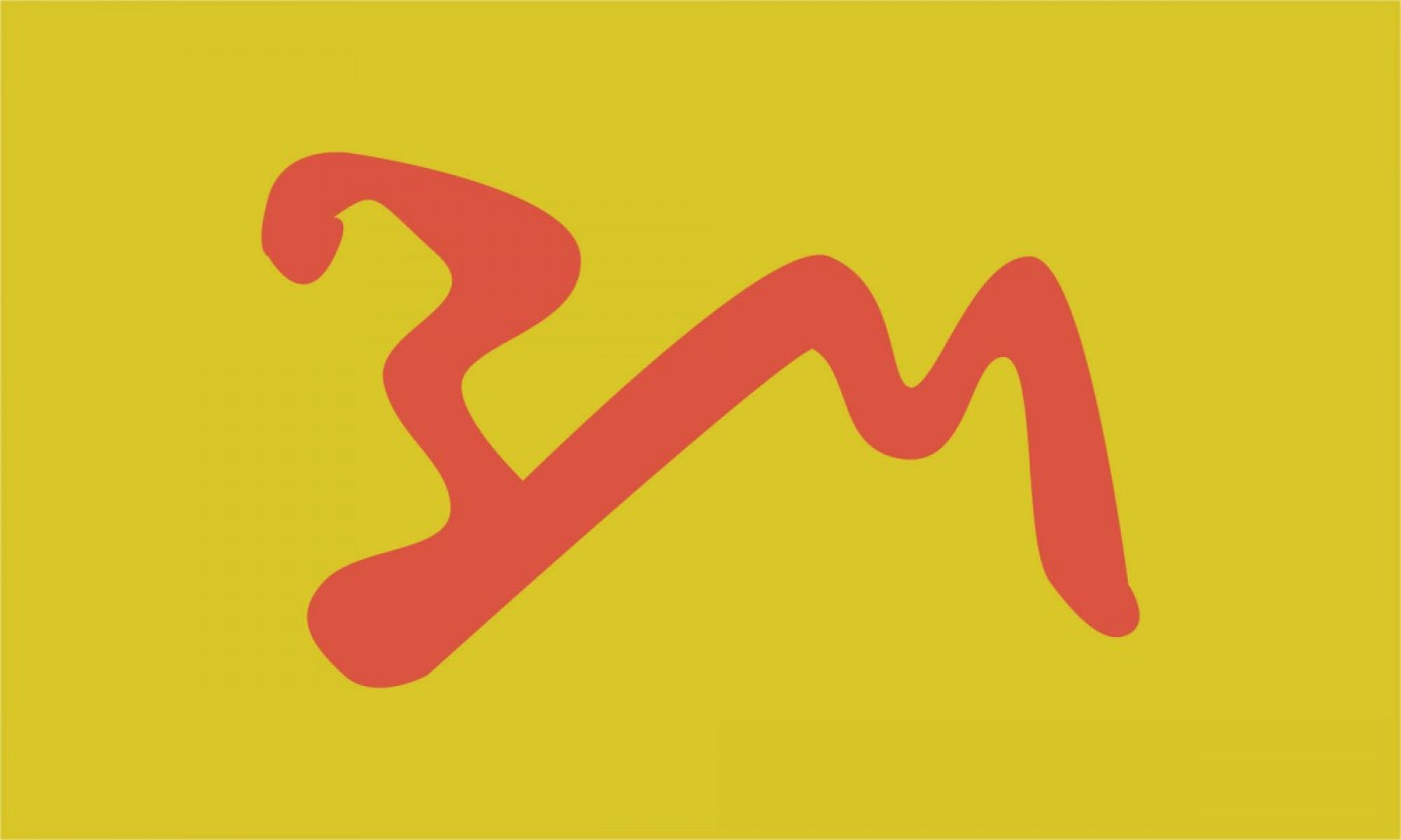
Idea #1 and Final Design : Overlay

When I spoke to someone else about what were my interests I mentioned liking cats so they helped me with creating a logo that makes the initials of my name look like a cat. The B has part of the letter cropped to look more like a tail and the M like a cats head/ears. This design has overlay appearance due to the B and M being connected with a common stroke and color. While creating this i had difficulties with creating the design like it was in my sketch with the pen-tool however the simpler design is easier to center. I believe what works for this design is how clean it looks so it would also look well in black and white, and while it’s a clean design with no complicated additions or shapes its an interesting design due to the strokes of the type.
Idea#2: Uppercase/Lowercase, Missing Stroke

The type in this is thick and lacks serifs and instead is curved at the end of the strokes in order to have a simple appearance. I choose to have an uppercase-lowercase design for this the missing stroke in the M is replaced by the stoke from the lowercase b. The lack of distance between he letters effectively links them together while the difference in colors separates the letters, making it easier to identify what letters they are. It is effective because the design is simple and easy to distinguish while being appealing.
Idea#3
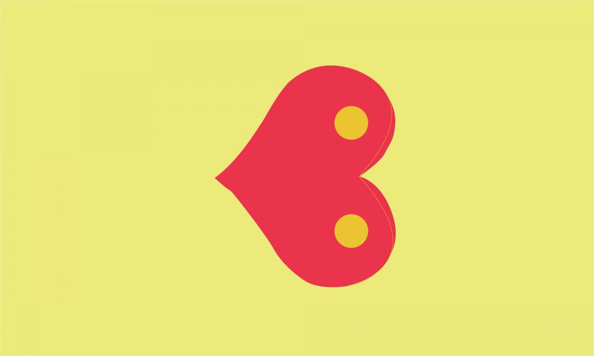
This design is a shape that I believe have the elements of the letters B and M i placed a thin line thats curves near the end of the heart to also show the M. I liked the design due to its simplicity and how it has two letters in one shape. While I thought that this design was appealing I think it might be ineffective because of how difficult it might be to see how there is an M and B. The thin line going through the heart also may be hard to see both in this and in black and white. Before i thought about having a thing line in the design I thought about how it wouldn’t be so appealing with a gradient and adding a thick curve instead of the circles might make it difficult to see the B or M.
Idea#4: Cropping
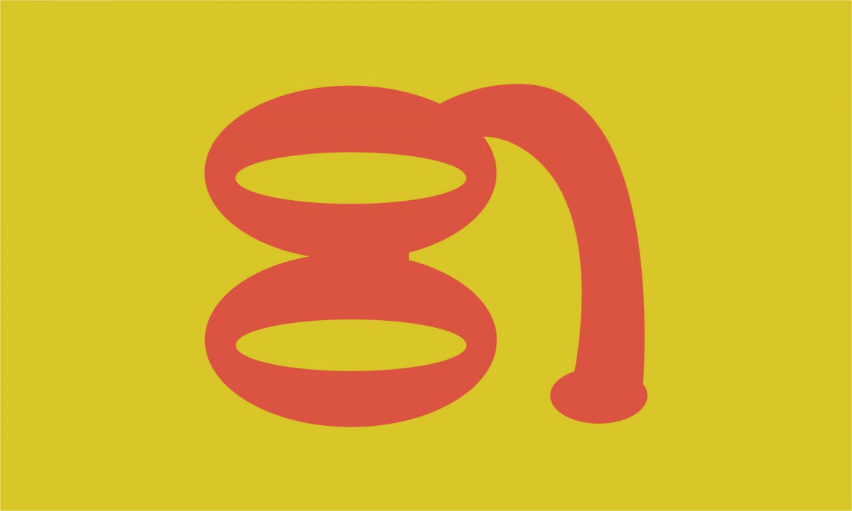
I think this is one of my two least successful designs, although I personally find it appealing. I wanted to have the letters to be linked by having them in one color, cropping half of the m, and having no space between the colors. I also exaggerated parts of the letters, replacing the B with two ovals and having the m more curved but due to this it makes it harder to distinguish the letters.

