
The projects One day of my life and One day in her life are my video clips created in the video editing program – YouCut. I used to cut video parts, my logo, effects, and music for the first video. For the second, in addition to the above, I added more photos with captions. The program is a set of panels and tools. The main panels are the files you use, the timeline, the display screen, and editing tools. When you insert your media files – photos and video segments into the program’s timeline, you can adjust the speed, cropping to the right moment or separating them. You can add effects, set up transitions, and put music. Since I already had experience creating videos, it was not very difficult for me. Although there are a few things I want to mention, I spent the most time picking music and adjusting it to fit the video. I tried to make the volume fluctuations in the music correspond to some active movement or a moment that stands out. And I also want to add that most of the time, I spent coming up with ideas and planning scenes for the video.

The “New Wave” in graphic design appeared at the turn of the 70s and 80s simultaneously with architectural postmodernism, quotation, contextualism, and the Memphis style in object design, which proclaimed that design should be emotional, exciting, sensual, awakening the imagination and pleasing to the eye. All these parallel artistic movements together brought about a revolution in professional design consciousness, the consequences of which are perceived today as the opening of a new paradigm in the development of visual culture. One of the female designers who was the procreator of this trend is April Greiman.
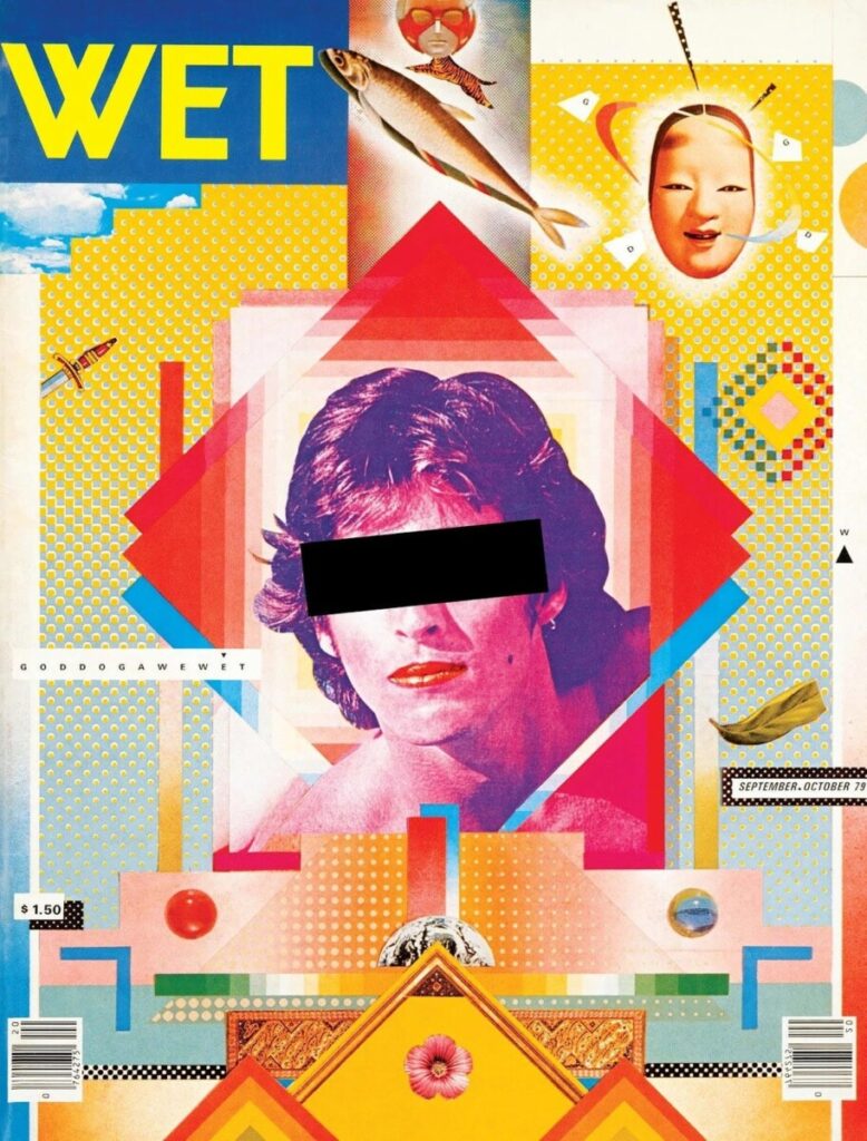
April Greiman is the queen of a new graphic design trend. She is one of the first women to use and implement the computer in design and has made breakthroughs in her graphic work. Also, despite the condemnation from others, she did not stop creating her works. She continued her contribution to the development of Communication Design. April Greiman’s work impresses with its uniqueness and deep meaning in displaying design and communication in the human world of art. April was seen by people as always bold and open to new achievements and activities in graphic design.
For being passionate and upbeat, she has been recognized as one of the first designers to enable computers and digital tools to develop her work. April Greiman saw a fantastic opportunity while experimenting with the sheer number of computer possibilities they had to offer and its enormous potential. She said they need to be used in graphic design. Greiman developed a specific style in his work within what later became known as the New Wave.
Greiman feels the title of a graphic designer is too restrictive and prefers to call himself a “transmedia artist.” Her work inspired designers to develop the computer as a design tool and show curiosity and exploration in their approach to design. Her style includes type layering, where groups of letterforms are layered and floated in space along with other objects such as illustrations, shapes, photographs, and color swatches. It creates a sense of depth and dynamics, particularly by combining graphic elements through the extensive use of Apple Macintosh technology. The Los Angeles Times called her graphic style “an experiment in hybrid imagery.”
For more information download file.
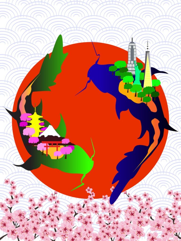
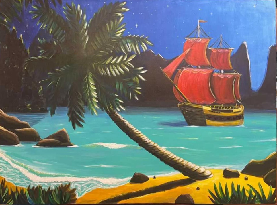
Size: 16in x 20in
Media: acrylic paints on canvas
1. Cain and Abel 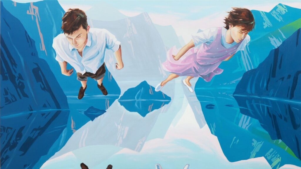
2. Huxley’s Guide to Switzerland 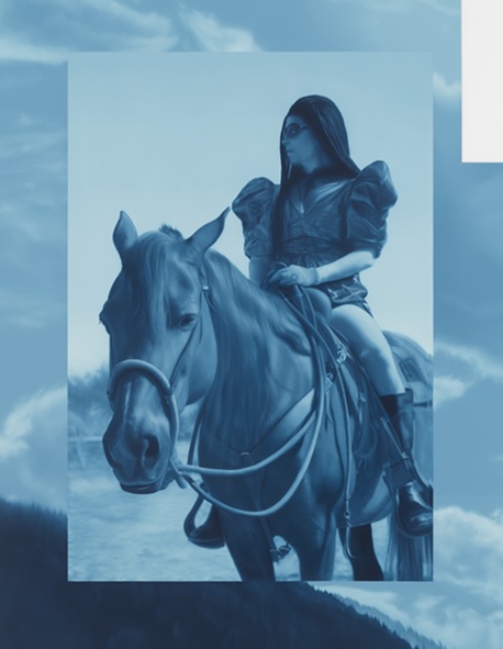
3. Saturday’s hallucinations
This week, I visited the Nassau County Museum of Art’s exhibition “Blue.” The blue color in many nations symbolizes the sky and eternity. Blue is not just a color; it hides history and secrets. Many artists have discovered the vibrant blue color and used it in their work. Therefore, I wanted to look at three pieces that interested me.
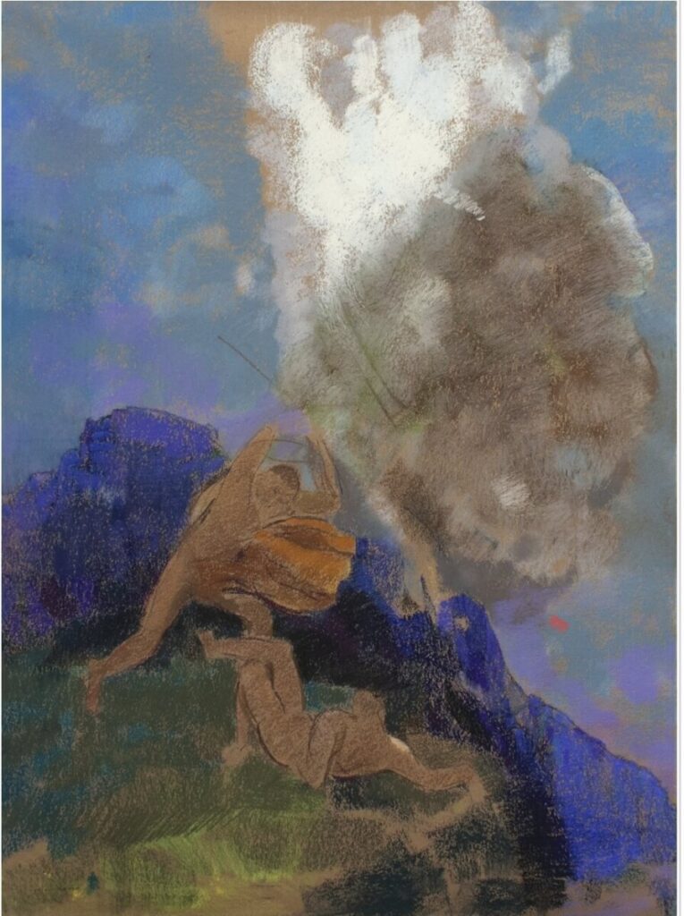
The first work of Cain and Abel was created by Redon Odilon, a French painter and one of the founders of Symbolism. The work was created in pastels on Bistre paper, and the size is 31 1/2 x 23.6 inches. The subject of the picture was the biblical story of Cain and Abel. Redon Odilon, as a symbolist, emphasized colors and, most of all, azure, which here indicates anxiety and that something terrible is about to happen. This shade of blue brings the figures of Cain and Abel forward to show the central scene in the composition. The picture is not detailed, depicted in shapes and strokes. I think it’s a very emotional piece and would love to see it live.
The second piece of Huxley’s Guide to Switzerland is by Christopher Winter, a contemporary English artist. He reflects modern reality and life in his works. The work was painted in 2011 with acrylic on canvas, measuring 35.5 x 27.5 inches. Surrealism was used in this mountain fantasy painting and the style of Japanese prints. Artist Christopher Winter used several colors of blue to show spiritual and moral comfort. He balanced all the other colors so that everyone would like to find something new again and again in this painting. After all, different worlds, and views open when looking at different parts of this picture. Of course, the focus of the picture is made on two people flying over the lake. When I first looked at this work, I felt how freedom is felt in their flight.
And the third work that touched me emotionally and felt like I was immersed in a book was Saturday’s hallucinations on December 2, 2018, by artist Andrew Sensor. The painting is painted in oil on matte white plexiglass with white powder coating and measures 46 x 39 x 2 inches. The blue colors evoke a deep, sensitively poetic undertone to this painting. A traveler is looking into the distance and looking for something, maybe unwanted adventures, or events. In addition to the girl’s traveler, we notice a horse that has turned its ears to the mistress and is waiting. The landscape behind it does not divert attention from the main composition but only adds atmosphere.
Can’t Stop After One
“Betcha can’t eat just one”
Lay’s slogan
This slogan precisely describes the most satisfying, delicate, crunchy, natural, and light taste of any Lay’s chips. The taste is simply divine, a tsunami of flavors! And now, let’s look at the packaging, which adds even more desire to take that first bite of these great snacks. Colors attract attention and can be recognized everywhere. There are six different packaging colors: gold, yellow, black, green, orange, and red. The classic logo sits in the middle of these six beautiful packages. I chose this logo because I wanted to discover what is hidden in the history and design of these delightful can’t stop eating just one chip.
Lay’s company focuses on the taste and quality of the product, which affects the positive customer reviews and high ratings. The whole story began with a salesman Herman Warden Lay who, during the Great Depression, sold chips from the trunk of his Ford Model A car and thus earned his living.
Mr. Lay established himself as a super salesman from early childhood, selling snacks and drinks at his stand from the age of 10 near a baseball stadium in Greenville, South Carolina. H.W. Lay’s business became so profitable that he opened a bank account, bought a bicycle, and hired workers to look after the stand. After two years of studying at the institute, Furman University in Greenville on an athletic scholarship, he dropped out and worked various jobs.
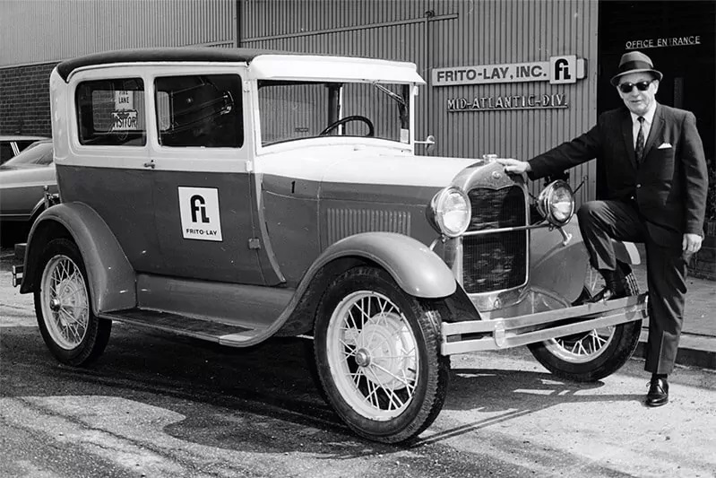
He then resumed his business career in 1932 as an independent snack food distributor in Nashville. In 1939, Herman Warden Lay bought a financially troubled Atlanta snack food manufacturer Barrett Food Company and turned it into the nationally known H.W. Lay & Company brand.
In 1961, two opposing companies, the Frito Company and H.W. Lay & Company merged, which people thought was impossible, but it did happen. Mr. Lay became chairman of the board of directors. And in 1965, he negotiated a merger with Pepsi-Cola to form PepsiCo, which now operates in 200 countries with a turnover of 14 billion dollars.
We can now see that the company has changed the design several times, but one part of the company has remained unchanged, the name of the company, which is also the name of the founder, Lays. The company and management considered modernity and relevance when choosing a design and luring buyers, which is important for the sales market.
For more information download file.

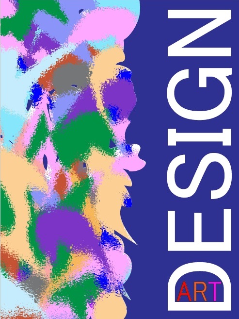
Art and Design are my passion and inspiration.
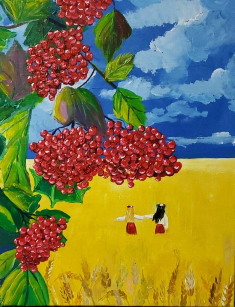
Size: 24in x 36in
Media: acrylic paints on canvas