
Can’t Stop After One
“Betcha can’t eat just one”
Lay’s slogan
This slogan precisely describes the most satisfying, delicate, crunchy, natural, and light taste of any Lay’s chips. The taste is simply divine, a tsunami of flavors! And now, let’s look at the packaging, which adds even more desire to take that first bite of these great snacks. Colors attract attention and can be recognized everywhere. There are six different packaging colors: gold, yellow, black, green, orange, and red. The classic logo sits in the middle of these six beautiful packages. I chose this logo because I wanted to discover what is hidden in the history and design of these delightful can’t stop eating just one chip.
Lay’s company focuses on the taste and quality of the product, which affects the positive customer reviews and high ratings. The whole story began with a salesman Herman Warden Lay who, during the Great Depression, sold chips from the trunk of his Ford Model A car and thus earned his living.
Mr. Lay established himself as a super salesman from early childhood, selling snacks and drinks at his stand from the age of 10 near a baseball stadium in Greenville, South Carolina. H.W. Lay’s business became so profitable that he opened a bank account, bought a bicycle, and hired workers to look after the stand. After two years of studying at the institute, Furman University in Greenville on an athletic scholarship, he dropped out and worked various jobs.
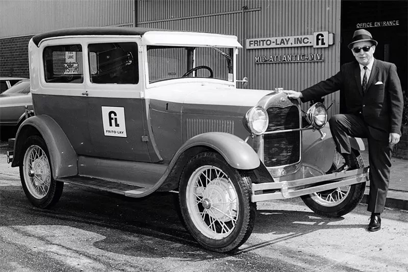
He then resumed his business career in 1932 as an independent snack food distributor in Nashville. In 1939, Herman Warden Lay bought a financially troubled Atlanta snack food manufacturer Barrett Food Company and turned it into the nationally known H.W. Lay & Company brand.
In 1961, two opposing companies, the Frito Company and H.W. Lay & Company merged, which people thought was impossible, but it did happen. Mr. Lay became chairman of the board of directors. And in 1965, he negotiated a merger with Pepsi-Cola to form PepsiCo, which now operates in 200 countries with a turnover of 14 billion dollars.
We can now see that the company has changed the design several times, but one part of the company has remained unchanged, the name of the company, which is also the name of the founder, Lays. The company and management considered modernity and relevance when choosing a design and luring buyers, which is important for the sales market.
For more information download file.