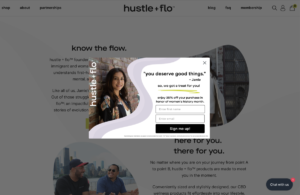
Throughout this internship, I have been working on various projects, with most of it being backend and minute front-end detailing throughout the entire website. In terms of designing content, I have successfully completed some landing pages and main website content, such as the pop-up design for Women’s History Month.
Since our business is women-owned, the supervisor wanted me to design a pop-up for new visitors to the site, with a large discount in celebration of women.
The main color scheme that the site uses is chartreuse, black and white, but in the brand guidelines document there is an allowance for the use of a light and dark gray that resembles a pastel purple appearance. These colors were perfect for the pop-up design, in order to make it stand out just a bit from the original theme. Additionally, I incorporated the naturalistic waves that appear throughout the whole website to appear in the pop-up, too. Keeping a consistent flow of designs was crucial to the supervisors, but I had some flexibility in terms of design outlining.

One of the challenges I faced was choosing the right image that created the persona that we wanted to convey. We did not want to use stock photography, so we had to work with the images that we had, which were quite a range of different environments and people. Jamie, the supervisor, is the face of the brand, so it made sense for us to use an image of her on a background that contrasted well with the gray/purple tones of the waves. Some images were cropped due to being vertical, so I had to utilize Photoshop in order to add extra bricks in the background with the clone and blending tools.
When users see this pop-up, they are met with Jamie’s signature quote, and an incentive to sign up for email newsletters in order to get a percentage off their next purchase.


