Tag Archives: a view from my window

Graphic Design principles 1 /cont Assignement 1: A View from my window Final Step – Paper Cutout

FINAL STEP ! 


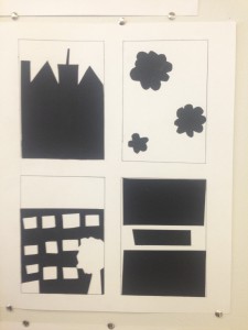
Paper cut bristol Pad with black paper

Hello …

This the last post sadley in the view from my window serious… however there are many more projects to come.

This part of the assignemt was to create Cut Paper Compositions out of black paper to make a contrast with the white 14×17″ Bristol Board, Using my inked thumbnail compositions as a guide, I created 4 figure-ground  relationships (2 stable, 2 ambiguous) .

this part of the assignment of hardest to do but the most rewarding for to have my first peice ever of art work done.

I’m really proud of it , and the reviws i got from other classmates where very posative , and they loved my work as much as i loved my work. There is a few things i would have done diffrenty but i guess with paractice and my passsion i will do just fine in this class.

Another fellow Classmates Worked i really adored was the work of  Sineah O’mahony. I loved her drawing and it was such an inspiration to me. Everything in the her project i belive is the perfect outcome for the project .

The element in her project showed the i belive perfect relationship between posative and negative space .  her Ambigous figures challenged me to find the focus point and her stable images were easy for me to find. Her art work was very pleasing and i can see a very high level of craftman ship.


Till the next Assignemt

Live, Love & Desgin

– Amera
Graphic Design principles 1/ Cont Assignment 1: Development of Skill and Craft “a view from my window”

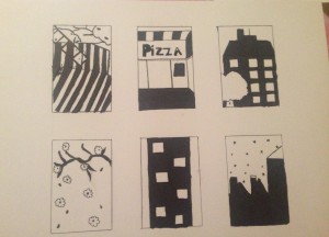
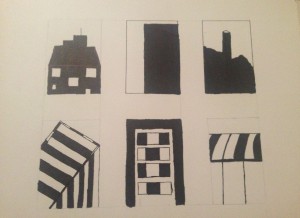
the first try at the Inked Thumbnail
the second Inked Thumbnail after class talk.

I will stard by saying i never how much time this would take me…

It took me more time than i would have taken me last semester to do my PRE-CAL Homework ..

With that said, this assignment helped me devolpe a critical eye to look at details in everyday life.

even thougth the view out of my window is nothing special , typical new york with brick appartnemts buildings and tree and cars. it got me looking for the intresting and to find the beauty in the city that never sleep.

the first thumbnails was made before the class talk and critque , after that i took it and though about a away to make it more intresting with the figure ground and stable images,  and kept the comments in mind while i re-did a new version.

I took the same window but looked at it from a diffrent point of view and at the nigth time and i got this.

I hope you guys like it .. till next post .

live, love and design.

xoxo

Amera