
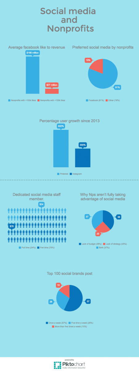
So this week has been a bit stressful at my internship, because i have been assigned to make an infographic on how Nonprofits use social media. At first i honestly thought it was going to be much easier because infographics look very simple and easy. But I quickly learned that it’s not like that. There is a ton of raw information that i had to look for and pick out what i can use. My supervisor Ann sent me some links and some information that our company had done in the past.
Once i found all the stats that i needed i went over it with Ann, we Broke it down into four parts, what social media outlets are Nonprofits using, What’s the social media landscape looking like,why some nonprofits aren’t really using social media, and what can Nonprofits use to make social media easier on them. Once i locked this down I began to finally make the infographic on Illustrator. It was taking me a while to get it, mainly because of all the data that’s suppose to go into it and not knowing how to creatively show it. Ann saw that i was having trouble with it and showed me to this amazing website called Piktochart.com that has all these preset templates of charts and graphs for infographics. “You don’t have to reinvent the wheel if you’re trying to get it, you can just use it” is what Ann told me. So before the end of the day on thursday i did one because i was still trying to learn how to use it but i think it came out okay then friday I did another one and it’s looking better. I was a bit frustrating throughout the week because i wanted to get it done faster but i couldn’t to impress my supervisor.
![]()

Draft 1
Draft 2

