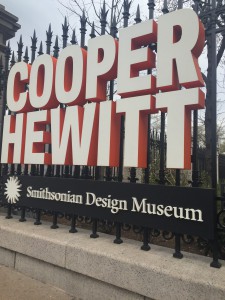
As a class we recently took a small trip to the Cooper Hewitt museum. to be honest i have never heard about this museum and i had new clue what it had. I know that pretty bad, being that i am from the greatest city in the world and there’s so many amazing museum around me.
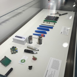
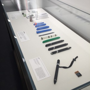
The first piece of design you’re introduced to when you get to the Museum is this amazing interactive pen that works with the whole museum. This pen lets you go up to any exhibits in the museum and save it on to the pen so that later you can log on at home or wherever you maybe and you can see everything you saved onto the pen. most of the art works and exhibits have a small circular area where you place, either the tip of the pen or the top part of the pen and it’s able to save it. 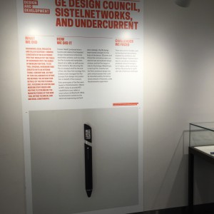
To me this is amazing and also part of the reason i choose design as my career. Recognizing a problem and doing something to fix it. how many times do people go to a museum and see something the absolutely love but can’t take a picture of it because there camera and phone died. Maybe they have the picture but cant rember the creator of the piece or what meaning it had. this pen can actually save all of that ! The Cooper Hewitt Museum has over 1000 exhibits and you can store all of them in the pen. you can basically visit the whole museum over if you really wanted too! In the bottom floor there’s also an exhibit about how and why the pen was made which was really cool since i almost saved about 300 pieces with it.
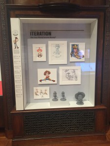
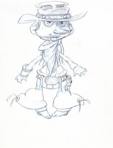
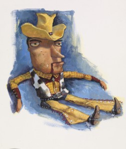
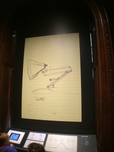
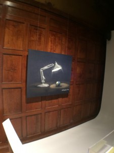
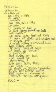
The Cooper Hewitt had an exhibit just about pixar. Now growing up i remember watching toy story Monsters inc and even the little lamp short before every pixar film. i would never get tired of them because it was simply amazing from the storytelling to the design of every character. Here they had a full exhibit including storyboards, concept sketches, scripts and many other things that helped create some of my favorite childhood memories. one of my favorite animated characters woody had his own iteration exhibition. i was looking at the creative process of the people who made Woody.
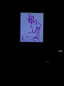
This is a Concept art. It was created by Steve Johnsonand Lou Fancher and created by Pixar Animation Studios.
This is a Luxo Jr. script. It was created by Pixar Animation Studios and created by John Lasseter.
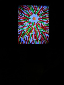
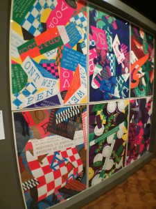 This is a poster. It was designed by Richard Niessen. It is dated 2015. Its medium is screenprint.
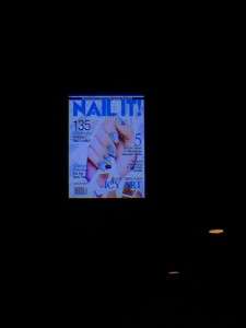
aside from the pixar exhibition the Print and digital poster exhibition was very interesting and eye catching. all those colors popping and the text placement really pulled your vision too it.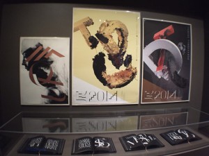
This is a poster. It was designed by Non-Format, Kjell Ekhorn and Jon Forss. It is dated 2014. Its medium isoffset lithograph.
leaving the museum i definitely feel very much more inspired and creatively refreshed. i saw a lot of things that will help my think through my designs better. i will definitely be coming back to.
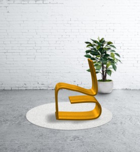
I would also like to announce here my new “Yee Chair” coming to an Ikea near you for only 200 dollars a piece. It was designed with the unique and flawless UX pen at the Smithsonian Design museum.


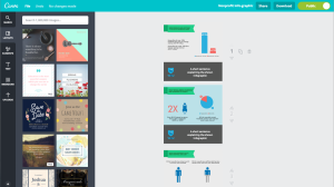
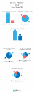
 This week i worked on some more blog graphics for the next upcoming post on social media. i’ve gotten a lot faster at making them and not over thinking them as well.