As the art director of Honda. The sales weren’t going as quite as we expected. So for our next issue of cars. We wanted something interesting, something new, something innovating. So Honda team created the Honda FCX clarity, the fuel cell Electric Vehicle. So for our new campaign we decied to go on a new image. Usually our campaigns would show a nonchalant, sometimes funny advertising. It was fun to make before, but funny is no longer the “It” factor. Since our Honda FCX clarity is an electric car, our new theme is serious and electrifying. Our main focus is to show our audience that electricity is the future.

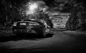
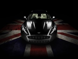
The photographer I would ask to help me with this campaign is Tim Wallace. Wallace car photography shows a significant amount of serious and clarity of what the car is. The Two photos that I show here are two perfect examples. The sidelit lightening shows the deep shadows with few light. The images show a low key contrast because of the dark shadows and the little light. Most of the images are black and white to show a serious feeling. The focus is the car. No matter what the viewpoint is, the car is where your eyes will focus on first. The viewpoint do show an overhead and low-level. Wallace would bring the exact reference we need to boost our sales for this campaign because we are showing a different side of Honda. The reason I would not pick either Clint Clemens nor Don Dixon is because of there similar work, they both show a lot of background including the car. But my eyes go everywhere but the car. Clint Clemens show more of a fun and light side. That is what Honda company did before and the sales were actually going down instead of up. So now we ask for something serious and something different. This is a big risk we are making but I believe it will save us.


If you want to emphasize cutting edge technology, Wallace would certainly be a better choice.
Thank you very much for the feedback regarding my work and creative style