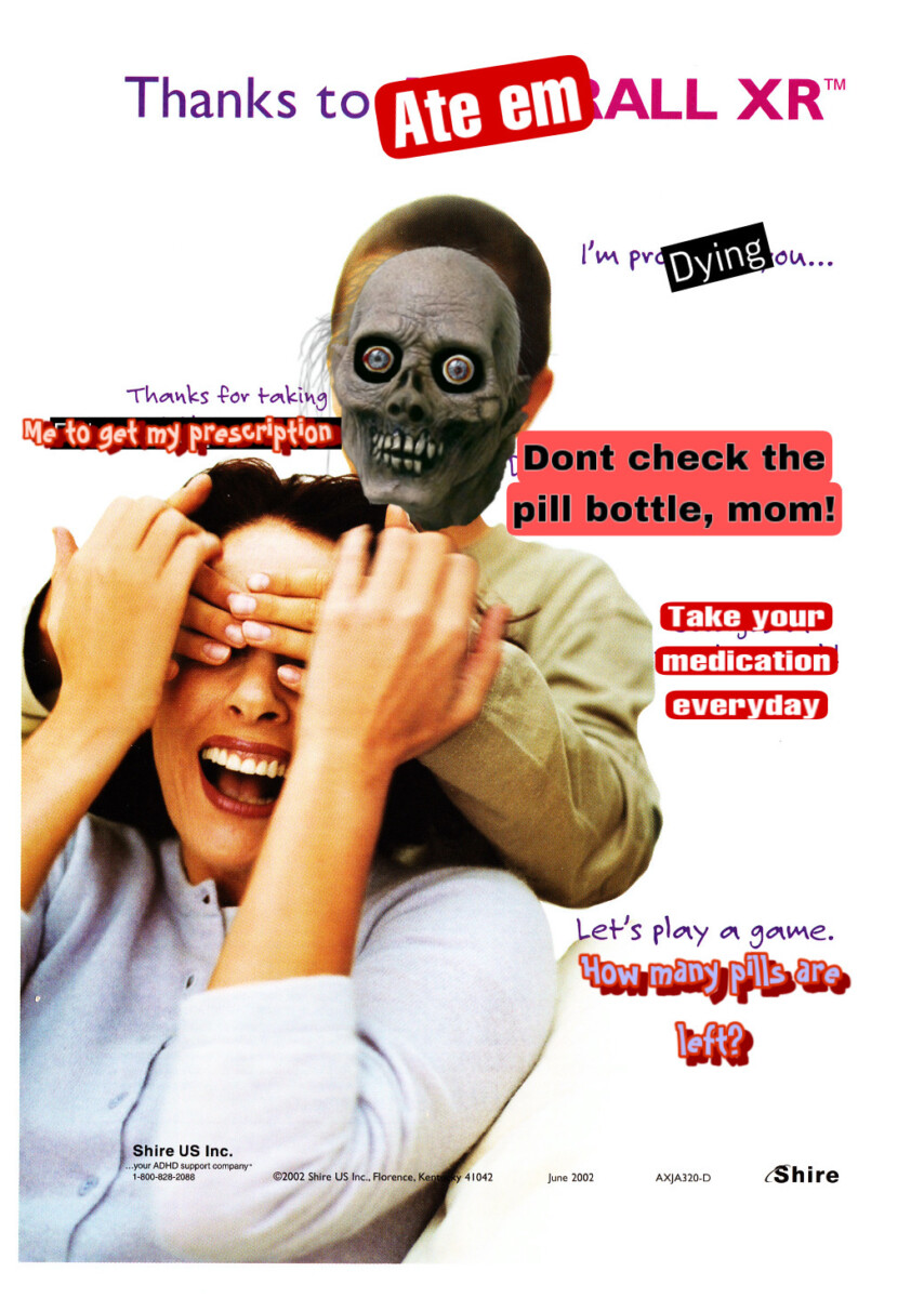
I chose this Adderall ad because I feel like medication is given so easily to people without question and in the end it can really affect and ruin so many lives. I do believe in the use of drugs but I have seen its negative affect on people and the way it can really ruin peoples lives without the right care and attention to its use.
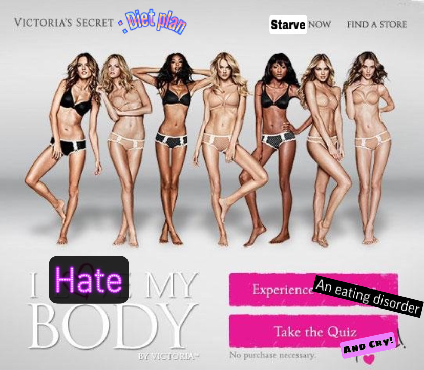
I think body positivity has been a very popular issue in society for a while and I wanted to take a Victoria’s Secret ad that had been quite controversial. I think there are many ads for men and women that can be very hard to live up to and that are also very difficult standards to live up to. These ads can cause eating disorders and do not promote a healthy self esteem.


Image #1:
-I like the skeleton face on a person. Very enjoyable to see and you get the message across.
-The bottom words do not work in the image and should be taken out.
-Some words being put in the image are placed well but others have partly visible words showing underneath that can be fixed.
-A place for Adderall pills to be in the picture should improve the image.
Image #2:
-I like the use of words changing to get your idea across.
-Some things are not completely covered; I notice a piece of a word behind Hate.
-To improve the image maybe we could see their stomachs being empty.
-The “No purchase necessary” at the bottom should be highlighted more to show, you do not need to buy anything just the images of bodies will promote unhealthy eating disorders.
The VS has been done a lot in the past.
The adderall is interesting but isn’t readable. Is mom getting the adderall? Not the kid?