![]()
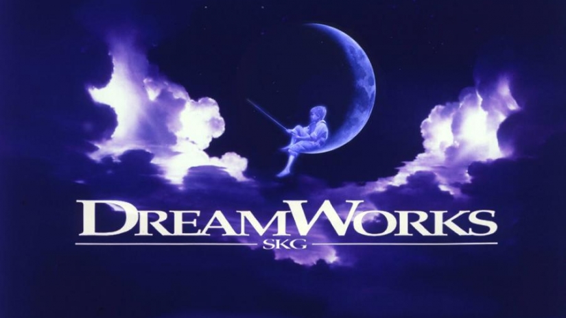
Dreamworks Animation is an animation studio located in California, USA. It was famous for their animation movies Shrek, Madagascar, Kung Fu Panda and How To Train A Dragon. The studio was founded by three famous men who are well known in Hollywood: Steven Spielberg, Jeffrey Katzenberg and David Greffen. The artist Robert Hunt hand drew Dreamworks first logo in 1994:The boy and the moon shown above. Robert Hunt is an illustrator who graduated from the Academy of Art in San Francisco with a bachelor’ degree. He created illustrations for a wide variety of projects: book covers, motion logos, advertisements, annual reports, packaging and documentaries. In 1994, Robert was hired by Steven Spielberg create the DreamWorks Logo; Spielberg first wanted the design as a CGI generated image of a man on the moon fishing but Robert chose for it to be a boy instead; the reason for it was because it reminded him of his own son. Steven Spielberg who is a well known as a director and producer in Hollywood today planned for the logo to remind everyone of the golden age of Hollywood. Disney’s chairman, Jeffrey Katzenberg and well known producer David Greffen both collaborated with Steven Spielbierg found in making this logo as well as the animation studio (the letters SKG on the logo are their initials). The logo is blue and that this color seems appropriate as it reflect the night sky.The typface of “DreamWorks Animation SKG” is Minion Black. It was selected because because of legibility, ease of reading, elegance and availability. You may notice that the “D” and “W” are twice as big as the rest of the font; there is no reason for this however
In 1998, the company introduced an update to its logo, a logo today called the cloud cover logo. Within years of growth the studio, it needed a new image. The three founders Speilberg, Greffen and Katzenberg agreed to stay with the original logo but these changes give the logo a more modern feel. There’s not enough info to get into the reasons why the founders or whoever made the changes of the logo actually did it. I’ll share my opinions on why they’ve made the changes. I believe the dark blue and purple tones in the background give this new logo a dreamier feel as it evokes the night-sky more vividly than the earlier logo. This logo seems more fantasy-like letting us visualize a boy fishing on a moon in the beautiful dreamy night sky.
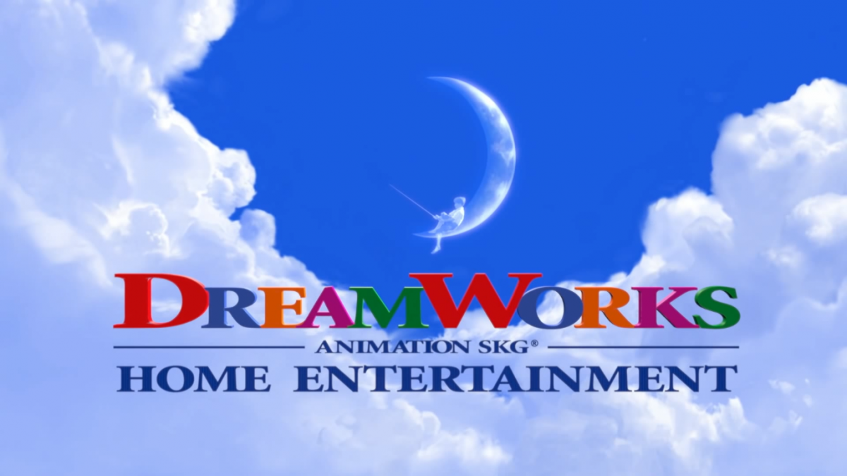
This logo is now the current logo which features a the same type but there are differences shown there. The words DreamWorks ae filled with colors that symbolizes the rainbow we all know and love. The rainbow is usually shown in the sky after a rain pour. But for this logo, it’s audience is basically children. This logo actually debuted when movies like Shark Tale, Shrek 2 and Madagascar came on the big screen. Also the computer generated images changed from dreamy night clouds to morning clouds. I believe this effect can be similar to waking up on a beautiful morning day. It literally shows happiness and brightness.
Bibilography
“The DreamWorks Logo.” Logaster, Logaster, September 27, 2012,https://www.logaster.com/blog/dreamworks-logo/
“DreamWorks Animation.” Closing Logos, WikiFoundry, Oct 24 2017, http://www.closinglogos.com/page/DreamWorks+Animation
“DreamWorks Animation License Agreement.” Lawinsider, Lawinsider, Febraury 4, 2016, https://www.lawinsider.com/contracts/2ccMqvrSzdQ0b8LVOsQkN0/dreamworks-animation/delaware/2016-02-04#miscellaneous/standard-logo-typography-font

