
The next day, I started to draw the thumbnails. My thought process for this design is that I think about the symbolism for women. In the first design, when I read the word GLOW, I thought about the symbolism of shining bright. In the second design, I did three different ideas by using the female sign. In the last design, I wanted to have a silhouette of the female face from the side view.

I started working on the design in Adobe Photoshop because I’m more comfortable with the program. In Photoshop, I design the background, and then I switch to InDesign to put in the text. When I finish with this design, I scrap it because of the white bars didn’t line up perfectly, so it looks unappealing.
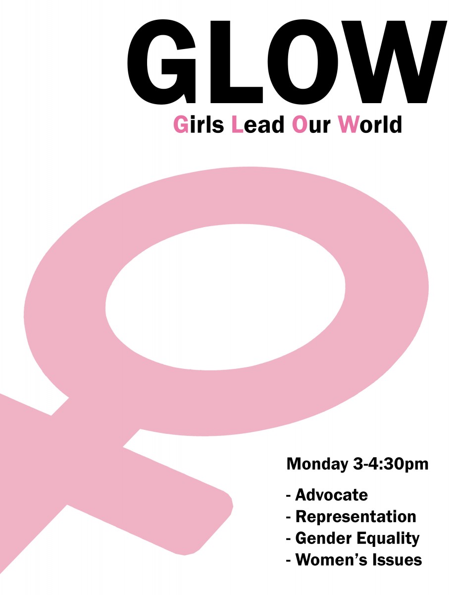
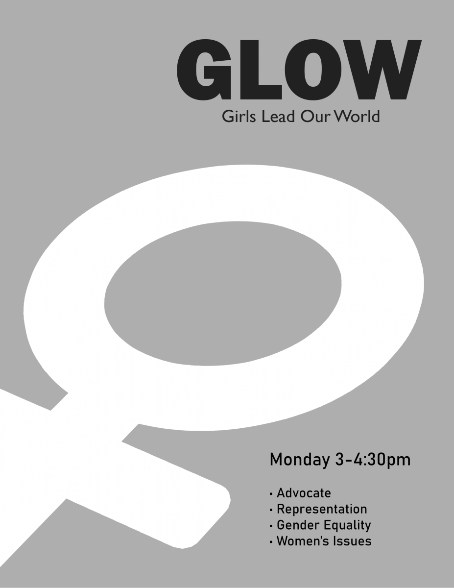
For this design, I did the same process as I did from the first design. I went with this one because the design is simple. I try to use the symbol to lead people’s eyes from the title to the small text.
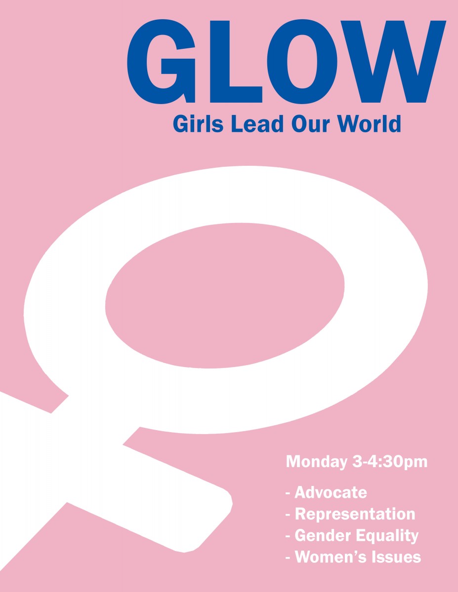
I went back and did a different version of the same design. I’m satisfied with this version. I switch the color, change the font, and added the blue to make it pop.
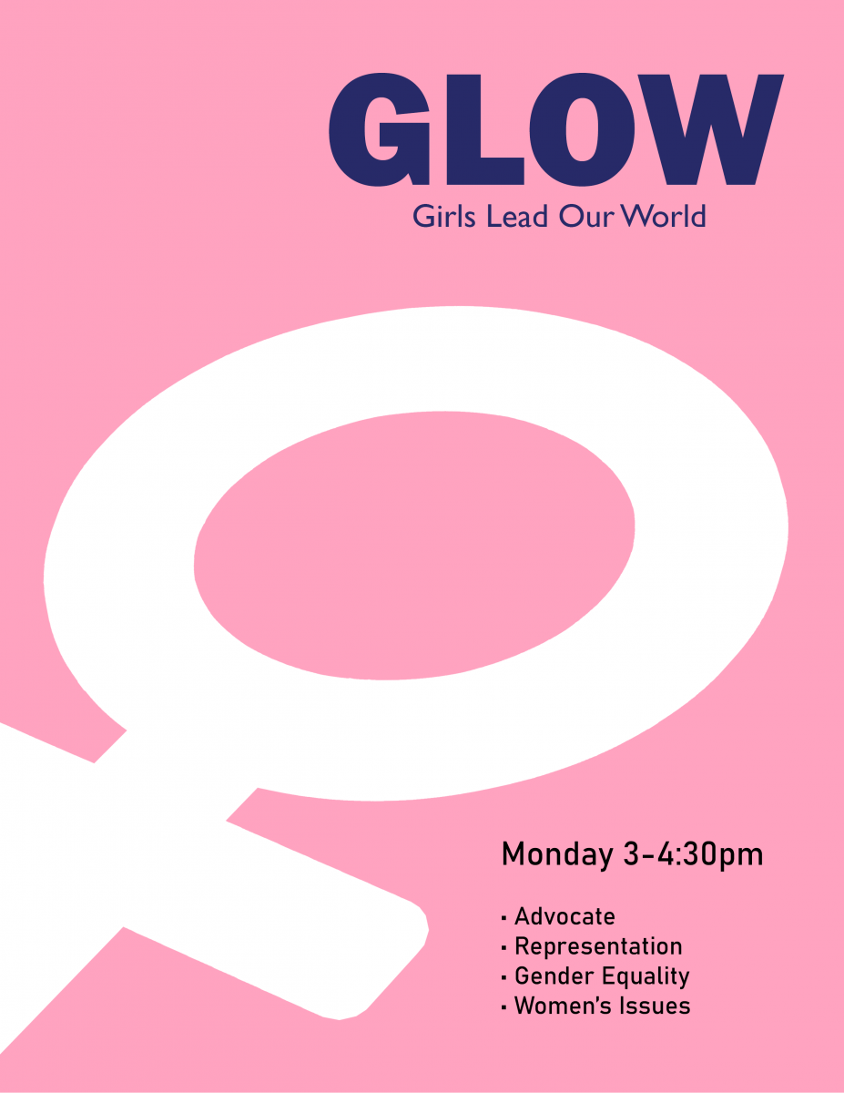
However, I wasn’t satisfied with the color and the title font. I made the color pink more vibrant and changed the title color to dark blue. I message T’ahna the poster design through Facebook Messenger. She forgot to mention that their school can only print in black and white.
Alright, no problem. I made it black and white on photoshop and then sent it again. I put all my files on Dropbox, and T’ahna can send all the JPEG files to her supervisor.

