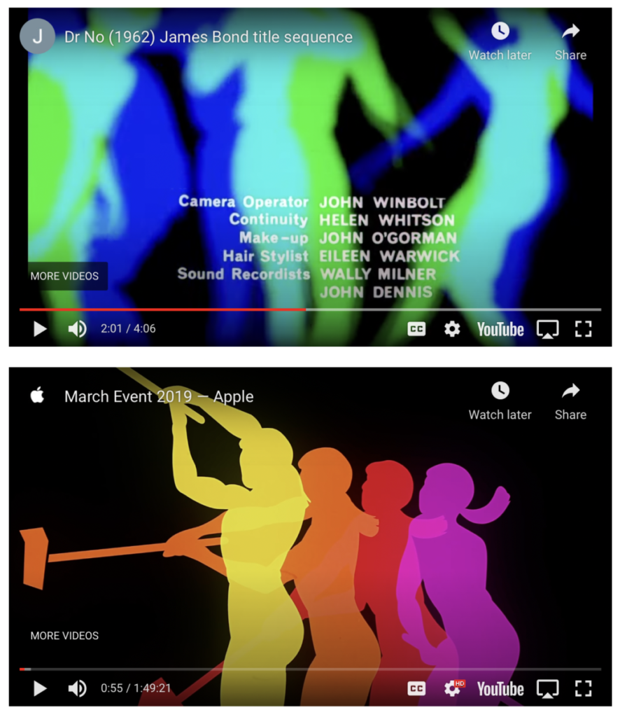
After watching these two videos, some of the common themes that I saw in the use of color were that they started with cool tone colors such as black, white and grey. They both start slow and quiet and then a few seconds into the film they both start to get a bit faster. The color in the film of Dr. No Credits start with neutral/cool tone colors then it starts to show moving circles of different colors which looks cool. While the color in the film of Apple Promo piece 2019 also begin with a mix of neutral and warm color. and a few seconds into the film we also get a variety of pop of colors with a mixture of cool and warm tones. Each film makes effective use of type combined with image by using music, color and different clips while also using contrast, repetition, alignment and proximity as well as a variety of typefaces. The audio, color and movement are related to one another because every time we get pops of color the music get fasters along with the movement and when we get more cool tones/neutral colors the music its slower and the movement too.
I really liked the music and the pop of colors from the Dr. No Credits video, it made the video very interesting and pleasing to the eye. From the Apple Promo piece 2019 I like the overall composition, the aesthetic of having the big screen with the iPhone and the new features was really cool.


