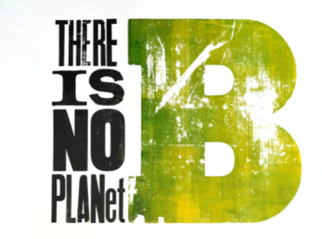
These are the top three poster that I liked. If I had to choose one, it would be the 1st one. I love how it’s telling the people that there’s not a planet b, and the words looks distressed in a way that they look sort of damage, like we are damaging our planet.
So, to answer one of the questions, what attracts my eye first? Well, something that attract my eye is the large capital letter b in the green color. There is use of repetition in the elements of the poster, such as the letters. I do believe this poster is effective, because I understand that our planet will no longer be survivable if we don’t take care of it.

