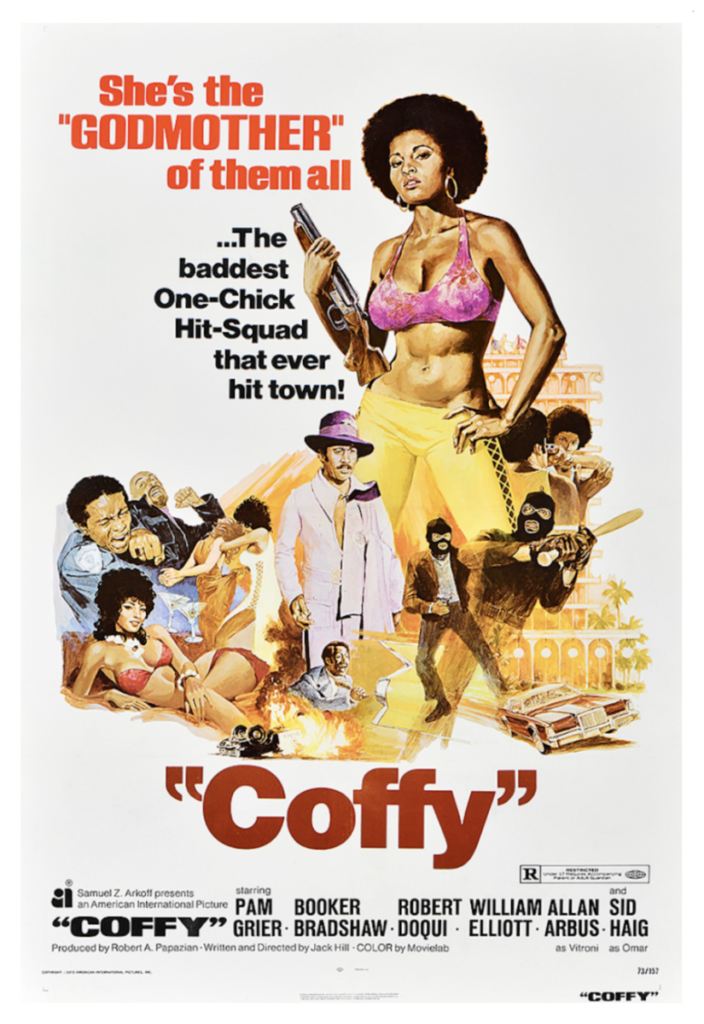
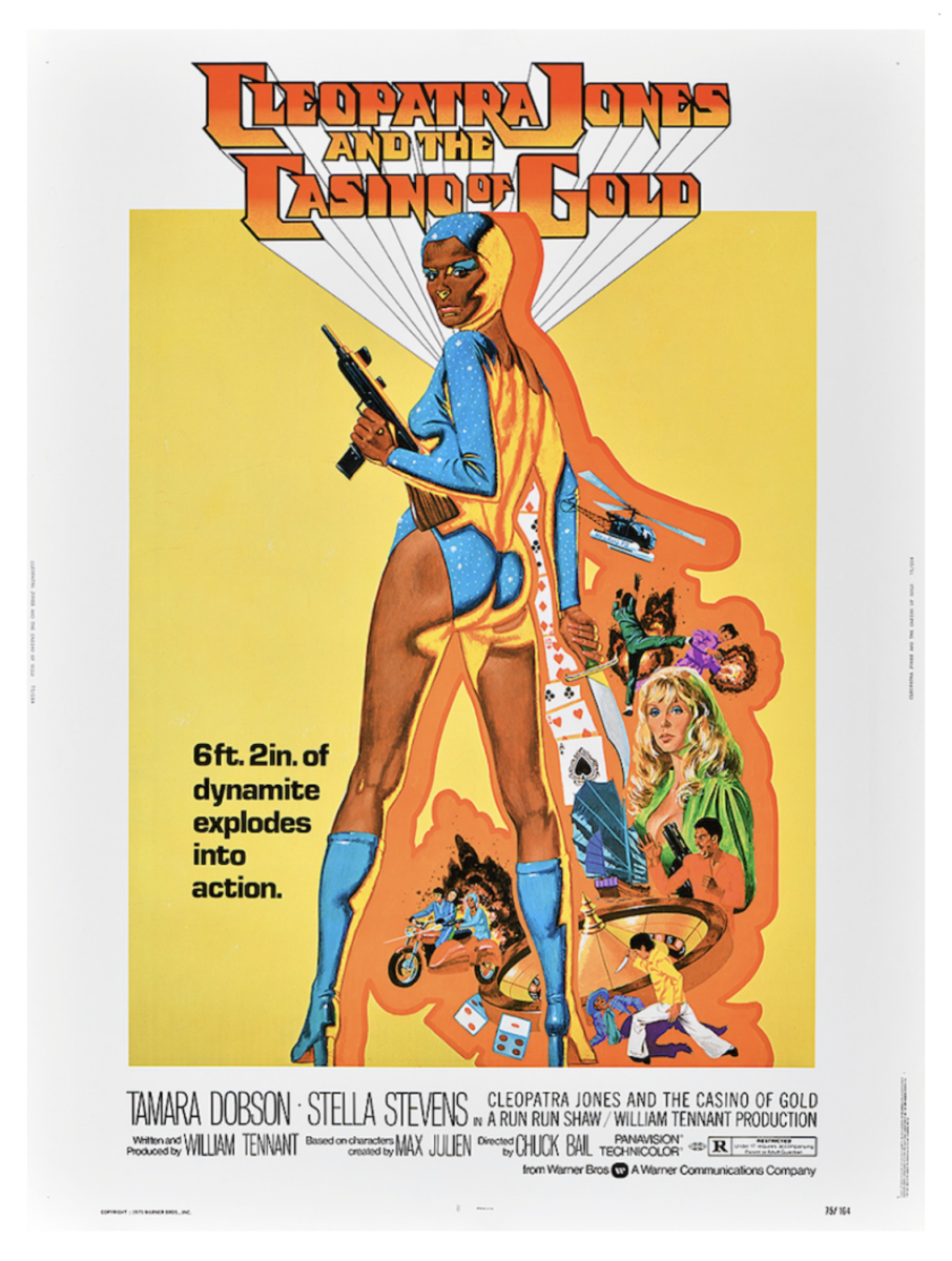
We had the opportunity to be part of a virtual tour of the Poster House Museum, it was awesome to view a poster about “Blaxploitation” movies, from the first museum dedicated to posters in the US. The overall experience was amazing we had a blast learning about the posters and how they connect with sound; because throughout the whole exhibit the woman who gave us the tour was providing us different music with each poster. It was really cool, and I would love to go in person to see if the experience could be even better.
Discussion: 3 posters from the You Won’t Bleed Me: How Blaxploitation Posters Defined Cool & Delivered Profits Exhibition


Poster 1: Coffy, 1973 created by George Akimoto
Poster 2: The Mack, 1973 created by Fred Pfeiffer
- For this poster I loved the contrast between the orange background with the black bold typeface and the man with white coat and hat. I really liked the warm tones throughout the poster. Something else I notice is the tiny gold car behind the figures. Something else I also like is that the figures are standing in the center of the poster, because you only focus on the figures and forget about everything else.
Poster 3: Slaughter, 1972 created by George Akimoto
- This poster is very graphic like the first poster, it has a lot of action/movement going on, which is one of the reason why I like it. I liked how the red bold typefaces stand out from the rest of the poster. I also like the yellowish/orangish colors in the poster against the white background, I feel like if that yellow/orange tint wasn’t in the poster, the poster wouldn’t be as intense/dramatic as it is.


