Last week during my internship in the Public Affairs and Partnership office at City Tech, I had the opportunity to design a logo for the department. I told my supervisor that I wanted to be as useful as possible and bring value to his office, and he gave me permission to create the identity of the department. This decision was taken because, since they are working together with the Professional Development Center ( PDC), they have their own logo. Many decisions were taken into account when I started to sketch the logo.
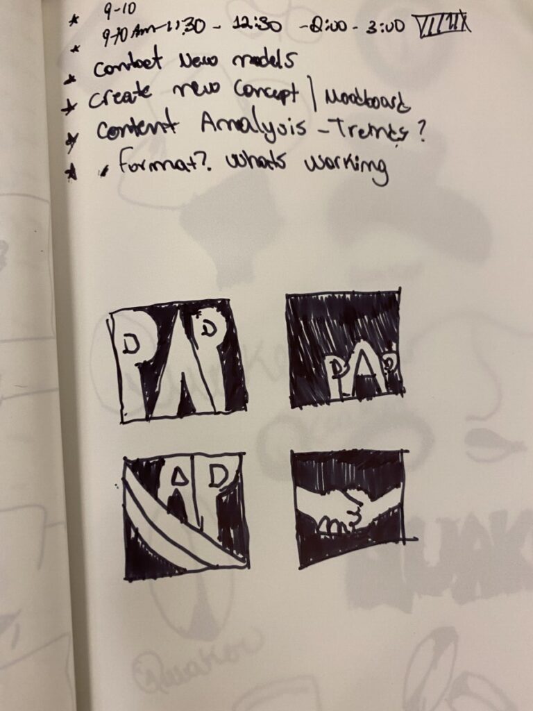
I decided to create four different versions, that way he can get different perspectives. One of the things that I had into account was to create something very similar to the PDC logo. They are different departments, but they are working together, so I did not want to mean any kind of division between their identity. To accomplish that, I decided to keep the same font and colors which goes well with the City Tech’s branding guidelines.
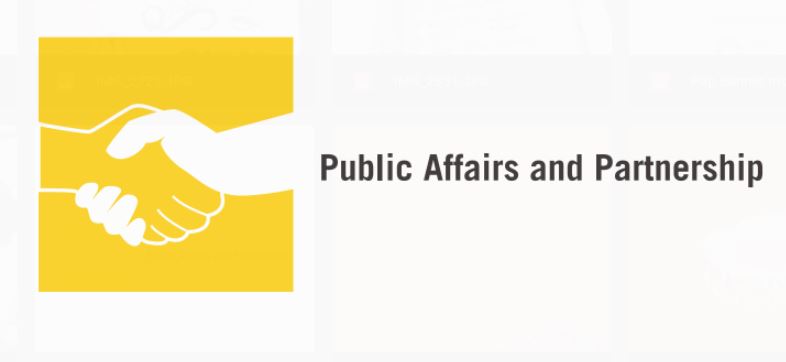
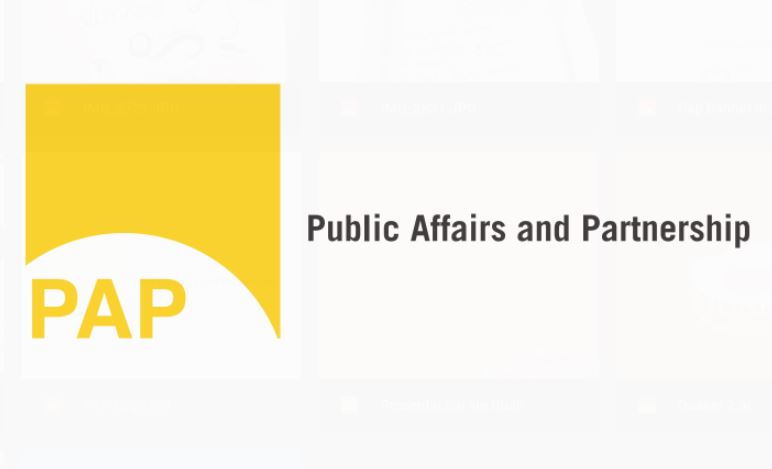

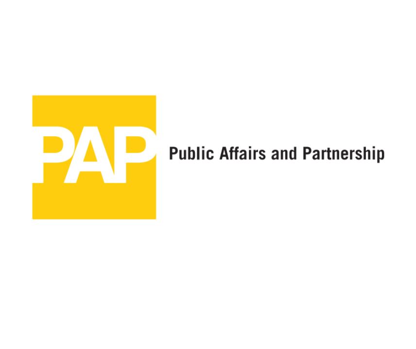
These were the results of all the designs. Simple, straight to the point, bold, and didn’t differ a lot from the PDC logo. My supervisor liked the PAP logo. He says that it’s more clear and doesn’t have any subliminal message for people to decipher. For me, the thinking process was a good experience and got me thinking about different solutions for this case. I feel proud to design something that they could use in the future.