Last week our class had the task to watch a webinar from different sources. I decided to pick “Type Trends 2022 Webinar” from Monotype. This webinar was about how design reflects society, the latest trends in typography and branding, and how the creative world is diving deeper into other technologies such as Animation and NFTs.
The webinar was presented by Charles Nix, a creative type director at Monotype. Accompanied by Phil Garnham, also creative director from Monotype.
The webinar was an hour-long, and I was caught by all the amazing designs that they have shown. The trend report this year was very data-rich, collecting work from different brands and agencies. One of the most important traits of design this year is everything related to the environment. Design is having an incredible impact on it, having in mind that we recently were under the crisis of the pandemic. Charles also shares how according to the data, people are feeling how we are living in a ” Time Warp” stating that time is not what it used to be. Now, what was a week can be felt like an hour. Everything is going faster, and design must reflect that as well.
Another key point is that we are digital, and it’s not compared to the digital concept that we had thirty years ago. Designers can also take advantage and use the Nostalgia to create an appealing and beautiful design. Charles and Phil focused on Ten trends from this year which I can name a few. They gave over more than two hundred examples of beautiful type design.
Soft Serve
It has been around 5 years and its design is a very delicate and elegant type.
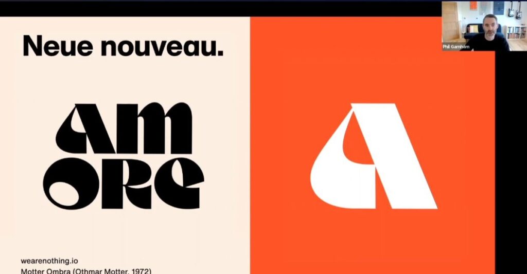
Neue Nouveau
Inspired by Art Nouveau and designers that used to create posters in the era when they had to be drawn by hand. Its quality is vital, stylish, chaotic, and uses a variation called Slick. It a less artistic and more modern than the actual regular Neue Nouveau.
Svelte Serif
A more bold-looking font that’s definitely stepping up as a trend and being used a lot in the market. It’s also very elegant and used for branding.
Dinamo
This font has a more standard look and can be used commercially easily. They just launched their type family and designers are starting to use it more.
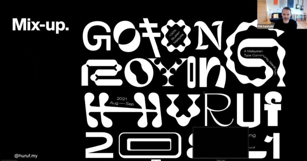
Another font trend that really caught my attention was the “Mix-up trend”. It consists of mixing and experimenting with designs with different fonts from different families. The feeling of freedom it gives, and also sparking creativity caught my attention immediately.
Contrast Type
This design trend as its names states consists of the use of type to create contrast and overflow. Since these were the trends that caught most of my attention, Phil also mentioned others such as Lateral Moves, Blockheads, Organic-Mod- Origins-Now- and more.
This webinar was helpful for my upcoming final projects as it gave me new ideas for design, and made me interested in trends that I didn’t know we’re having a great impact on different areas.