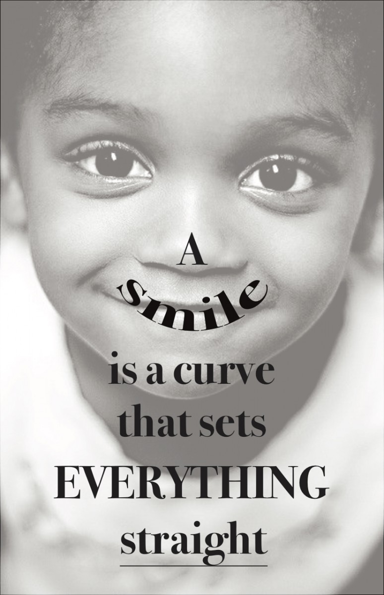
 Now, I decided to change my quote because I see that the previous one is kind of giving a negative impression to a person to take his/her interest. Then I chose this quote which seems simple but have a big logical meaning. I just used one classification with one typeface (Bodoni-bold), but playing with the text size balanced the composition. The reason that I put a kid’s photo in the background is, children makes you smile when you see them playing around. You see that they are so pure and harmless for this world.
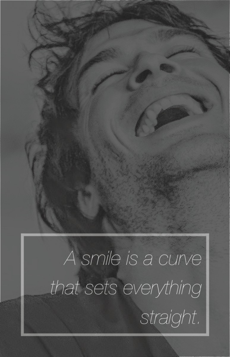 For the 2nd version of my quote’s image in the background is different. Ian Somerhalder is one of my favorite artist and when I saw this image it seems to me so naive and natural. Around the text I used a white box to make the text pop-up more than the background. Also I used Helvetica Neue – Ultralight Italic and I work with just black&white concept again.
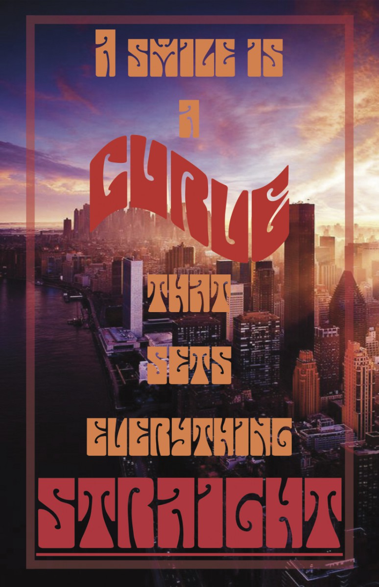 For the 3rd version, the image in the background is different than others which is its a colorful image. For the text, I used red and orange tones. Last semester, I had to do a poster for one of my classes and I used this font for the text. I really liked it because the letters are bold and each of them seems converted into a shape. The name of the font is “Butterfield”. I put the word “curve”, in a different shape which seems like arc, and for the “straight”, I just made the text size bigger and putting a line underneath.

