This is my portfolio that I did for Graphic Design Principles 2.
A day in a life
Link
Our video assignment was about to record many clips and to put them together based on what do we do in a basic daily life. I used the Imovie as an application. Here is the link for my video. Hopefully you will enjoy it.
Trip from UFT
Couple of weeks ago, we went to UFT print shop to get a chance to see how different kind of printers work and what are they using for.
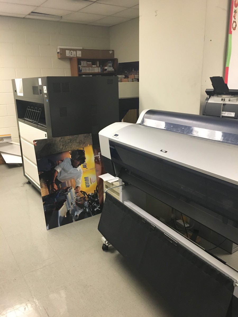
The first printer that we saw is called digital printing. It is the process of transferring a document from a computer or a digital device to a printing machine. They used it for printing big posters with a large format or high volume laser. Also, a digital printer re-draws the page image for each print rather than relying on a press plate to carry the image, a digital print requires no setup sheets and each sheet can contain a different image.
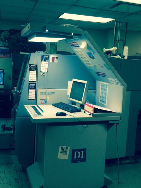
The second printer is called Rotogravure. During the gravure printing process the printing cylinder rotates in the ink pan where the printed cells fill with ink. When the cylinder rotates clear of the ink pan, rest of the ink is removed.The cylinder is brought into contact which is pressed against it by the rubber covered impression roller.
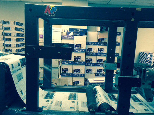
Offset printing is a process of printing in which the inked images are transferred from rubber blankets or rollers to a printing surface. They used it to print business cards, letterhead, catalogs, books/booklets, business forms, flyers, brochures, calendars, also invitations.
Changing the whole concept for visual quote
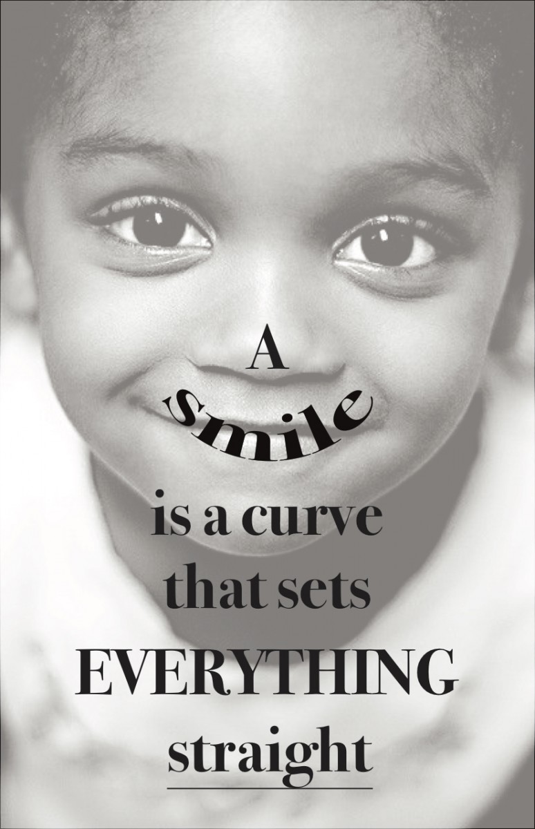 Now, I decided to change my quote because I see that the previous one is kind of giving a negative impression to a person to take his/her interest. Then I chose this quote which seems simple but have a big logical meaning. I just used one classification with one typeface (Bodoni-bold), but playing with the text size balanced the composition. The reason that I put a kid’s photo in the background is, children makes you smile when you see them playing around. You see that they are so pure and harmless for this world.
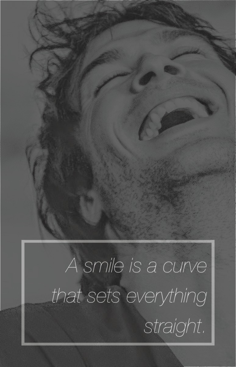 For the 2nd version of my quote’s image in the background is different. Ian Somerhalder is one of my favorite artist and when I saw this image it seems to me so naive and natural. Around the text I used a white box to make the text pop-up more than the background. Also I used Helvetica Neue – Ultralight Italic and I work with just black&white concept again.
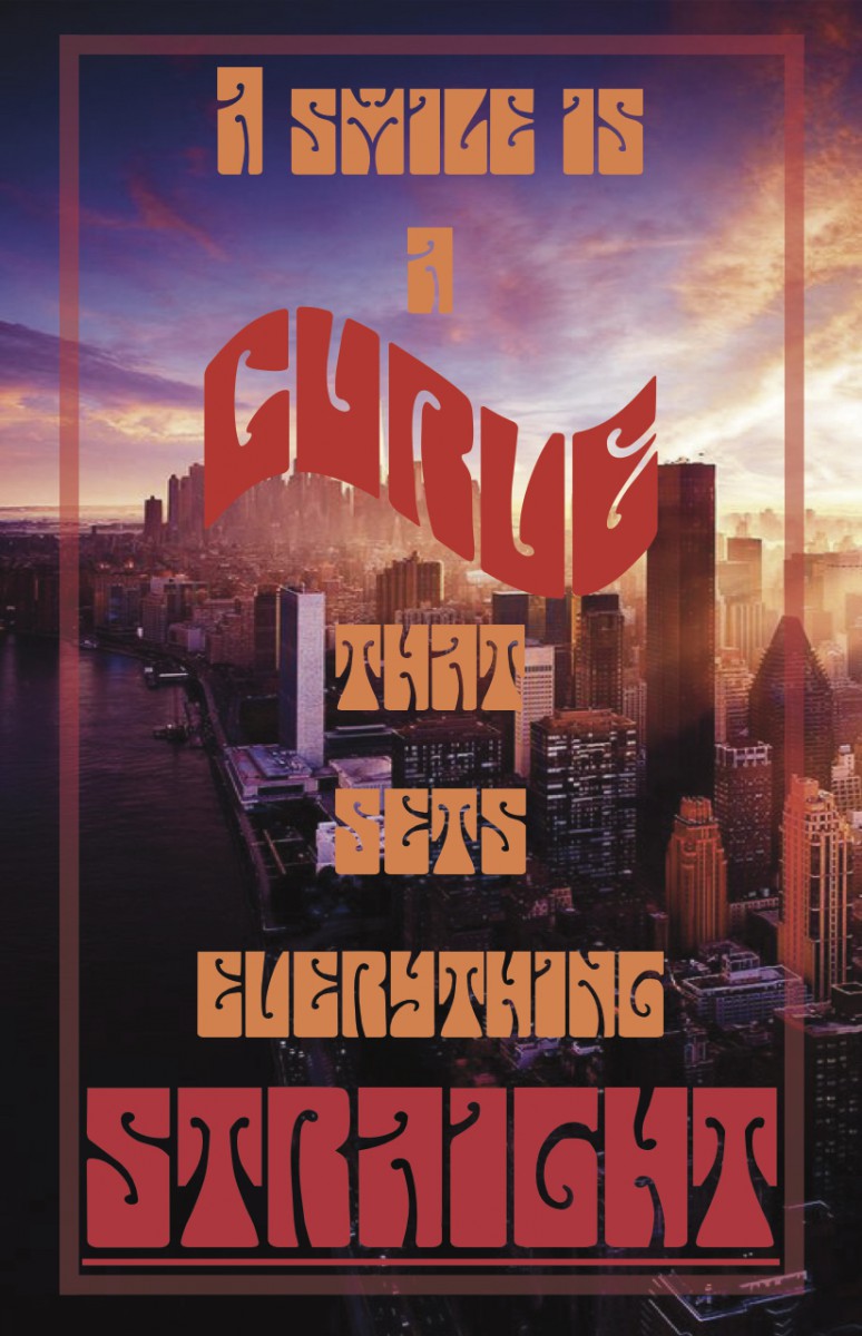 For the 3rd version, the image in the background is different than others which is its a colorful image. For the text, I used red and orange tones. Last semester, I had to do a poster for one of my classes and I used this font for the text. I really liked it because the letters are bold and each of them seems converted into a shape. The name of the font is “Butterfield”. I put the word “curve”, in a different shape which seems like arc, and for the “straight”, I just made the text size bigger and putting a line underneath.
First idea of my visual quote
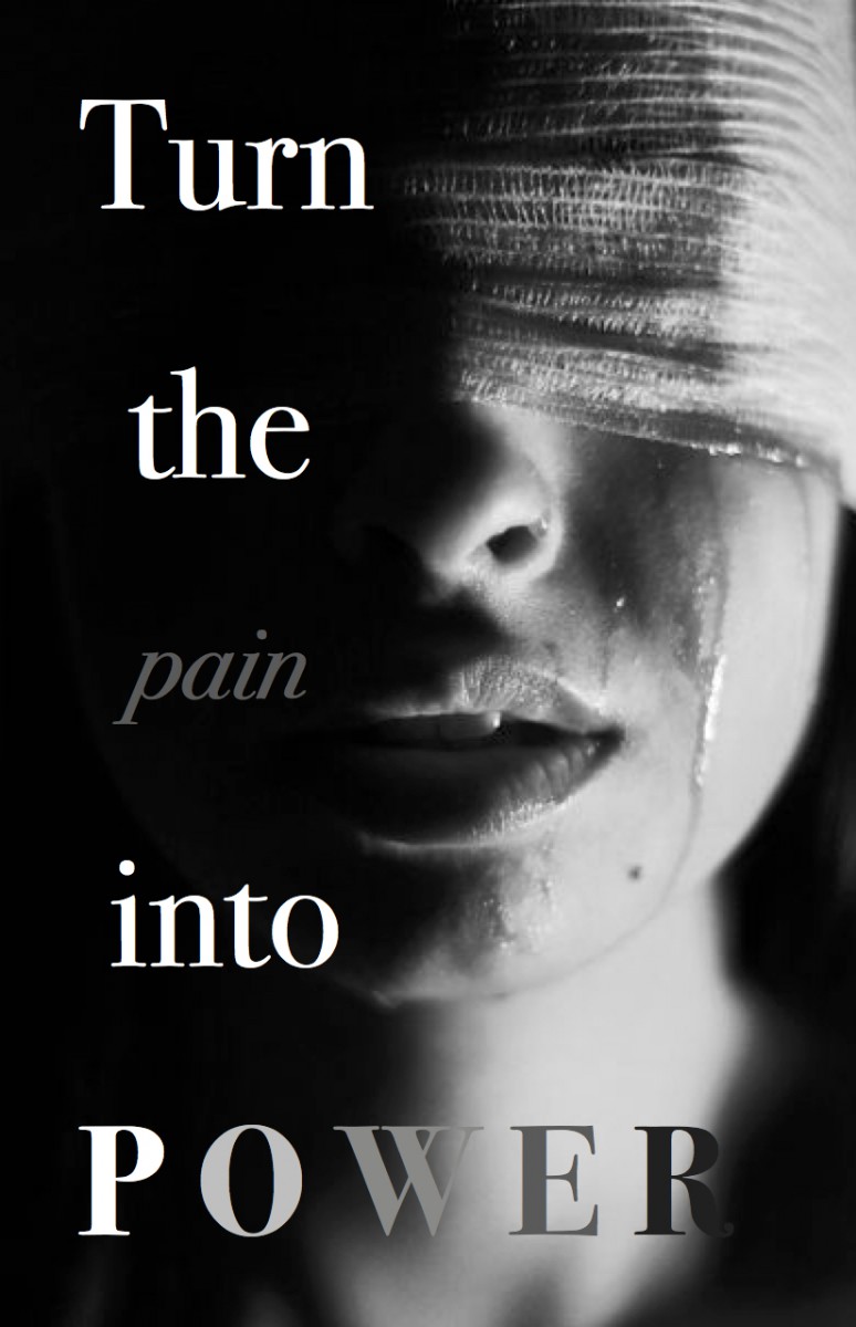 My first idea was to work with black&white concepts. Because the quote that I chose, it seems despairing in my mind and also it makes your motivation from low to high. I used Bodoni but different typefaces which are bold, italic and book. For “pain”, I used italic because pain makes you weak and desperate. For “power”, I used bold because power is your strength, power makes you strong to get over with the pain sometimes. Also, in my opinion the image in the background is successful on representing the text.
My logo
![]()
My logo represents my initials of my first name and last name which are “Y” and “A”. It shows that two letters are combined with each other as a ligature. I used the paint brush tool to make my own serifs smoothly. So I can be feel more free on doing my letters.
You can find the best inspiration in Cooper Hewitt
Gallery
Process of Song-Movement Book
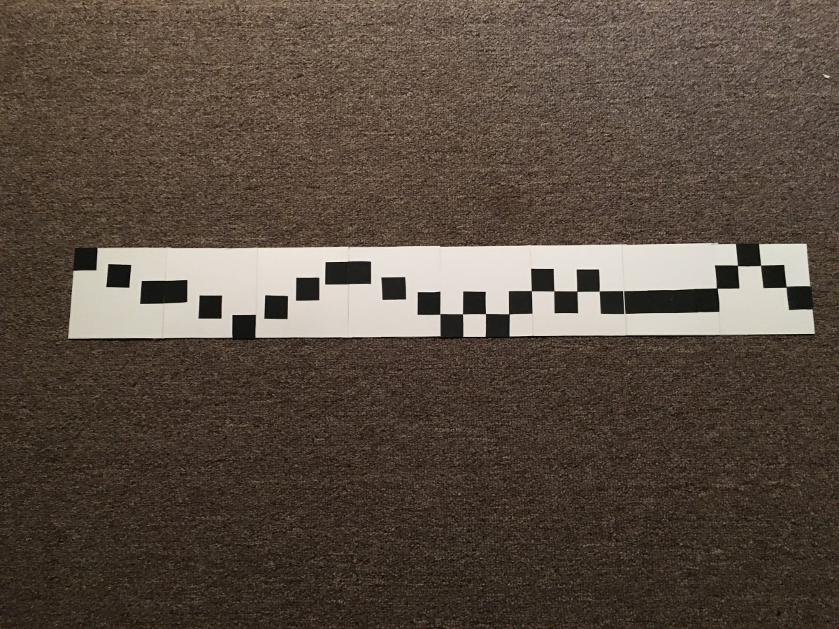
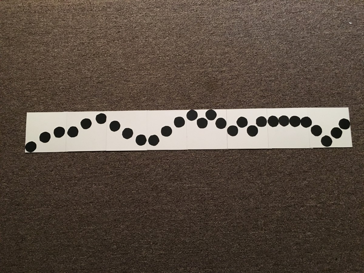
From Project#2, I learned the balance between positive and negative shape does really matters in a composition.
- Leaving too much negative space will make your composition unbalanced.
- You need a strong pattern to make the composition better.
- Low visual weight = low contrast
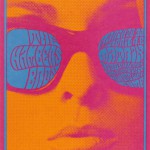
MoMA-Design for Ear and Eye
Gallery
This gallery contains 7 photos.
On Saturday, I went to MoMA (Museum of Modern Art). I saw a lot of interesting hand-made materials, which are actually designed for “ear” and “eye”. The posters of illustration took my attention, because every one of them gives a … Continue reading
Creation of Texture
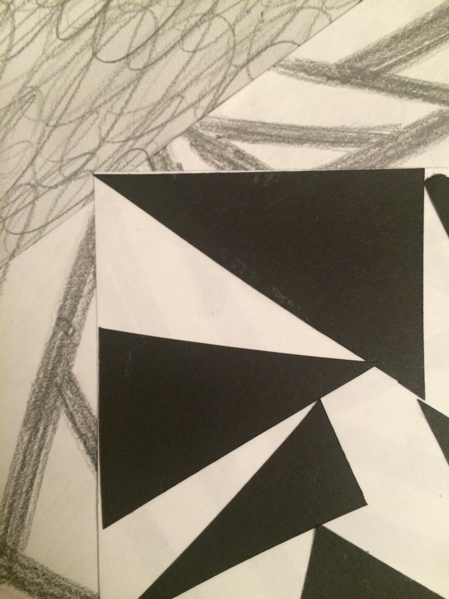
It is a combination of 3 compositions of texture. It feels like really confusing because there are too much complexity, besides simplicity. Mostly we can see triangles or geometric shapes than organic shapes. Also the variety is different from each other.

