Self Assessment

I am nearing the end of the 120 hours needed to complete this internship. I have to say that this internship workplace has to have been one of the more difficult places I have worked at but also equally as rewarding. I think the measurement of success for an internship lies in how much the student learned and grew from the experience of the internship and I can say in that regard that this internship was a success. Also this internship was definitely something that I could only do as a learning student that did not need to have a job yet.

This internship served as a challenge to my skills as a designer. I got feedback from my supervisor on my work but it was much different than the feedback I would get in my classes since my supervisor was not a graphic design professional. So in the end, it really came down to me to do the proper research into certain topics in order to bring my design project to fruition. This is an important skill that I developed and cultivated during this internship that I believe will serve me well in my future workplaces.

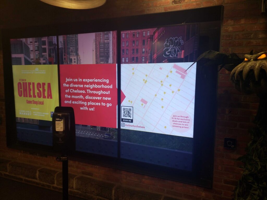
In addition, this internship has given me plenty of material to add to my portfolio along with being able to say that my designs have been printed and viewed by a large audience. As I have stated previously, this will be invaluable to me when I go job hunting after I graduate with my degree. This internship had given me a lot of responsibilities and also has taught me the importance of creating a schedule and keeping a clean file organization to ensure that I can find things quickly. I can only hope that I will get to use all these new skills at my future workplace and that it will help me on my path to becoming a full fledged design professional.

Working on ads for Shop the Village

This week to wrap up the Shop the Village campaign, I was assigned the tasks of creating LinkNYC kiosk ads for the event similar to the ones I created for It’s Time For Chelsea. Thankfully, as I already had created one for the ITFC event, I had all the dimensions for the kiosk and I had an idea of what these ads should typically look like as per my research I did during ITFC event. The first thing I did when starting this project was to look over the brand guideline book for the Shop the Village event.

The guideline book held the branding colors for the event as well as the typeface that was chosen for the logo. So piggybacking off of that, I used the same typeface in the guide book for the taglines in the ad. I worked on writing the tagline and then came up with the first draft of the ad design. I showed it to my supervisor and she was the one to suggest that I change the tagline to the one that is currently on the ad right now. Then bouncing off the new tagline, I decided to create 3 different versions of the ad to promote each aspect of the event; Shopping, Dining, and Exploring.

The hardest part of the creating these ads had to be curating the images from Unsplash to match the feel of being from NYC. I spent hours looking through images, to find a perfect match for the ad. After that, the second hardest part was overlapping the images with the diamond shape and figuring which part of the picture I wanted to come out of the diamond shape. It took me a while of going on youtube and google to figure it out but in the end I was pretty happy with the final version that I created. I ran it by my supervisor, who loved it and she gave me the go ahead to upload it in the dropbox.

Self Reflection

At this point in time, I am nearing the end of my internship. These 2 months that I spent working at my workplace has been very informative as to how I should expect my future workplaces to be like. This internship has been one of two times that I have been given close to free rein on how to design project deliverables so that has been invaluable experience. At the end of the day, I have no idea how my evaluation will go but I can honestly say that I put all my effort into this internship.

One thing that I managed to gain from this internship was more knowledge on how to use Indesign and Illustrators as well as learning to grab certain images from websites. As the majority of the work I was doing revolved around creating social media ad for businesses, I had to quickly research how to pull certain images from the business’s website. There are images that are on the business website that seem to at first be un-downloadable, but thanks to my ability to look up information on the internet, I have learned how to download certain logos that only exist as a type svg. This information will help me later on when I need to pull a logo from a website later on in my career. Also my knowledge of using the Indesign and Illustrator has increased just because I had to use it everyday for work.

This internship was definitely pretty high pressure with a ton of work that needed to be done. However, I knew that going into the internship and I also knew that I could handle that kind of workload. I am grateful for this opportunity to work in a real workspace with project dead lines and grateful for the opportunity to see my design work being produced and shown in Manhattan. I can only hope that adding these works to my portfolio will strength it and give me a fighting chance of getting a job as a Junior Graphic Designer when I graduate.

Continuing work on Shop the Village

I have completed all the business promo for all the business’s that signed up so far for Shop the Village. Now that I had a template for the promos, the hard work was just sourcing the images especially the businesses that didn’t include images to be used for their promo posts. I learned a lot during this time looking up how to download certain images and logos from websites that look like they cannot be downloaded at first glance so that will help later on at a different workplace. I also started work on the light pole banners for the campaign, however that wasn’t difficult to do because my supervisor just wanted the logo for Shop the Village centered on the banners for now. Once they confirm the sponsors for the event, they will want me to include their logos on the banner too.

Besides Shop the Village work, I was told to go on the company’s Canva account to help create new member posts for their Instagram. These posts were made to announce new businesses that joined the company’s membership. This took up a lot of my time this week because I had never used Canva before and I needed to do research on how to use the site before diving in.

The most exciting thing that happened this week was that the ads that I created for the Chelsea Market was put up on the screens there. It was cool to see that my work was up for people to see and I plan on visiting the Chelsea Market myself to see it up on the screens.

One of the ITFC campaign ads that I created displayed on a screen at the Chelsea Market.

Starting work on the Shop the Village Campaign

This week, after meeting with my supervisor in a video call, I started looking into the Shop the Village campaign. I was basically creating the same deliverables for Shop the Village that I created for ITFC but this time I had a full branding deck that was created by a designer group that the company had hired. I had a late start to the project on the first day because I did not have all the assets needed to duplicate the look from the brand deck such as the typography they used and the svg for the created logo for the event. That was sorted out at the end of the day after my supervisor emailed the designer group for the assets.

The first thing I started on for Shop the Village was the business promos, just like for ITFC. The company only just started to promote the event so there wasn’t many businesses that signed up. I started on a draft for the template which I created on Adobe XD. I tried to use elements from the logo to create the first draft for the promos because I thought that would give a more cohesive look to the campaign. However when I presented the draft for the promo, my supervisor rejected the idea because it looked too much like a flyer. They told me that I should just use large images since the most engaged posts on Instagram are just images and not too much text.

I was a little disheartened to have the draft rejected since I thought it was a good idea. However when I took her suggestion into consideration for the next draft, I realized that having a larger image made more of impact versus when I cropped the image to the shape of the logo. I decided to use the colors from the branding deck on the contact information at the bottom of the promos so that way it would work with the rest of the deliverables I would be creating in the future to match the campaign look. The other deliverables I worked on this week was just small edits to the Safe City Safe Streets promo package and the Hidden Charms of Chelsea tour flyer.

Ethics Assignment Part 2

In the past for my design work, I have created the illustrations myself so therefore there is no copyright issues. I do tend to use a lot of images in design as well, however even in my student work I have made sure that the images are able to be used for free in both commercial and non commercial purposes. I figured that if I made this a habit early on in my design career, I would not have to relearn this when I got into a professional work environment. What I have learned after reading the assigned articles is the importance in crediting the original creator and while the images I have been using so far does not require that I credit, I will be doing so moving forward in whatever capacity I can.

The Fairey Copyright was a very interesting read and it is hard to give a proper opinion of the outcome when I do not know the entire specifics of the settlement. However I will say that I agreed with many of the fair use reasons that Fairey used to defend his HOPE poster. I personally believe that Fairey’s use of the photo did fall under fair use since the final product was transformative. However his coverup of the wrong photo being used was wrong. I believe that this misconduct was what forced Fairey to have to settle with the AP because otherwise he had a very strong case for fair use of the image for his political poster because he didn’t copy any of the photo’s original content that was created by the photographer.

Sources:

Crawford, Tad. “Use of Photography” AIGA,  AIGA Business_Ethics 47556770-Use-of-photography-1-MB.pdf

Cas Fisher, William. Case Study on Fair Use and Fair Dealing: “The Hope Poster Litigation” Harvard Journal of Law and Technology,  Hope_Poster_Case_Study-1.pdf

Hawkins, Sara. “Copyright Fair Use and How It Works for Online Images : Social Media Examiner.” Social Media Examiner | Social Media Marketing, Social Media Examiner, 23 Nov. 2011, https://www.socialmediaexaminer.com/copyright-fair-use-and-how-it-works-for-online-images/.

Ethics Assignment Part 1

Design Ethics are a very important part of the design process. It helps a designer be more aware of the professionalism required when handling outside images for a project and be aware of the context in which the project is using said images. After all, these rules exist to protect our work as well as others from infringement.

So far at my internship over at my workplace, the way we obtain images and company logos is from the company itself. Luckily my internship does not have a NDA (Non-disclosure Agreement) that needed to be signed so I can talk about the nature of my work. As this is Week 6 of the internship, at this time I am working on the social media campaign for a program called It’s Time For Chelsea. All the companies I am creating business promotions for on Instagram agreed to be in the program and has voluntarily submitted in pictures of their own business and logos.

Over at my workplace, we haven’t discussed proper handling out images we use that are from an outside source. However even before this class and reading the AIGA materials, whenever I was working on a paid project I made sure that whenever I used an outside image to credit the original author. I also made sure the images I was using were made for free commercial distribution. Thankfully a majority of the images I used when designing for the It’s Time For Chelsea campaign has been submitted by the companies themselves and cannot be altered.

Sources:

Crawford, Tad.  “Guide to Copyright” AIGA,  AIGA Business_Ethics 47556757-Guide-to-copyright-1-MB.pdf

Crawford, Tad. “Use of Photography” AIGA,  AIGA Business_Ethics 47556770-Use-of-photography-1-MB.pdf

Hawkins, Sara. “Copyright Fair Use and How It Works for Online Images : Social Media Examiner.” Social Media Examiner | Social Media Marketing, Social Media Examiner, 23 Nov. 2011, https://www.socialmediaexaminer.com/copyright-fair-use-and-how-it-works-for-online-images/.miner

Finishing up work for ITFC campaign

I sent over my draft of the promotional package to my supervisor and they approved of the layout. Now I am just waiting on the official copy for the event to be written for this year since the copy on my draft is from last years event. This week I was tasked with creating a flyer for a tour of Chelsea that is happening at the beginning of November that is part of the ITFC campaign and creating ads for the LinkNYC kiosks and Chelsea Market for ITFC. I spent a lot of time on pinterest and Google looking up different kinds of ads used for the LinkNYC kiosks and then started working on a design in Indesign. I was told that the ads needed to have a QR code which leads to the ITFC campaign website so I went online to see what different designs I could use for a QR code.

I spent most of the work week creating the ads and flyer. I was really excited to work on the ads since they were going to be put in an actual live environment for people to see. Of course it was also nerve wracking when I was actually creating the designs for it since it was going to be shown in public and the perfectionist inside of me wanted to make sure that I absolutely nailed the design.

While I was working on the design for the ad, my supervisor sent images of the logo for the event on a t-shirt and a tote bag which I helped to design. It was really cool to see the work mocked up on the images and even cooler to know that the designs will be printed for the event. Even though I had a lot of work to do for the event this week, seeing those images really made it worth the work worth it since I know I will be able to add something to solid to my portfolio once this was all over.

Continuing work on ITFC Campaign

This week was perhaps the most stressful week of my life as I continued working on the business promos for the participating businesses joining the ITFC campaign. Last week my coworker and I were told to coordinate with the marketing interns to pass off the files we designed for ITFC to them so that the marketing intern could start organizing the promos into scheduled posts for approval on a google slideshow. On the first day of my work week, I was messaged by one of the marketing interns who was confused because they had no idea how to set up the slideshow. After giving them, what I perceived to be good instructions as to how it should be done and also telling them to message my supervisor if they were still confused, I went back to my design work.

A couple hours later, I was messaged by my supervisor asking if I had talked to any of the marketing interns. I told them I had and that I had given them some instructions on how to get the work done. Imagine my surprise when the supervisor tells me that the intern I had spoken to had not done any work on the presentation and also told them that I hadn’t communicated with them at all. Thankfully because of my work ethic from the previous weeks, my supervisor didn’t believe what they had said and chose to fire the marketing intern at the end of the day since they still hadn’t completed any work.

I volunteered to help set up the presentation of the social media posts after that incident because my workplace needed someone to help out with it but also because I was interested in researching about how to get more engagement on social media. So I spent the rest of the week doing research on social media and also finishing up the business promos for the event. I was also tasked with redesigning a promotional package for the Safe City Safe Streets event which was something I was interested in doing since I liked designing publication materials. Creating the design was simple enough since the event already had branding guidelines laid out for it so I didn’t have to come up with the colors or what fonts to use. Designing under constraints has always been much easier for me to do versus being given free rein on a project. After comparing my initial design for the promotional package versus the one done last year, I can confidently say that I did a better a job and now I’m just waiting for the beginning of the next work week before I send it over for my supervisor’s approval.

Starting work for the ITFC Campaign

My first task for creating graphics for the It’s Time for Chelsea campaign was to create Instagram business promos for the list of businesses that decided to sign up to be part of the event. This task was a bit difficult for me to begin with because I had never designed anything for social media prior to this and I also never had experience for it in class either. The first two days of the week consisted of me researching the companies on the list and reading through their history. I also looked through the images that the companies gave of their businesses so I could decide which ones would look best on Instagram. I also researched how other businesses promoted themselves on Instagram and asked my supervisor if there were examples of previous business promos done for past events. Luckily there were, so I logged into the Dropbox and looked through those promos for inspiration.

The first thing I did was making a template for the layout of the business promos. I thought that having the same layout for the promos would make it look more recognizable as part of a bigger campaign. I ran this idea to my supervisor who agreed on the idea and then I set out to make the template. Thankfully the ITFC campaign already had some graphics created for it such as their logo and branding colors so I didn’t need to come up with those.

The logo for the ITFC Campaign
One of the many business promos I helped to create for the campaign

Once I had come up with the template for the promos, the rest was smooth sailing. The only factors that I needed to worry about was choosing a picture for the promos and what would be written on them. The written part was the most challenging because some of the businesses were not offering deals for the event so for those businesses I would need to read through their company history to find the best way to describe them. Thankfully I had the help of my coworker on the business promo and the ITFC website so the workload was manageable. My coworker and I even worked on mood boards for the campaign so that way we would be on the same page as to what kind of pictures we would want to work with. My supervisor had also told us to work together with the marketing interns so that after the business promos were done, they would be able to schedule a post for it for when the campaign would begin on October 15th.