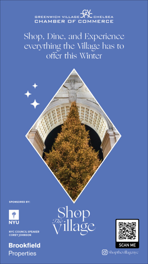
This week to wrap up the Shop the Village campaign, I was assigned the tasks of creating LinkNYC kiosk ads for the event similar to the ones I created for It’s Time For Chelsea. Thankfully, as I already had created one for the ITFC event, I had all the dimensions for the kiosk and I had an idea of what these ads should typically look like as per my research I did during ITFC event. The first thing I did when starting this project was to look over the brand guideline book for the Shop the Village event.
The guideline book held the branding colors for the event as well as the typeface that was chosen for the logo. So piggybacking off of that, I used the same typeface in the guide book for the taglines in the ad. I worked on writing the tagline and then came up with the first draft of the ad design. I showed it to my supervisor and she was the one to suggest that I change the tagline to the one that is currently on the ad right now. Then bouncing off the new tagline, I decided to create 3 different versions of the ad to promote each aspect of the event; Shopping, Dining, and Exploring.
The hardest part of the creating these ads had to be curating the images from Unsplash to match the feel of being from NYC. I spent hours looking through images, to find a perfect match for the ad. After that, the second hardest part was overlapping the images with the diamond shape and figuring which part of the picture I wanted to come out of the diamond shape. It took me a while of going on youtube and google to figure it out but in the end I was pretty happy with the final version that I created. I ran it by my supervisor, who loved it and she gave me the go ahead to upload it in the dropbox.