Description:
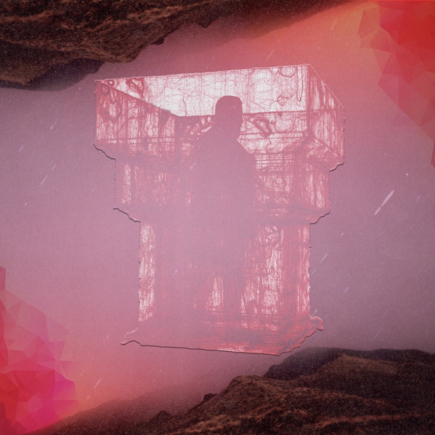
The band name I got is Burly But Harmless. For the album cover, I though of making it tone down/simplistic design with the hills and the red-ish gray sky background.
So first I placed a cutout artwork in the middle and changed the layer into a Lighten to bring out the white. This makes it like fade into the background and pop with it’s highlighted outline. The corners are like broken parts so it exposes some of the red for like a corruption within the cover.
So for the music genre I thought for this is a sort of Hip-Hop and or Pop style.


Leave a Reply