BRIEF
Create a photo-illustrated type treatment that visually portrays a word as its literal meaning. Print and present two versions of this treatment: one with a plain black or white background, and another illustrated and placed within a photographic environment.
BACKGROUND
An autological word is one that looks like its literal meaning. They are pretty common in writing systems derived from pictographs (the Mandarin character for forest, 林, looks like two pine trees) but in phonetic languages (like English) they usually need to be designed.
PROCESS
STEP 1: WORD AND FONT CHOICE, BASIC LAYOUT
- Choose a word with at least 5 letters. Adjectives are not required, but might be easier
- Find a suitable typeface. Avoid fonts that are very thin/lightweight – they are harder to illustrate. Don’t use “destroyed” or “grunge” fonts – we have Photoshop, we can destroy them ourselves. I recommend the Lost Type Foundry, Adobe Fonts (accessed through your Adobe CC membership), and Google Fonts. Dafont.com has some great and unique typefaces too, but you have to wade through a LOT of junk to find them.
WARNING: TYPE FILES CAN EASILY HID VIRUSES – if a font site has a bunch of junk ads, that’s a huge red flag. Scan files from these sites before installing them (or don’t download them at all). - Create a new Adobe Illustrator document, 8.5″ x 11″ in landscape orientation (CMYK or RGB color is fine). Add your word to this document, then use the character panel to scale and position each letterform. You can also place the letters as individual elements, depending on your typeface and the style you’re going for.
- Complete this as homework for Friday 11/24 – you will need this treatment for the next step.
STEP 2: CONVERT TO OUTLINES, MANIPULATE & FINALIZE TYPE
- Open your layout from the previous step and save a new copy (File -> Save As).
- Outline your text to convert it to vector paths (Type -> Create Outlines). Ungroup the individual letters so they can be moved/manipulated individually (Object -> Ungroup).
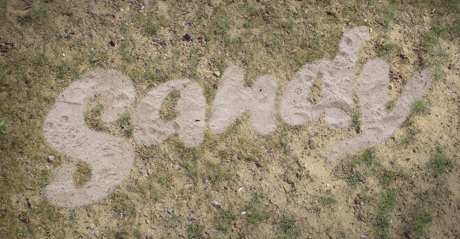
- Use the Direct Select and Pen tools to edit letterforms to suit your eventual illustration. In the example, I extended the tail of the “Y” to look a little looser; since I knew I would be writing the words in sand, I also rounded off sharp corners in the letters.
- Export a .jpg of your modified type (File -> Export -> Save for Web (Legacy)) and upload/post to OpenLab. Tag with categories “Project 5: My Literal Type” and “P5 Step 2: Finalize Type” – will be reviewed in class Tuesday 11/28.

STEP 3: PLACE IN PHOTSHOP, PRODUCE ROUGH COMP
- Create a new Photoshop document at 8.5 x 11″ with a 300ppi resolution.
- Place your finalized type (File -> Place Embedded).
- Find the source images to use for the materials of your letters – you can of course take your own photos, but otherwise STOCK OR CREATIVE COMMONS IMAGES **ONLY**. My absolute favorite site for stock illustration assets is Textures.com – you can download medium resolution images for free, and high-res is much cheaper than on conventional stock sites. Openverse is an image search engine that ONLY shows images with some form of Creative Commons license. If you use Google and/or Bing image searches, you can limit the results to Creative Commons licensed images through their “tools” options, which you can also use to filter out low-res images.
- Place, position, and clip your images. If you’re making type with a 3D effect, you can use the perspective and warp transforms (Edit -> Transform -> …) to fake linear perspective and visual depth.
- Have your comps ready for review and class work on Friday 12/1.
STEP 4: TWO FINAL COMPS
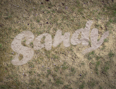
- Manipulate the letterforms and images so they “fit” – in the example, I tried to mimic the depth and contours of the sand so it would appear more dimensional, and used custom brushes to add some grain outside the piles.
- Find a suitable background image/”environment” for your type treatment – this needs to be very high res (at least 2550 x 3300px).
- Place your background image in the comp. Adjust and manipulate the image and your type so they appear to exist in the same space. In the example I adjusted the colors of my background to bring them in line with the sand, brightened up the sand to make it easier to read, then used a custom brush to “paint in” some clumps of grass around the letterforms.
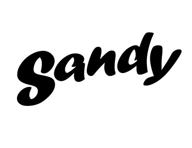
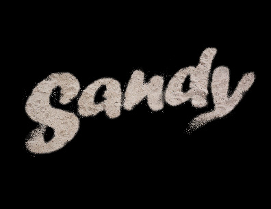
- Save two TIFF versions of the file (File -> Save As) – one with a black or white background, and one with your photographic background. You will use these for the printed version.
- Save two low-res JPG versions of the file (File -> Export -> Save for Web (Legacy)), setting the export resolution to 1275 x 1650px. DO NOT USE THIS FOR PRINT – the resolution is too low!
- Upload/post your low-res JPGs to OpenLab. Tag with categories “Project 5: My Literal Type” and “P5 Step 4: Two Final Comps”. Due Friday 12/8.
STEP 5: PRINT, MOUNT, AND PRESENT
- Convert the TIFF versions of your files to CMYK color (Edit -> Convert to Profile), and boost the brightness 10-15% to compensate. You can check the print preparation instructions from Project 4 – they’re very similar.
- Create a new Illustrator document at 8.5 x 11″, CMYK color, 300ppi raster effects.
- Place either of your final TIFF images in the document.
- Create a rectangle exactly 8″ x 10.5″ and center it in the document. You can use the “properties” panel on the right to precisely resize and reposition graphic elements.
- Use the rectangle to make a clipping mask of your image (Object -> Clipping Mask -> Make). This leaves a clean white margin around the edges so we don’t have to print full bleed.
- Export as a PDF using the “High Quality Print” preset. Make sure “all printers’ marks” is checked in the dialog box.
- Repeat #20-25 for the second image.
- Print on coated cover stock, ideally at professional print shop.
- Mount both images to the SAME black presentation board or foamcore. How you size the board or place your images on it is up to you, but aim for clean, consistent spacing and aligned elements.
SCHEDULE & DUE DATES
11/21 (Tuesday) – project assigned
11/24 (Friday) – basic type treatment complete
11/28 (Tuesday) – review finalized type in class
12/1 (Friday) – rough comps ready for review/classwork
12/8 (Friday) – final comps posted to OpenLab, printed project due, final critique.