Please Read the Lecture: COMD 3313 Intro to Composition
(Only read up to Part 7, Directing the Viewer.)
Share an illustration that makes great use of Composition. Explain why:
- Deconstruct the illustration: Who created it and what process and media do you think they used?
- What does Compositional Techniques does the illustrator use?
- Why do you consider them effective?
Be sure to read eachother’s observations BEFORE posting your own.


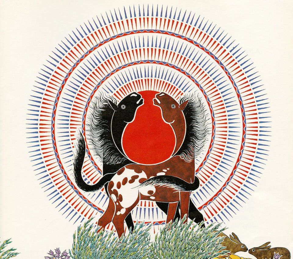
This illustration was created by Paul Goble who was an English writer and illustrator of children’s books. I believe he used watercolor then digitized or scanned into a computer.
One strong compositional technique that Paul used is symmetry to bring unity to the illustration. His great use of negative space allows for the focal point to stay eye catching with distraction. There is also a great use of repetition in the patterns and textures allowing for the illustration to stay balance. The contrast of the colors use also adding visual pleasure.
All the elements used in this image are super effective at making it a great illustration and causing or leaving a reaction for the viewer to think about.
The illustration I would like to shared was created by Goni Montes, he begun his career path as a scientific illustrator. His process to create this illustration was an variety of warm color palette and brush stroke, I believe the media that they use is traditional thumbnails. He develop his concept and composition work on thumbnails, then he turn his sketches into finals by adding details and colors.
In this illustration he uses several compositions such as movement, rhythm, repetition and balance. All these compositions let the viewer wonder around the illustration, yet with a clear focal point. It creates an effective illustration because it communicates with the viewer and it has a very interesting concept that allows people to think deeper.
The illustration I would like to shared was created by Goni Montes, he begun his career path as a scientific illustrator. His process to create this illustration was an variety of warm color palette and brush stroke, I believe the media that he use is traditional thumbnails. He develop his concept and composition work on thumbnails, then he turn his sketches into finals. by adding details and colors.
In this illustration he uses several compositions such as movement, rhythm, repetition and balance. All these compositions let the viewer wonder around the illustration, yet with a clear focal point. It creates an effective illustration because it communicates with the viewer and it has a very interesting concept that allows people to think deeper
Chad Gowey’s LEOPARD ATTACK illustrated for Euroman magazine depicting a leopard hunt in Zimbabwe. First, He did some thumbnails sketches and some larger version for detail. Second, he adds a more detailed sketch in Photoshop. Third, he transfers his sketch onto watercolor paper and used the watercolor for color. Last, he used Photoshop to adjust the color and level.
The Compositional Techniques he used is Directional Lines, the direction leopard pounces on direct the eye in to the hunter, then directed to the hunter that is far away and facing back.
I consider them effective because leopard is very vivid, and can’t stop looking at the detail of the leopard. People will stand in the hunter’s point of view, worry and fear for him, also wondering what will happen to this hunter.
Well Done to all of you! Good Analysis of composition.
An interesting work to me was Mark Ulriksen’s cover for the New Yorker’s January 12 2009 issue. It appears to be an analog work done by paint and then converted to digital for print. It consists of a cat overlooking a blue skyline while on a roof. The Empire State building is visible in the piece.
The skyline and the buildings are blue in contrast to the orange sky, distinguishing borders through changes of color. Blue and orange are effective opposites in according to color theory. Gradients are also a major part of this piece, as the renditions of the buildings are assisting by fades of blacks or whites. The upper skyline fades to black, creating a stronger border than others, as well as give an effect of an afternoon’s effect of shadows. This is also existent in clouds, which’s lights are beamed from below indicating a setting sun. The gradient effect gives layering and depth to the illustration, and with every element having it, creates uniformity in style.
The foreground consists of a cat on a building which has a color palette similar to the sky, which helps avoid conflict of what to expect in rhythm by adding a familiar choice of color to create peace.
The illustation i would like to share is from an graphic artist named Rob bailey he does vibrant scene from life using shapes and high vibrance colors. The compositional tenchniques he uses which i think make his work most impactful is his ability to use negative to soace to draw attention to his focal points , he also uses rythm with shapes and colors to create theme in all of his work
The Illustration that caught my eye during the reading was Guido Reni’s St Michael Archangel. This piece is rather interesting considering the context of the situation, and how it utilizes composition. The ways it manipulates composition is mainly regarding what’s happening in the middle to the bottom right corner of the illustration. While making heavy use of directional lines to draw emphasis to the events going on, “The Artists of the 16th century Baroque movement used exaggerated motion and clear, easily interpreted detail, and strong diagonal composition within a static frame. This makes it fairly easy to identify the directional lines in their compositions.” While utilizing a specific type of technique when it comes to composition, that being angles considering the events taking place is presented diagonally. I consider them effective since directional lines and angles go hand in hand and complement each other to draw the viewers attention to a specific area in the illustration.
Great Observations on Composition. Consider these tools and techniques as you work on PROJECT 1!
Good work!
Prof Woolley
In the early 20th century many new things happened that started illustration or the concept of it. The illustration was created by Paul Globe as he started as a writer to write children books. The concept he was doing caught my eye because of how he used symmetry in his illustrations that I thought brought attention to the viewers eye; when he used the black and white space to create a composition using patterns and repetition to make the illustrations he has made.
The Illustration that makes a great use of composition is from an illustrator named Giacomo Balla. Balla used certain graphic elements like directional lines in order to provide the image hierarchy. From the first illustration from Bella’s, we can see the dog first in the illustration because of it’s size and contrast of colors. Then, repetition is used in the frogs in lilypads, hovering in the sky. These hovering frogs, spreading around the illustration describe the concept of speed as a dog. Additionally, it also provides the contrast of colors between the frogs blending in the background and the dog with a pale color.
Phoebe Morris is an illustrator that made great use of negative and positive space. In the book Peter and the wolf is shows a wolf looking at a duck. In the middle of the book it is intentionally left empty to have an outline of the character Peter. His decision making of the tail of the fox was well done and represented more than the regular eye can just pass by. It was also an ahhh moment. I think phoebe Morris did this in the computer and was for a book. The detail in the foxes tail to make the outline of Peter’s outline was very well thought out. For some people the first thing you see could be the kid and then the wolf or opposite so this use of empty space is really eye catching.
Based on the reading. I would like to share Aubrey Beardsley art work, which is the woman in the dress. Although negative space isn’t ideal when it comes to art, Beardsley pulls it off really well because there is an even amount of negative and positive space. He knows where the eyes should rest and lead with positive space and add many details. The black gives contrast, leaving the white area to rest, while guiding you down to focus on the details.
The Jazz Illustration by Gary Kelley had a nice use of colors that were monochromatic. The rhythm is really strong and you can even feel the flow, how loud and soft the illustration is. I learned that the different elements in the frame, was intentional by the artist. Kelley used the element of the “picture plane.” The picture plane is the space in which you compose the image. In addition, the line direction is very strong and the use of line weight gives it a really well depth to the illustration because of the exaggeration/strong detail.
The illustration I wish to share is “Automobile in Corsa” by Giacomo Balla. I am caught by the composition that draws you in with the directional lines that point to the top left corner like the vanishing point of a perspective diagram. In addition there a rectangles that frame the vanishing point like ripples on a still surface of water as they extended outward. The bottom two thirds of the illustration are abstract swirls of gray and white that give the element of movement and add to the illusion of direction as the swirls closest to the top left gradually become smaller. I believe the medium used in this execution is created with gouache. The paint is created by layering opaque layers a top one another as well as alternating the swirls of grays to end with curls of white, the strokes alternate between smooth and flat strokes which cover evenly to bristled strokes that could only be made by a brush