sketchbook 7
Master Study : The Art of Albrecht Dürer
As the only way to represent value in printed books was through the use of line, we can easily see how the art of printmaking and that of pen and ink illustration are deeply linked.
To see an amazing example of this idea in action, let’s look at the German Renaissance printmaker Albrecht Durer (1471–1528). Durer demonstrated the true mastery that could be achieved in inked and printed line art. Through expert understanding of line and value, he created depth, volume, and mood.
As you examine the following images, take careful note of Dürer’s use of hatching, crosshatching, and stippling in these images. Consider the incredible sense of volume achieved, and the quality of light, created through masterful use of line.
- Albrecht Dürer, Adam and Eve
- Albrecht Dürer, St. Jerome in His Study
- Albrecht Dürer, Knight, Death, and the Devil
- Albrecht Dürer, The Four Horsemen of the Apocalypse
- Albrecht Dürer, The Sea Monster
Pen and Ink Illustration: an Introduction
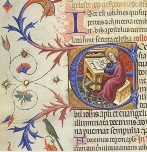
We can trace pen-and-ink illustration’s roots back to the very earliest illuminated manuscripts.
An illuminated manuscript is a manuscript in which text is supplemented by additional decoration. The earliest known examples come from the Byzantine Empire, from 400 to 600 CE.
Illuminated manuscript
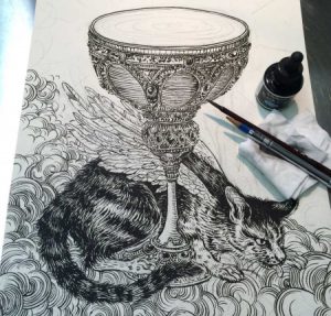
But regardless of the antiquity of the medium, pen and ink are used all the time by contemporary illustrators, with a spectrum of different results.
Yuko Shimizu Work Process Shot
Illustration and the Art of Printing
Illustration’s development has paralleled the art of printing and reproduction, with very specific moments in history periodically reinventing our medium. We can boil these moments down to a few landmark inventions:
- the printing press
- color lithography
- photography
- digital printing
- digital media
Arguably, the invention of the printing press is still the most important thing that has occurred in the history of our art form.
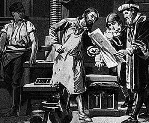
When Johannes Gutenberg invented the printing press, developing a movable type system in Europe between the years of 1440 and 1450, he completely revolutionized the world of human communication. He also initiated the marriage between illustration and publishing that still exists today.
Just as type could be reproduced for print, so could images. The invention of illustrating by means of cut woodblock followed closely the invention of moveable types for printing.
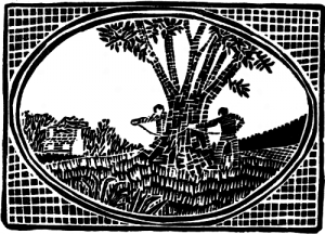
Early Chinese woodblock print
It’s important to note that Chinese were the first by far to use woodblock printing, with the earliest known work dating back to before 220 CE. However, in Western illustration the first woodblocks date from the beginning of the 15th century and the invention of Gutenberg’s press.
Gutenberg added illustrations—usually woodcuts—to his printed books. Very soon after that, books with woodcut illustrations became commonly available.
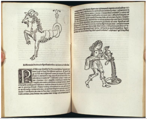
These illustrations were limited to black ink on white paper, forcing illustrators to render subject matter and to represent dimensionality using only lines, leading to the development of hatching in the pages shown here.
Illustrations by Erhard Ratdolt, 1488, in a book written by Persian astrologer Albumasar
MoCCA Festival of the Arts – EXTRA CREDIT ASSIGNMENT
The MoCCA Arts Festival is a 2-day multimedia event, Manhattan’s largest independent comics, cartoon and animation festival, drawing over 7,000 attendees each year. With 400 exhibiting artists displaying their work, award-winning honorees speaking about their careers and artistic processes and other featured artists conducting workshops, lectures and film screenings, our Festival mission accelerates the advancement of the Society’s broader mission to serve as Manhattan’s singular cultural institution promoting all genres of illustration through exhibitions, programs and art education.

EXTRA CREDIT TRIP ASSIGNMENT :
Go to the show and look at as many different kinds of work as you can.
Choose one creator whose work you admire. Interview them about their work, inspiration and career. Find out how they approach their work, their process, and how they got started in the industry. Take a picture with that creator and their work. Write a blog post and share it on open lab. Be sure to credit them and share their social media info with the class.
Tag your post as Discussion, Title: MoCCAfest interview: ____creator’s name____
DUE: Tuesday April 10th
Student Examples MIDTERM
MIDTERM
- Brandy Ortiz – Celestial Seasonings Morning Thunder Tea
- Amir Tamang – Cycle Buff Beauty
- Dana Moreno – Evil Urges Beer
- Jessica Hernandez – Mangorita
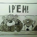
- Heather Parton – IP’EH Beer
MIDTERM PROCESS BOOKS
brandy ortiz – Brandy’s process book
amir tamang – atamang_processbook
Dana Moreno – DanaMoreno_Midterm_Processbook
FINAL SUBMISSIONS FOR PROJECT 2
Hello Class!
Please submit your Project 2 Final Submissions for grading and print.
If you ALREADY submitted part of your work last week, YOU MUST STILL UPLOAD IT HERE TO BE GRADED!
Please keep in mind that the DROPBOX LOCKS Tuesday March 27th at 11am!
You are required to submit:
- 11 x 17 Black and White Poster Design, pencil sketch, Ready to Print.
- at least 3 Value Studies (Can be traditionally shaded pencil sketch or a digitally shaded sketch.)
SUBMIT YOUR WORK HERE
Wet Media Techniques, Part 1: Ready, Set, Paint!
Successfully working in Wed Media depends on applying specific principles. There are habits you can develop and things to set up ahead of time that will make all the difference.
Painting in any water-based medium depends on the interaction among four key factors:
- the absorbency of the paper
- how wet or dry the paper is
- how much pigment you are using
- gravity
Begin by setting up your work area properly before you start.
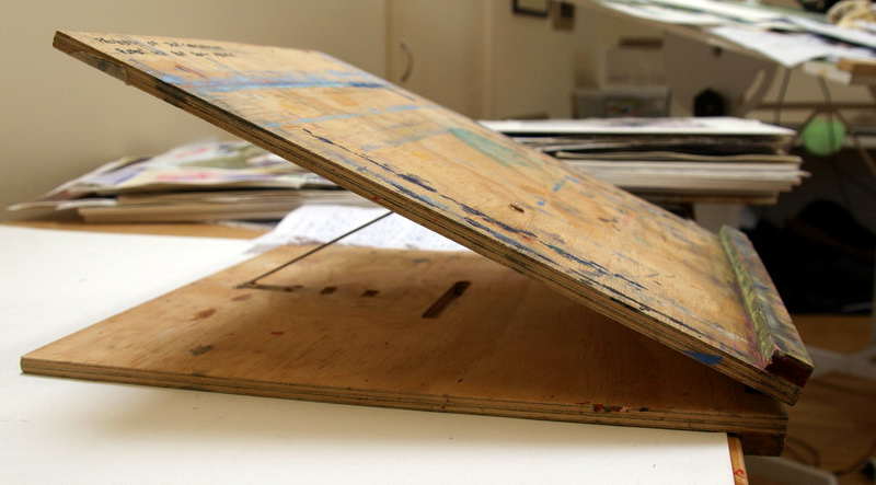
To account for gravity, set your art board at an angle. The steeper the angle, the stronger the force of gravity will be.
This angle is subject to personal preference. Some people like just 20 degrees (equivalent to a couple of textbooks propping up one end of your work surface) while others have a much steeper angle like this:
- Have everything you need on-hand. Lots of clean water and paper towels are a must.
- Try out your colors first. Don’t just blindly jump in.
- Try your colors at different opacities. See what they look like with different proportions of water to pigment.
- Try making a glazing chart to understand color interactions. (You’ll learn how to do this on the next page.)
- Mix colors you know you want to use beforehand and test them on a test strip of paper.
To prevent your work from buckling and warping you should tape your paper or illustration board down with artist’s tape, or work on a watercolor block. This will let the paper block or work board help the paper maintain its shape through repeated applications of wet paint.
Finally, if you’re working on a watercolor block and want to remove your painting, or you need paper for tests and roughs, you should remove your work by inserting a dull knife blade or a credit card into the opening at the top of the block and running it around the perimeter to break the adhesive bond and remove the page.
SUBMIT YOUR WORK
MIDTERM PROJECT : Finalized Illustration using a full range of value
DUE APRIL 10th
Overall Project Description:
For your Midterm Project you will be COMPLETING either Project 1 or Project 2, using a full range of value. You may use any combination of ink and pencil techniques, with digital finishing, to complete your work. Consider this a final art piece, ready to hang in a gallery or submit to a client for publication.
Final work will be judged on the uniqueness, clarity and cleverness of overall the concept, utilization of composition, skillful use of media, and of course overall technique.
You will be graded on both your Work Process Presentation, and on Final Art.
GRADING BREAKDOWN:
50 % project grade Submit a PDF PROCESS BOOK guiding us through the project from inception to conclusion. (see examples)
- Carefully SCAN your process work. This should include : Your Source Material, Brainstorm, Thumbnails, Concept Sketches, Value Roughs, Related Sketchbook Work, and Final Art.
- Carefully Label all of your work so that your thought process is CLEAR. Be sure all of it is presented well: facing the right way, no shadows in the picture, good contrast, etc.
50 % project grade Submit a print ready 300 DPI JPEG of Final ART
SUBMIT YOUR WORK
The Modern Art of Hatching
Print illustration continued to grow as time went on, with advanced technologies allowing for increasingly better image reproduction. Illustrators on both sides of the Atlantic were becoming household names!
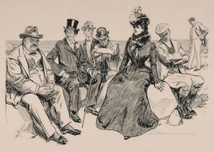
Charles Dana Gibson, At the Beach
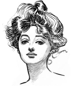
Artists such as Charles Dana Gibson were both depicting and creating the American culture of the time. His pen-and-ink drawings were reproduced in magazines across the globe, and his images found their way into both American homes and the American consciousness. His iconic ink drawing of the “Gibson Girl” was, he said, a composite of “thousands of American girls.” The image shaped the face of American femininity of his generation.
Charles Dana Gibson, The Gibson Girl
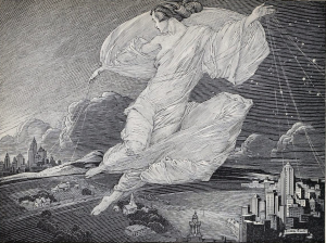
During the years between 1865 and 1917, a time known as the “Golden Age of Illustration,” books and periodicals were the world’s major source of entertainment. This stands as the publishing industry’s most dramatic period of worldwide expansion, and of course that expansion can be seen in the incredible use of inking techniques used by the artists of the time.
Franklin Booth, A Continent Is Bridged, originally an illustration commemorating the 25th anniversary of transcontinental telephone service. Note the similarity in technique to the work of Albrect Durer.
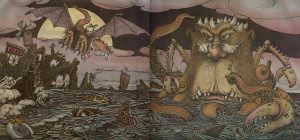
Hatching is as relevant to illustration now as it was at the advent of the print industry, though most artists use the technique in combination with some kind of coloring medium, either traditional or digital.
Mercer Mayer, One Monster After Another, pen, ink, and watercolor
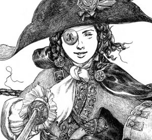
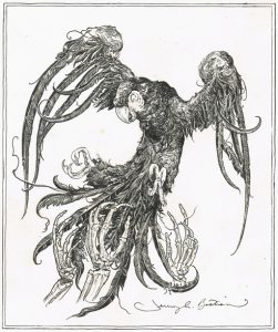
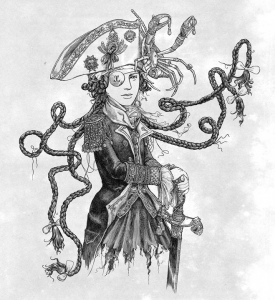
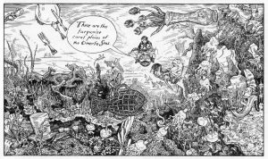
Jeremy Bastian is an American comic book creator and illustrator best known for the book Cursed Pirate Girl. Each illustration is created at a 1:1 scale using a very fine brush and ink. His painstakingly rendered drawings are reminiscent of Dürer in their skillful use of hatching technique, but are perhaps more strongly connected with the pen-and-ink work of the Golden Age illustrators he cites as his influences, Rackham and Tenniel, who we will look at later in this course.
Look at the gallery of Bastian’s work. When you look at Bastian’s illustrations, take the time to zoom in and really examine his use of line to create value and describe form. Also note how expressive and alive his lines are.
- Cursed Pirate Girl
Jeremy Bastian, illustrations from Cursed Pirate Girl
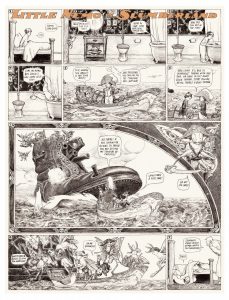
Here you can take a look at a one-page comic created by Bastian for the Eisner-Award -winning anthology Little Nemo in Slumberland, an homage by modern cartoonists to the work of Winsor McKay.


