Society Of Illustrators

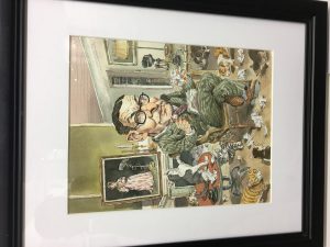
Going to the Society of Illustrations was really interesting to me because I haven’t been to a museum in years. While inside, I seen so much amazing artwork. I seen artwork that must have taken months to create and others that only had a few things going on. One of the art pieces that stood out to me most was John Cuneo’s art piece called “T S Eliot” for his client “Humanities”. This piece stood out to me because the drawing of the man was in the style of something you would get when you go to the city and a street artist draws you and you have a big head and big nose.

John Cuneo was an American Illustrator whose work was appeared in many large publications such as Sports Illustrations, Esquire, The Atlantic Monthly, and The New Yorker which makes sense because of his art style. He was given many awards by the Society of Illustrators for his work. After doing some more research on John Cuneo  I found out that all of his art has the same type of style. A lot of his work is very comedic. I liked that he used simple lines and sketches to create an amazing design. Would definitely love to see more of his work in person.

Visual Vocabulary

Yuko Shimizu makes an excellent point in stating that clients will always know who to call when they are looking for a specific solution to a problem. Every artist, no matter the medium, has a trademark in a sense. A unique talent for and/or passion for a certain medium or subject that identifies artist uniquely and individually. For example, a music artist like Micheal Jackson is internationally recognized as the “King of Pop” because he was exceptionally talented at pop music. Personally, I have a drive for interesting and unique hand lettering, due to my interest in typography. In the future, I can potentially be seen as the ideal man to hire for a job that may require that kind of work, but only however, if I can truly prove my craft and talent in that department.

Field Trip: Society of Illustrators

The illustration I chose is “The Whale Who Lived on a Faraway Hill”


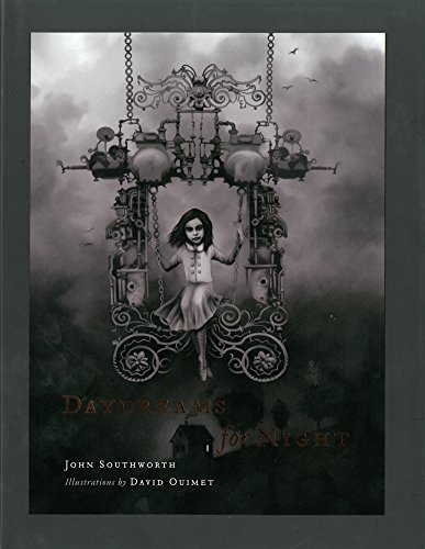
This piece was created by David Ouimet using Carbon Dust as the medium. Which is a way of using carbon dust that I was not even aware existed. However, the main reason why I chose this piece, is because of the sadness and sense of loneliness it evokes when you look at it. You can’t help but feel sad and distressed for the whale; so different and out of its natural environment. A feeling we can all relate to at some point in our lives.

This piece was commission by Asuka Shinshan, for a Japanese reprint of a children’s book called Daydreams for Night.


Society of Illastrators

While touring the Society of Illustrators, I honestly seen a lot of great pieces. A few stuck out to me, but one of my favorites would be tis editorial piece, “My Lesbian daughter” by Edel Rodriguez. It shows a mother embracing her younger daughter holding the colorful “Gay flag”. I am a colorful person myself, so the flag stuck out to me instantly. The arms in the picture, are almost confusing, but I like it. I see one arm that’s definitely the mothers wrapped around the side of the daughter, but the other arm I’m not sure if it is the mother or the daughter’s holding up the flag. It’s almost confusing, you see 3 arms and this it, I find that interesting.

Also, from the title I automatically figured the artist to be a woman, but with doing some research I see it was a man, even more intriguing. Edel Rodriguez is a Cuban American whos works been international. He also has a lot of accomplishments such as graduating with honors in painting from Pratt Institute in Brooklyn, NY. In 1994 and 4 years later receiving a Masters of Fine Arts in painting from Manhattan’s Hunter College graduate program, WOW. You can tell e took art seriously. From his website, I see throughout his career, Rodriguez has received commissions to create artwork for numerous clients, including The New York Times, TIME Magazine, The New Yorker, and many other publications and book publishers. This one I like was made for TIME Magazine.

On the plaque, next to “My lesbian daughter” it says his medium was mixed media. Going through some of his portfolios I can see that he actually makes a lot of painting and from observing, red must be his favorite color! He uses red A LOT in different shades, most often uses bloody red.

Society of Illustrators

After doing research about artist Goni Montes, I notice that all of his artwork shows the use of incredible digital color. Goni Montes was born in Ponce, Puerto Rico. His rendition of “Tamiel, Angel of the Unseen”, which rename as “Tamiel, The Sight Unseen” grab my attention when I visit the Society of Illustrators’ annual show. I love the use of color and the perspective. I went on search the old version for this piece of artwork, I notice that he improve the color and change the perspective of the angel, it come out much better compare to the old one. The old version of this piece of artwork was specific for  Peter Mohrbacher’s project name: Angelarium. Peter Mohrbacher had worked on this project back in 2005. The main purpose of this project was to defines the ideas of the surreal angelic figure. I went to visit this website and I saw all of the angel’s figures seems abstract which was very interesting for me to see. I admire the creativity of all the artist that work on this website because I had a lack of imagination. Angel was an inexistence figure when we said angel, the first image that pops out in our mind was a yellow ring on top of the head, big wing, and friendly face. But in the project Angelarium, the artist create a lot of abstract figure for the angel, some looks like a devil and some don’t even have a facial expression. They push themselves out if their comfort zone and design the creature that they call as “Angel”. Unfortunately, I didn’t find much about the working process of this project but I’m sure Goni Montes was very good on the use of digital color because the color grabs my attention first. Although it was a printout, the color was ablaze.

Society of Illustrators

Peter Mohrbacher is a concept artist whose work can be found in many Magic the Gathering cards, a feat in and on its own. Mohrbacher’s passion project, “Angelarium” begun as his fascination for the lore behind many mythical angels from different cultures. Angelarium is a collection of digital illustrations of mythical angels as interpreted by Mohrbacher. I have been a big fan of these amazing illustrations for several years now. The mood that the color palettes, painting style and setting create have been incredibly influential in my taste and aspirations in terms of concept art. The piece I’ve chosen to review is Tamiel, The Sight Unseen by Goni Montes and ironically, for Angelarium.

This piece stood out to me more than any other for a couple of reasons. I’m a big fan of digital art, and I completely suck with color. The feeling of an overwhelming deity reminded me a lot of Angelarium, and to my surprise, this is a piece of a work created specifically for it. After doing some research on it, I couldn’t find anything related to the design process involved in creating this illustration. But thankfully, Mohrbacher himself stated in a reddit post “Normally I’m self posting around here, but this time it’s for my buddy Goni Montes who created this awesome fallen angel painting for me.” As I was wondering why the style of his other pieces in the collection was so different from this one.

This is Tamiel, Angel of the Unseen as illustrated by Peter Mohrbacher himself. All of his illustration sport this same eerie and mystical feeling to them. From what I could gather, Montes’ illustration was some form of fan art or collaboration created for his friend’s collection.

From the two, I’d personally lean more towards Mohrbacher’s version. Montes’ use of perspective successfully creates a feeling of omnipotence. It makes the viewer feel smaller, lesser-than this deity. But Mohrbacher’s mastery of color is such an amazing sight (ha). The focus lying so heavily on the angel design itself, and how well it blends with its surroundings… I just can’t help but love how mythical it all feels.

Society of Illustrations

Except for the illustration in the lower left corner,these illustrations were showcased in the Society of Illustrators. I love Japanese art and these pieces by Yuko Shimizu quickly caught my eye.  It is inspiring to see how hard work pays off because the result of pieces must’ve took a lot of time. The intricate details with in these figures are my favorite part and the fact that this was done in ink which you can’t erase is amazing.The pieces are part of series called Tale of Shikanoko and the author of the series is Lian Hearn. The client is Farrar Strauss & Giroux and the art director is Alex Merto.

In an interview with FSG Work in progress Yuko Shimizu said “They are all ink drawings with brush on paper. No digital work, other than how the colored sections are separated from the rest of the drawing”. When finding an illustrator for the series Merto said “Yuko came to mind as soon as I started reading these stories. Her illustration style pairs perfectly with Lian Hearn’s writing because it blends traditional Japanese style with surrealism. That’s what we were aiming for with the design of this series”.

Yuko Shimizu is known as one of “100 Japanese People The World Respects” by Newsweek Japan in 2009. She has worked for many clients in advertising, editorial and publishing. With clients such as Rolling Stones, Nike, DC Comics, Esquire and many more she has quite the resume. Not only has she won awards in the Society of Illustrators but she also won awards from places like the Society of Publication Designers, Art Directors Club of New York and Association of Illustration. I can’t wait to see what else she brings to the world through her vision.


Society of Illustrators

2/22/17

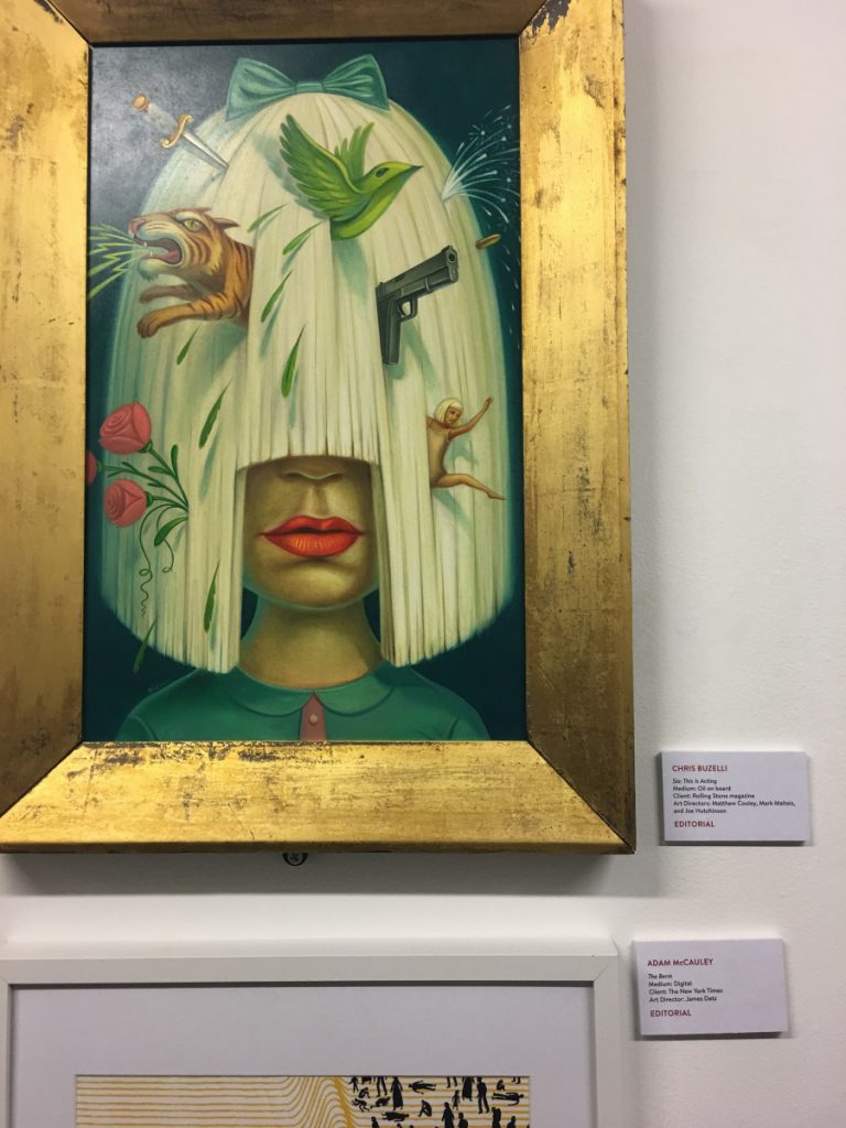
The piece that stood out to me the most in the Society of Illustrators was a work for The Rolling Stones magazine, which was created by Chris Buzelli. I thought it was interesting how this contemporary piece is driven by surrealism, which has existed for millennia, even though the subject matter is based on pop culture, and a celebrity figure of todays modern society.

The medium is oil paint, and best believe Buzelli is a master of this medium. His technique draws from artists like Salvador Dali and Frida Khalo, and it is especially apparent in his portraits, like the one above. Fantasy is his bread and butter, and his surrealistic style ties perfectly with his paintings.

Not only does he have am impressive resume, but he is also a professor of the craft at The School of Visual Art in NYC. He has done similar work for other huge clients like Time Magazine, The New York Times, Macy’s, and Urban Outfitters.

Ive always taken an interest in editorial art, and I think its fascinating the way he utilizes such an old technique to express new and modern day concepts to the society we reside in today. It speaks level to his artistry to be able to accomplish such a thing.

Society of Illustrators

After the field trip I had so many thoughts in my head of what I saw in the art gallery. The art piece that caught my attention the most was called “Black Water” which was an editorial by none other than Daniel Zender. This piece was created digitally for the New York Times Book Review. The reason I am so fond of this great work of art is the way it sort sways back and forth like water. I like the showing of the dark character is reflected along with the trees. Daniel’s artistic style focuses on the dark side of life but she puts humorous twists in her work with color and composition. Its what keeps his work well balanced.

There was another piece of his work that was shown in the gallery that I almost missed until I realize their almost related to each other. This piece is called “Embarrassing Photos of Me, Thanks To My Right-Wing Stalkers”. You have a person trying to hide in the dark but the paparazzi exposing the subject. Whats a little different about this piece is that Daniel is spray painting to bring out a flashy camera taking effect in this situation. Its really breathtaking.

Wet Media Techniques, Part 1: Ready, Set, Paint!

00319-group-8-2ww-m

Successfully working in Wed Media depends on applying  specific principles. There are habits you can develop and things to set up ahead of time that will make all the difference.

Painting in any water-based medium depends on the interaction among four key factors:

  • the absorbency of the paper
  • how wet or dry the paper is
  • how much pigment you are using
  • gravity

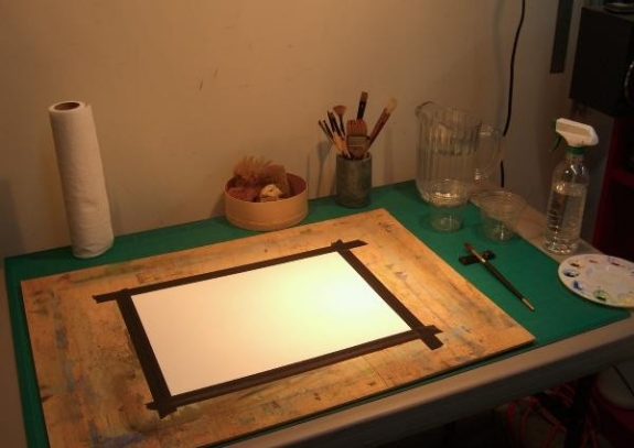
Begin by setting up your work area properly before you start.

ill_232_v9_m09_p13_angle_1

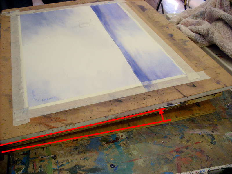
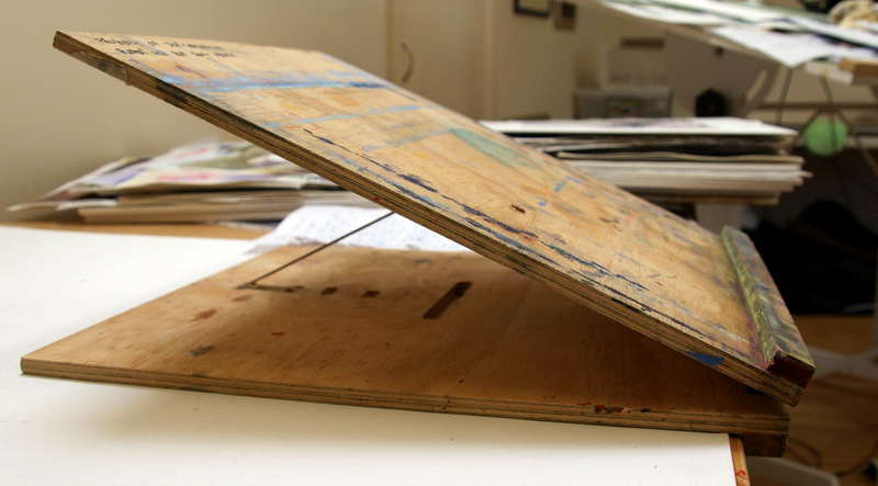
To account for gravity, set your art board at an angle. The steeper the angle, the stronger the force of gravity will be.

This angle is subject to personal preference. Some people like just 20 degrees (equivalent to a couple of textbooks propping up one end of your work surface) while others have a much steeper angle like this:

ill_232_v9_m09_p13_angle_2

  • Have everything you need on-hand. Lots of clean water and paper towels are a must.
  • Try out your colors first. Don’t just blindly jump in.
  • Try your colors at different opacities. See what they look like with different proportions of water to pigment.
  • Try making a glazing chart to understand color interactions. (You’ll learn how to do this on the next page.)
  • Mix colors you know you want to use beforehand and test them on a test strip of paper.

1472600025443


To prevent your work from buckling and warping you should tape your paper or illustration board down with artist’s tape, or work on a watercolor block. This will let the paper block or work board help the paper maintain its shape through repeated applications of wet paint.

1470870755606

Finally, if you’re working on a watercolor block and want to remove your painting, or you need paper for tests and roughs, you should remove your work by inserting a dull knife blade or a credit card into the opening at the top of the block and running it around the perimeter to break the adhesive bond and remove the page.