The first contemporary issue that interests me was Cyber Bullying. Cyberbullying is bullying that takes place using electronic technology. As of today, technology replaces the way people communicate with each other. You can talk to someone across the country easily with the internet. According to the article “Cyberbullying: A Crime that Affects Everyone,” 42 percent of the teenagers report being cyberbullied over the past year. 20 percent of them try to commit suicide, and one in 10 of them attempt it. The Internet is a place where you can express yourself and hide your identity from all the other. Sometimes a word that you said may influence how others think. Because the fact that nobody knows who you are, Cyber Bullying can easily happen. Sometimes when people express themselves through the internet, others give comments. When people leave a bad comment, it will affect their emotion. I care about how others said, so I know how if feels. This was an issue that will last for a long time because there are no laws was create to protect the teenager that was being bullied through the internet. That’s why I choose this topic.
Category Archives: Discussion
Value and Composition
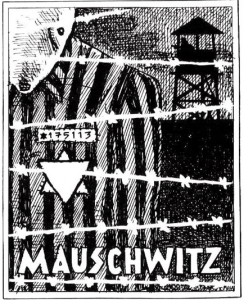
This illustration was done by Art Spiegelman. It was done for his graphic novel “Maus”. He uses value to demonstrate the dark and gruel times Jewish people went through during the Holocaust. The values range but they are consistent in that elements are divided into white, grey and black.The background and post guard are black to show the grittiness of the camps. The sky and the mouse are grey. The grey sky makes the mood sad and melancholic. The artist made the barb `wire white as the focus in front of the everything. The composition is strong because of the values and emphasizes the hierarchy from the barb wire to the background. I felt the values really depicted the mood of the illustration.
Value and Composition
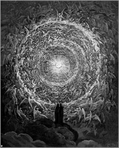
This illustration from Dante’s Inferno was illustrated by Gustave Dore. He uses value to make the center a big focal point. By getting progressively darker away from the middle of the page it leaves an empty space in the middle. Also I think it shows the gray-scale as it shows various levels of value. It’s like the middle is drawing you in the light with the edges of the page being in shadow.The way everything is moving towards the light can give of a sense of curiosity to see what’s so attracting about that light.
Value&Composition
Below was a painting name “Thusnelda at the Triumphal Entry of Germanicus into Rome” by Karl Theodor Von Piloty. The reason why I chose this paint because it gives me a strong feel on the use of value structures and tonal organization. From this painting, I can tell the main figure that artist want us to focus on was the women in the center with a kid. This painting has a lot of people but I didn’t feel the composition was busy at all because the different value Karl use. Karl makes the most important figure white and the rest dark. He also uses gray value to make the background not stand out too much but you will also pay attention to it.
Society of Illustrators
This field trip to the Society of Illustrator really opened my eye and mind. The way people illustrate and thought process is always amazed to me. This time I mainly focused on editorial illustration. I did one two semesters ago without getting any credit. Probably due to the article I chose wasn’t fit for me therefore I did not think of a good illustration to go with it. So, when inside the Society of Illustrator, I want to figure out the way they drew and what inspire them to drew their pieces.
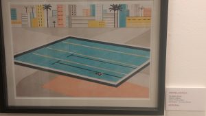
Until, I came upon one illustration which curious me, and made me want to dig deeper of their illustration process and that piece is Andrea Mongia’s The Depth of Swim. Andrea Mongia is an Italian illustrators who was grown up in Rome and work for clients such as The New York Times and Wall Street Journal. Most of his clients are newspapers,, which he did a lot of editorial illustrations. This piece was done for an Italian magazine, Rivista Undici.
As I look around, I found out most of the editorial illustrations appear in this kind of style. Not only that, I remember one of my friends who is starting her editorial illustration career has the similar style of this one as well. This style always has lighter colors and easy feeling when viewing. I wonder if this is the most popular style when comes to editorial illustration? I would love to try out their techniques on some of my future pieces. Also, I found out they don’t use a lot of colors, and most of them don’t even draw shadows! But the way they drew didn’t made their images look flat. That is amazing.
Trip to Society of Illustrators
This trip to the Society of Illustrators gave me a sneak peek of the field that I was interested in. Out of all the artwork, I chose this one that was displayed in the bathroom. This illustration captured my attention the most out of all the other art pieces. This pieces by Anna and Elena Balbusso. After research, I found out that they made an illustration for each queen in the deck of cards. The illustration by itself made a huge difference. It looked like the queen of hearts from Alice in Wonderland. This illustration was created for mixed media. All four of pieces were displayed together in the Society of Illustrators January 6 to January 30, 2016. 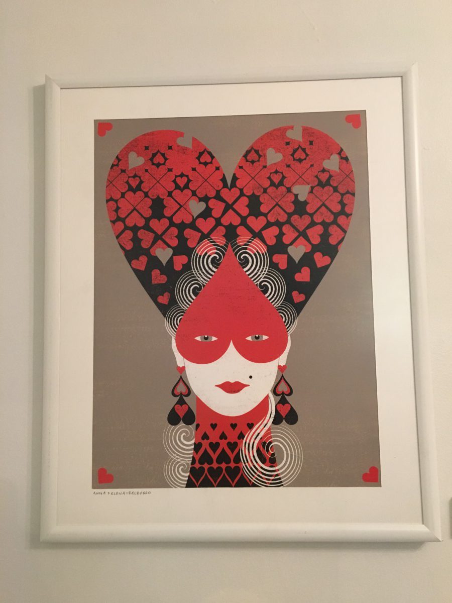
Trip to The Society of Illustrators
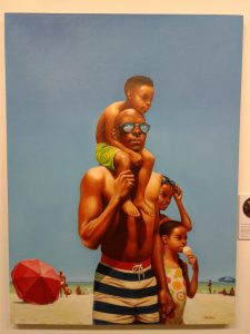
On February 21, 2017, travelled to the Society of Illustrators where I exhibit a bunch of pieces of illustrations from several different artists. Out of all the artworks that was displayed on the small museum “A Day at the Beach” by Kadir Nelson stuck out to me the most. Kadir Nelson is an African American artist, illustrator, and author that was born on May 15, 1974 in Washington D.C. Ever since he was three years old, he always has an interest of drawing and art. He specializes in illustrating stories of black history and African culture. He illustrated one of his art pieces, “A Day at the Beach” for The New Yorker magazines. This art piece caught my attention by how detailed the man, his kids, and background in the illustration looks. Nelson’s art piece was done on oil on canvas and the colors blend perfectly with its light and dark values and shadings. It was published on July 4, 2016 by The New Yorker magazine corporation company. This illustration speaks to me by not only representing Black History Month, but also proving to the world that not all great artwork is done digitally nowadays; sometimes great art can be done the classic way.
Visual Vocabulary
In Yuko Shimizu blog “Visual Vocabulary” she was saying that you have to know what you good at first then impress the art director with it. From my point of view, I think she was trying to tell us that we need to know what kind of style that we good on and improve it. So that instead of trying to be better than other, you can be famous or remember by people from the style of your artwork. I can use my sketchbook as a tool to developing my own visual vocabulary because I can easily tell what I’m good at when I look back on my old drawing and you also can tell what you improve and what you bad at. I’m the type of person that interesting in gaming and animation. I often draw the character from game or animation so my style maybe playful. Compare to body figure drawing, I’m more good on animation drawing so I think this might become an important visual signature of myself.
Trip to The Society of Illustrators
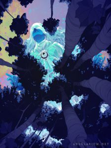
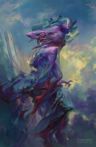
Among many great pieces from the editorial exhibition of the Society of Illustrators, I happened to be amazed by Goni Montes’ piece, Tamiel. This piece called my attention with its bright lucid colors. At first glance, you may notice a brightly colored woman but soon you notice that this is an enormous woman on top of a forest. The way perspective was used impressed me. Goni Montes digitally illustrated this piece for the book Angelarium: Book of Emanations. Angelarium was a project started by Peter Mohrbacher. worked in the gaming industry and was the one to start this project. It’s based on the various angels in mythologies and created. The goal of the book is to explore the various ways angels can be envisioned in surreal ways. The book is being funded through a kickstarter, and so far $50,000 have been pledged.
this was the version done by Peter Mohrbacher. I find both pieces amazing. However, Goni’s calls my attention more because of the bright palette and composition. Although, Mohrbacher’s looks more defined and finished, I happen to like works like Monte’s . All in all, I really enjoyed the trip and it helped me see great work and makes me want to put in more effort into my work.
Visual Vocabulary
The concept that employers would seek out specific illustrators for what they’ve shown to be experts at wasn’t exactly foreign to me, but it wasn’t something I had given a lot of thought. I want to be a 3D Character artist, and Character Concept artist. I had never exactly devoted my time to improving therefore I feel like I’ve fallen behind in terms of industry standards. Late 2016 I begun devoting most of my free time to studying art fundamentals. After a couple of months tackling perspective, I’ve now just begun studying Hampton’s Human Gesture book. Soon I’ll be moving on to digital painting and color and light theory as well as color composition, which will allow me to perform master studies. After first reading Yuko Shimizu’s my first thought was “I want to be known for creating dope character designs of course.” But it hit me that dope character designers come in the dozen. After some thought, to me it’s clear that I want my sketchbooks to be filled with studies of every kind. I want to not only be known for designing and modelling great characters. I want to be known for demonstrating an absolute mastery of art fundamentals which I can use to my advantage to be an extremely flexible artist.

