Concept Sketches

 My article was basically about a cat whos owner dressed him in fashionable japanese style clothes while they eat dinner together. The Japanese owner also gave their cat an instagram page, which has more than 89,000 followers.  The pictures are all of the cat sitting infront of Japanese dishes.

When i first started brainstorming i thought about the cat, he’s calm and collective. He’s different you don’t really hear about too many cats willing to sit still and pose for the camera, lets not forget have an instagram with plenty followers. i wanted to portray something different or representation of cool.

Figure Drawing Resources

Hello Class!

Several of you are sharing the same stumbling blocks on your basic drawings. That is OK! … as long as you know it and are working to improve it. So on that note, here are a few resources to help:

HUMAN HANDS MYSTIFY EVERYONE AT FIRST!  Don’t feel bad! Here are some helpful guides!


Turning the human head is also very tricky…


And just in case we missed anything… heres the WHOLE figure in one Big Poster.  HAPPY DRAWING!


Big Guide to Drawing the Body by Cedarseed


THE COLOR WHEEL

1466034999442

YES, you painted one of these in Kindergarden. I know. However the usefulness and knowledge that can come from this tool is limitless. So please let go your preconceptions toward color, and using a color wheel and come into this with an open mind.

The color wheel is one of the most powerful tools artists and designers have to help us understand and use color effectively.  It is strongly recommended that as you examine the different color schemes thought this post and the following, you look at a color wheel and plot them out.

1466035082557


FUN FACT! The first circular color wheel was created by Sir Isaac Newton in 1666. As if the laws of planetary motion and gravity weren’t enough!

1466094968998

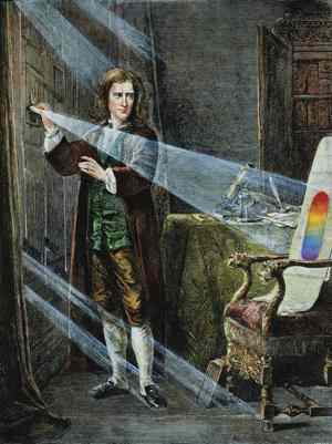
Foto: picture-alliance


1466095035989

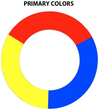
We begin with a three-part color wheel that shows only pure colors, meaning colors which no amount of mixing will result in. These three colors are of course our primary colors: red, yellow, and blue. All other colors are derived from these three hues.


1466095027770

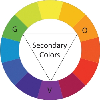
Next we move on to our secondary colors. These are the colors formed by mixing the primary colors with each other: green, orange, and purple.


1466095133395

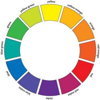
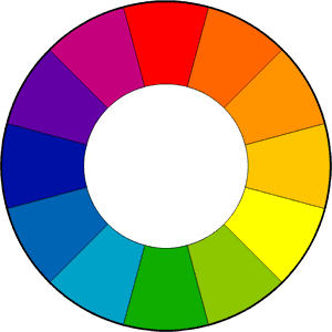
You can further break down the color wheel into tertiary colors. These are the colors formed by mixing a primary and secondary color: yellow-orange, red-orange, red-purple, blue-purple, blue-green, and yellow-green.


1466095577744

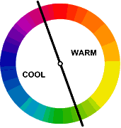
And of course we divide that wheel based on Color Temperature, with warm color opposite cold.


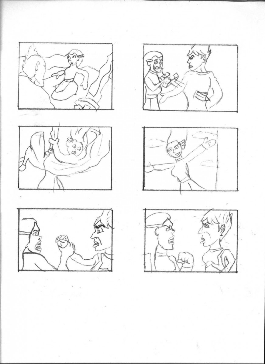
To create a successful illustration, your color palette or scheme needs to support your big idea. It must work to further your narrative and or concept.  If you have already taken Color and Design, you will have worked with various color schemes.   In the next few posts, and in the remaining weeks of class, you’ll look review color theory in detail, and see how those color schemes can influence narrative. We will also look at how they are applied in both fine art and in contemporary illustration
1466095598653

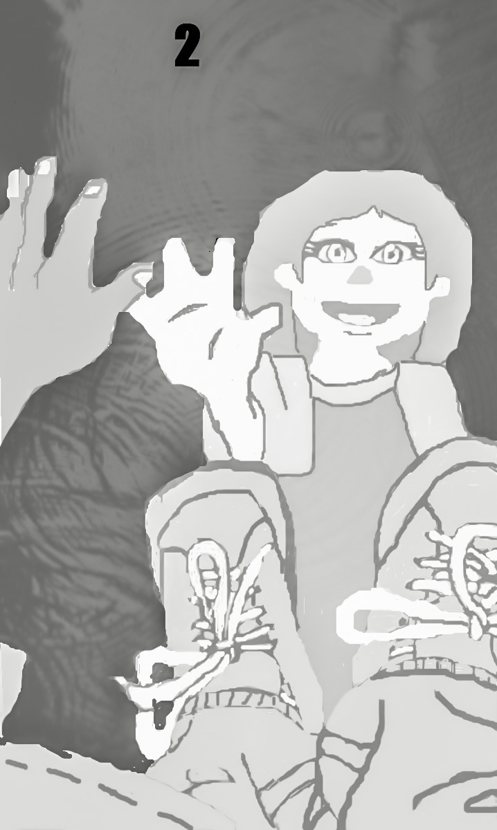
Drawing by Philippe Buchet, Color by Matt Hollingsworth


NOW lets get deeper into some real COLOR THEORY!

Marcos Chin’s insight into editorial Illustration process

Hello Class-
Illustrator Marcos Chin an award winning artist whose work has appeared as surface and wall designs, on book and CD covers, advertisements, fashion catalogues, and in magazines.  His editorial illustration work has appeared in Time, Rolling Stone, The New Yorker, GQ, Sports Illustrated, The New York Times and others.  He recently posted about the editorial process he learned in school and how his process has evolved.  Check it out!

Marcos Chin Process

Whenever I work on editorial projects I distill the brief, or article into one or two simple sentences because it helps to focus my imagery towards communicating the essence of the story. I learned this from my teacher in art college @pauldallas_art … Nowadays I sometimes I go even further and distill the story into only a few words. I learned this method of working while teaching alongside my friend @chrisbuzelli who taught me to locate the action within the story and then visually describe it. Doing so will aim to help create pictures that have a strong idea and immediate read without being too obvious, or cliché… I’ve incorporated this way of working into my illustration practice and now I feel like I have a new super power 

I’m going to have this piece of paper up where I can see it while I brainstorm concepts for an editorial project I’m working on right now. #marcosprocess #match#connect #respond #ocaduillustration


Redo of Sketch #1

I decided to change the first sketch entirely. The metaphor for this image is still the same as the original first sketch. I drew some tree branches to show that there’s some background and that the boy is looking at a reflection from the puddle. Here’s the image that inspired this sketch below:

Here’s the article for this sketch: http://www.huffingtonpost.com/entry/autism-muppet-sesame-street_us_58cf5f15e4b0be71dcf5b455

Redo of Final Sketch #3


I redrew this sketch and while the the characters for the most part retained the same pose, there is some differences with the hand placements. I also added a background to the drawing. In case you missed it, this sketch is for this article: http://www.huffingtonpost.com/entry/autism-muppet-sesame-street_us_58cf5f15e4b0be71dcf5b455

I used two photos as references for this sketch redo. The first one below is for the pose and handle, while the second one below is for the background.