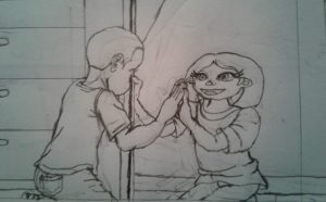
I redrew this sketch and while the the characters for the most part retained the same pose, there is some differences with the hand placements. I also added a background to the drawing. In case you missed it, this sketch is for this article: http://www.huffingtonpost.com/entry/autism-muppet-sesame-street_us_58cf5f15e4b0be71dcf5b455
I used two photos as references for this sketch redo. The first one below is for the pose and handle, while the second one below is for the background.


I know it’s late, but it’s still better than not posting this at all. I hope you all get to see this soon, so I can finally work on the next part of the assignment.
Devin-
Again- Nice work on these editorial sketches!
Ok… this has some potential… BUT the anatomy is off on the boy… find a model of a similar age to get that pose. Also if I had to choose I like the other design you submitted before best of all.
Good work!