Stories: A Love Letter

greg ruth

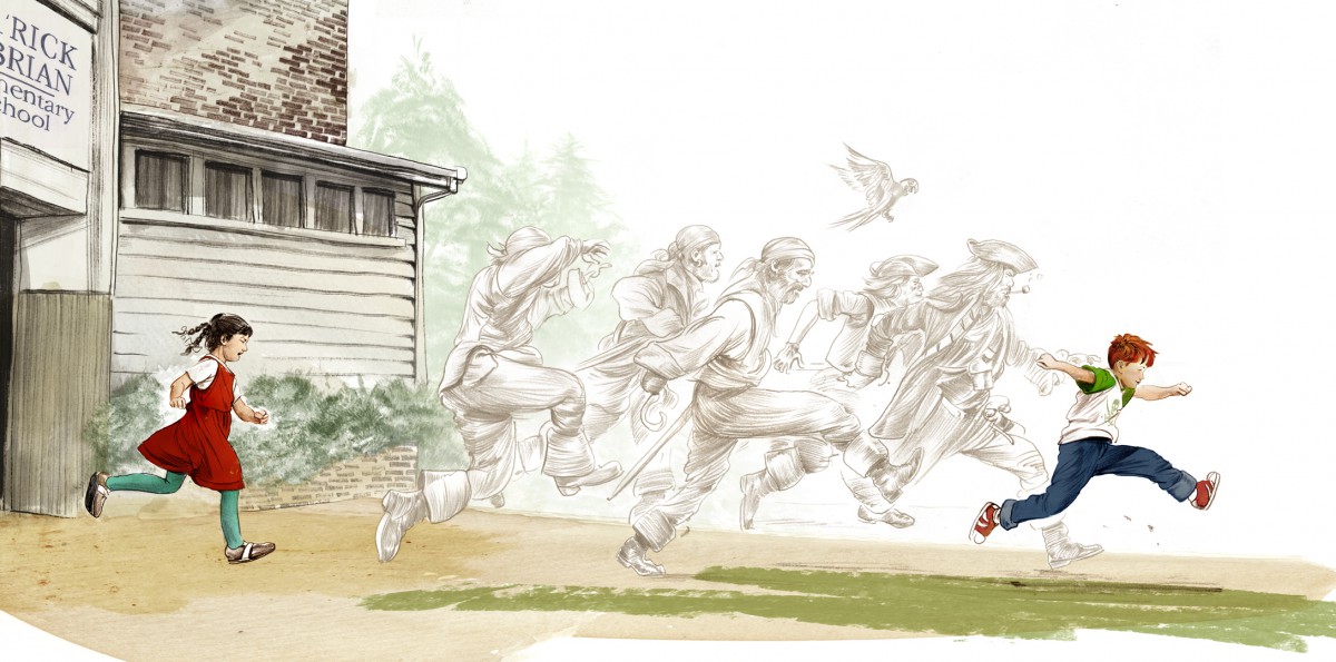
Greg Ruth, A Pirate’s Guide To Recess

Is there any aspiration more human, and more powerful, than the art of storytelling? As illustrators, we are admittedly very biased! After all, what is illustration if not the art of visual storytelling?

Some people are naturally adept at storytelling. They will captivate a room and have their audience hanging on every word. They know just the right moments to pause, to hush their voice, to yell, to inject tension or humor. But another person can tell the exact-same story and clear the room out!

Visual storytelling is no different. A thousand illustrators can approach the same work, each with their own unique storytelling voice (again the idea of personal vision), and each one will come out with a different interpretation, a different read on the story. Some of these reads will invariably be more successful than others. The ideas we will be approaching in this module will help us to be sure our interpretations work. We examine the intimate relationship between story and visual art, and look at how our all our artistic decisions affect our ability to tell a great story in our own unique voice.

You’ve heard the old saying “a picture is worth a thousand words?” In great narrative illustration it’s absolutely true!

––Illustrator Greg Ruth, from Stories: A Love Letter

source: Muddy Colors

Concept in Illustration

Featured

Class

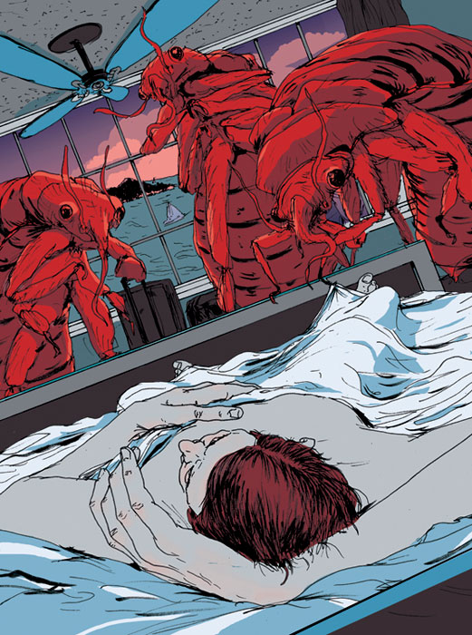
Find an editorial Illustration you admire. Such as this amazing illustration by Mike Byers on the topic of Bed Bugs.  🙂   Read the subtext about the illustrations and where / how they were used.  Analyse what metaphors they chose to illustrate the subject matter. Observe the way the artist has conceptualized their subject.

Pay attention to what methods they have used:


Fusion

Juxtaposition

Replacement

Exaggeration

Symbolism

Displacement

Period Imagery

Style


Here’s a few places to start looking:

https://society+of+illustrators+competition+editorials

http://theinspirationgrid.com

https://www.creativebloq.com


But most of all, just look.


SARA

Weeks 3 & 4 ALL ABOUT INK

For The next 2 week’s readings please read and COMMENT that you completed the reading on each of the following blog posts.  You MAY read ahead, and it is suggested that you READ These before beginning the #Inktober challenge.


Week 3

Week 4

  • pen-and-ink-illustration-an-introduction
  • the-modern-art-of-hatching
  • master-study-the-art-of-albrecht-durer


Week 2 – Jillian Tamaki on Idea Generation

Please Read Jillian Tamaki, Idea Generation

THEN, RESPOND TO IT IN OUR DISCUSSION FORUM:

In a few sentences discuss the article.  Consider questions like:

What are Concepts?  What methods does Jillian Tamaki use to generate hers?

Are there specific steps she takes?

Do you have other methods unique to your process?


Be sure to read eachother’s observations BEFORE posting your own.

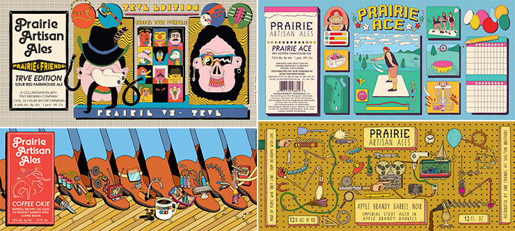
Week 2 – How Next Level Design is Driving the Beer World

This Article by Veronica Meewes for the online design magazine PUNCH, explores the “new generation of eye catching label design” with a close up on five example breweries and the inspiration behind the labels that have become “ their visual calling card.”

After reading this article, consider how YOUR label design is a visual calling card for the product.  

  • Write a few sentences describing the intention of your label.
  • Find a label design which uses illustration in a manner you find interesting, eye catching or inspirational.
  • POST the designs along with your comments on them for DISCUSSION next week.

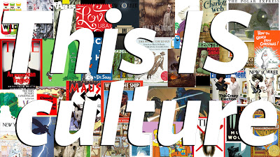
Week 1 – John Hendrix, This is Culture.

Please Read John Hendrix, This is Culture.

THEN, RESPOND TO IT IN OUR DISCUSSION FORUM:

In a few sentences discuss the article.  Consider questions like:

What does Hendrix Define Illustration as?

What does he mean when he calls illustration a powerful, profound, and unpretentious shaper of our visual lives” ?  

Be sure to read eachother’s observations BEFORE posting your own.