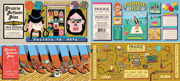
This Article by Veronica Meewes for the online design magazine PUNCH, explores the “new generation of eye catching label design” with a close up on five example breweries and the inspiration behind the labels that have become “ their visual calling card.”
After reading this article, consider how YOUR label design is a visual calling card for the product.
- Write a few sentences describing the intention of your label.
- Find a label design which uses illustration in a manner you find interesting, eye catching or inspirational.
- POST the designs along with your comments on them for DISCUSSION next week.


For the project I have decided to do a label from “Celestial tea“. Celestial tea has so many favors and I chose to do Bengal spice. As this name and theme is so much familiar to my culture and my country the packaging reminded me of my country. The label contained so much interesting scenery with people, mountains, tea garden and tiger on it. Indian and bengali people drink lot of tea throughout the day so this packaging would definitely caught heir attention of feeling as they are home to those who are living in abroad.